When Website Usability Loses You Money
The other day, I was hunting on the internet for lunch and I stumbled onto a restaurant I hadn’t ordered from in a long time. It turns out that they had added an “order online option” which automatically gave them the edge on all the other Pizza mongers in Pittsburgh (with the exception of Dominos, who has one of the best order online setups I have EVER seen. Unfortunately, I’m not the biggest fan of Dominos pizza.)
The checkout process was like a cheap date: not pretty, but super easy. And at the very end, the best part: A tip calculator!
Now let me momentarily digress. My ability to do math in my head is probably rivaled by that of – oh I don’t know- a crack addicted chihuahua. Because of this handicap, I have a pretty odd method of tip-leaving that is based more on the type of service that I’m tipping for than the actual percentage of whatever I paid for in the first place.
Usually (always….) this really works out well for whoever I’m tipping. For instance. Bartenders get $1 and whatever change I get for every drink, even if it’s just Coke. (If I don’t have a tab. If I have a tab, the tips probably average way more per drink since by that point I’m a drunk crack addicted chihuahua.)
For dinners, it’s typically between $10 and $20 depending on how often my water glass gets filled up, regardless of whether I’m at Tom’s Diner or Bravo’s. If I’m eating at a really nice place, it’s likely that the Boy is paying, and I needn’t bother about such things at tips. For delivery drivers, it’s usually at least $3 if not $5, depending on the weather, the challenges my location poses, the length of time they have to drive etc.
Now back to the story at hand. This awesome tip calculator not only calculated my tip based on percentage of what I paid for my pasta, but also allowed me to simply click on the right number. In this case, 20% was all of $2.90. 20% is also, well, a fair tip for someone who just had to cross a bridge to get to me on a relatively nice day. So that is what I left them.
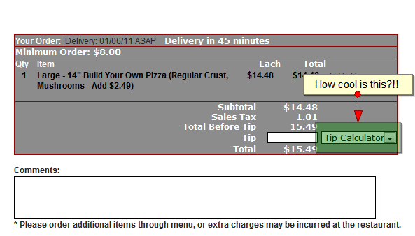
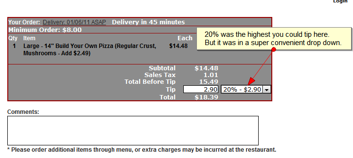
Had this nifty tip calculation feature not existed, that driver would have gotten a much higher tip. This got the hamsters in my carb-starved mind sluggishly running in their wheels. This poor low-tipped driver might only be an example of a greater issue. As website usability testers (as well as SEOs and analysts) we deal with usability every day, and the general rule is: the more usable the better. But is this really true? Might occasionally limiting a user’s possible actions actually result in MORE money? Well, probably, yes. In some cases. Like the following:
The Pros And Cons of a Really User Friendly Website
Sometimes, the very things that may make a site super-usable can also have some unforeseen and unwanted repercussions. However, it’s a thin and wavering gray line. Lots of usability experts/the books of information they publish preach that we should include easy, intuitive navigation, lots of leading information etc. and they are totally right. Except when they’re wrong. Look and PPC landing pages for instance. You (usually) don’t want a full horizontal and vertical navigation with bread crumbs and everything else included on the landing page. That would make it super usable, but it might also lead the targeted traffic to pages less suited to actual conversion. They might like what they see, but offering them more choices at that point might lose you the revenue. That is a great example of how usability best practices can lose you money. Here are a few more:
Decision Paralysis
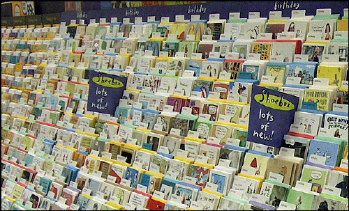
Have you ever been faced with so many options that you decide not to pick anything? I have. Recently. I usually find myself making a midnight run to the nearest Walmart the day before any given holiday to scrape up last gems in the picked over card racks. It normally takes me 10 minutes, because there are a limited amount of cards that don’t have moving parts or sound effects left. It makes my decision easy. Two days ago, I was being completely, uncharacteristically, ridiculously forward-thinking and found myself looking at Valentine’s day cards.
Faced with an entire AISLE full of cards, I found myself completely incapable of making a decision. They were grouped together, but only by relationship (daughter to mother, husband to wife, child to parent etc.) It would have been way more useful if they had been subdivided further into genre (daughter to mother/funny or husband to wife/ risque) That would have limited the quantity of cards that I would have seen initially, but would have made the entire process more manageable, and I would have walked out of there with a girlfriend to boyfriend/funny card and no problem.
There’s a very fine line between too many easily accessible options and not enough as any medium to large sized e-commerce site webmaster will tell you.
Lower Average Conversion Value
This idea of usability adversely affecting conversion value brings us back to the thing I noticed with the tip calculator, but there are many other cases where additional choices may lead to lower conversion size. Here are some possibilities:
- Service Package Size: Many different packages of services. Lots of SAAS companies have this problem. They have the “Deluxe” package, followed by the Really Deluxe, Super Deluxe, Awesome Deluxe, Super Awesome Deluxe, Giant Enterprise Deluxe with a Cookie, and maybe some more after that. One one hand, breaking out services in this way creates more customized packages that are likely to be attractive to almost every conceivable type of client. On the other hand, offering too many graded choices will often cause clients that would potentially want the Awesome Deluxe package to choose the Super Deluxe one instead because they want to save that extra $50 a month. Users typically choose the middle of 3 packages. You can lump your services together however you want behind the scenes, but don’t sacrifice order size just to try to reach everyone at once on the conversion page of your site.
- Shipping Options: Offering a half dozen shipping and insurance options and carriers is often unnecessary and may cost you revenue, even if the process of choosing these is dead easy and intuitive on the website. Better by far to include insurance (if necessary) in a flat rate shipping cost and add one other rush option at a premium (or a similar two choice process.) If the user made it all the way to the shipment selection portion of the checkout, they’re rather invested and as long as the cost isn’t way outside of their expectations (which you can manage along the way), they will happily pay. You don’t WANT them opting out of an option that can make you money, and by providing those options you’re inviting them to do that.
- Loss leaders: A website is not a restaurant, and the happy hour model is not always effective. Faced with the choice between an inexpensive single product and a higher-priced gift basket containing that product on the same page, there is a much lower likelihood that the user will choose the more expensive gift basket. Giving them a lower cost alternative in the menu might be a reasonable alternative.
Information Overload
Everyone knows copy is really important to a website. From an SEO perspective, it gives the search engines something to index. From a usability perspective, it gives the user needed information to encourage them through the buying funnel. From a… well you get the point. You need copy. Arguably, on a truly nice and usable site, the copy will be formatted in a way that is not overwhelming (broken up by pictures, bullet points, ordered lists etc.) However, sometimes, the sheer volume of product description can actually turn users off. Make sure that you’re taking all phases of the buying funnel into consideration when designing how massive copy will appear on the site. Take care of your impulsive, ready-to-buy clients up top and then let the other information settle into tabs or at least below your strong calls to action. Otherwise, you risk overwhelming your user.
Hopefully this post was somewhat helpful. Even though the common sense, often repeated maxims are present, I thought it was interesting to look at how, even if you do everything right, you might still lose money. I think it’s helpful to occasionally remember that there are two sides to a usable site. You want to make sure that you have a site that CONVERTS.
In other news, I had a hard time finding good, general examples. Anyone know of any sites that are so usable you want to hit them with your keyboard? Thanks!
