6 Ways The Google Analytics Dashboard Is Better Than You Think
The Google Analytics dashboard doesn’t give you a lot of options. You click the “Add to Dashboard” button in a report and you get what you get: depending on the report, it might be a pie chart, or a graph of the metric over time, or the top 5 rows of the report. It’s OK for a quick snapshot, but it’s not very customizable. In fact, there are lots of third-party tools to build a better dashboard.
But the GA dashboard just might be better than you think. A few of us were sitting around the table yesterday and the topic came up, and we made a few observations of how useful the dashboard can be.
1. Save a Filter
You already know you can navigate to any of the reports and add them to your Dashboard, rearrange them, and get rid of the ones you don’t want.
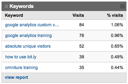
But did you realize that if you filter the report (using the containing/excluding filter at the bottom of a report, or the Advanced Filter), when you add that report to the Dashboard, that filter is saved? For example, if I filter the Keywords report to exclude “luna” (to show just our non-branded keywords) and then add the report to the Dashboard, I see just the non-branded keywords.


This means, for example, that you can have multiple Top Content reports in your Dashboard, each filtered for different sets of pages. Or multiple Keywords reports, each filtered for different keywords.
The not-so-nice part is, the label of the report doesn’t say anything about that, just “Keywords” for all of them. See #4 below for a trick to help in this department.
2. Drill down
If my business is selling widgets in a storefront in Schenectady, I probably don’t need the world map from the Map Overlay report on my Dashboard.
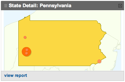
But fortunately, I can drill down at whatever level I like — continent, country, state, city — and add the drilled down report to the dashboard.

This works for any report: drill down to a specific traffic source, a specific page, whatever you like.
3. It’s a Permalink to the Report
The really nice thing about #1 and #2 is not just that you get the report on the Dashboard. It’s that “View Report” link at the bottom of the widget, which takes you directly to the report. It’s a good way of saving reports you go back to over and over. Instead of taking 5 clicks to navigate there and apply a filter or drill down, you get there in 1 click straight from the Dashboard.
4. Name Reports Better with Custom Reports
(Shout out to John Henson for pointing this one out.)
Using a Custom Report allows you to change the name of the report so that instead of seeing “Top Content” for multiple reports, you could see “Articles by Tim”, “Articles by Tom”, etc.
By simply recreating the report you are interested in as a Custom Report, you can name it whatever you want. For example, you could create a Custom Report named “Articles by Tim,” filter that report to only show Tim’s articles, then add it to the Dashboard. Then create another Custom Report (which may well be exactly the same except for the name and filter) named “Articles by Tom,” filter that report to only show Tom’s articles, and add that to the Dashboard as well.
What you end up with is much easier to read Dashboard report. The titles are much more descriptive and easier to identify.
5. Apply an Advanced Segment Across Lots of Reports at Once
(Kudos to Dorcas Alexander on this one.)
Advanced Segments are great for looking at just the audience that you’re interested in, and especially useful because you can use them across almost all the reports in Google Analytics to see just that audience. But if I want a summary of information, I might be stuck applying that Advanced segment and compiling data from several different reports.
You can also apply Advanced Segments from the Dashboard to see a quick view of all the reports segmented at once. This can make getting the picture of what your segment is doing that much quicker and easier.
6. Export and Email the Dashboard
Instead of maintaining emails for multiple reports (even with the “Add to Existing” feature, this can sometimes be a pain), you can also just choose to email the Dashboard report, and you get an attachment with data from all the reports you’ve added to the Dashboard. Now, if you want to add a report to your scheduled email, just add it to the Dashboard and you’re done.


