5 Things We Love About The New, New Google Analytics User Interface
Last week, most of us logged in to a big surprise in our Google Analytics, and it wasn’t a traffic spike, it was the new, new look:
Whoa! Google Analytics, you lookin’ fine.
Now that we’ve had a week to digest the changes, here’s a few of our favorite things that Google has added in this substantial update.
- Sharing of Custom Reports and Dashboards has never been easier.
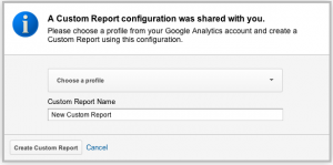
I think this most affects people who work with clients or have teamwork among analysts, but if you’ve ever wanted to share a custom report with someone before, it was a pain (usually ending up in the wrong profile), and the ability to share Dashboards was just nonexistent. The new interface lets you choose what profile to apply the dashboard/filter easily.
- Less flash!

You can now view Google Analytics on your iPod/iPad and see the line charts. I suspect this also explains why GA feels a little peppier. They are most likely phasing out all flash in favor of HTML 5. (A peek into the source code shows that graphs now come from an Iframe which is rendering things with scalable vector graphics)
- Toggle Buttons are More Clear.

A bunch of features that have been in GA for some time are more apparent now, thanks to a clean new layout of buttons. For me, the Compare Metric and Plot Rows options are much more obvious now. I also really like the Day/Week/Month toggle, it seems cleaner and is definitely less buggy then the old drop-down.
- Sampling Slider.
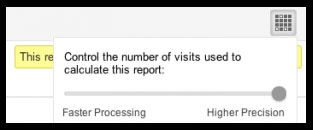
While you still can’t turn off sampling (unless you use GA Premium), at least it’s possible to show your customers that sampling can be pretty accurate (or inaccurate) depending on the amount of sampling. I’ve played around with this to see what percentage Transaction data gets the most inaccurate. I’m not sure why anyone would want .02% of their data sampled in exchange for speed, but it’s possible now.
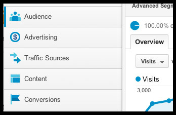
- Pretty Thumbnails.

This small bit of eye candy makes the sections in GA really pop out, and makes the overall tool look a little more exciting. Although Daniel Waisberg makes a great point that the $ symbol should be by goals instead of Advertising, but I guess Google doesn’t see it that way!
Still using the old GA? We’re offering a free online webinar to help with the transition. Sign up now, we’re limiting this webinar to the first 90 people.
News & Insights
Related Perspectives