Google Analytics Goal Flow: How Visitors Really Move Through Your Funnel
You may think visitors move through your goal funnel exactly the way you set it up in Google Analytics. Unfortunately even after you take care to avoid the most common funnel issues, surprises (sometimes hidden) may appear (or lurk) in your data.
Check out the Goal Flow report to bring more details into view. Chances are you’ll see visitors doing things like skipping steps and looping back to previous steps – things you just can’t see in the standard Funnel Visualization report.
I pulled some example funnel data to show how these two reports relate to each other. Let’s review a couple quick points about funnels to see where funny-looking data may appear.
Where funnel numbers come from
Looking at the Funnel Visualization report, you may wonder: How did a visitor get from A to B? What do the numbers on each step really mean?
First, you should know that each step displays the number of visits for that step, not the number of pageviews. If you want to match the number to your Content reports, look at unique pageviews. Google Analytics defines unique pageviews as “the number of visits during which the specified page is viewed at least once”. Thinking of “visits that touched this step” is one way to keep it straight.
While the number of “visits that touched this step” is true for the first step and last step (the destination URL) in the funnel, it isn’t necessarily true for the intermediate steps of the funnel. The Funnel Visualization report will backfill between steps, counting visits for a step that was not touched as long as a previous and subsequent step was touched in those visits.
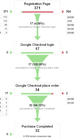
Backfill (or a goal setup error, or both) may explain why the same numbers appear between two or more steps, as in the example shown here. When that’s the case, you’ll also see “0 exits” on the right side of the funnel. Assuming you have a reasonable amount of data, not just a couple of visits, you should instead see at least a few exits at every step of the funnel.
In this example the funny-looking data that draws my eye is the “0 exits” next to step 2. It’s very unlikely that all 17 visits going from step 1 (registration page) to step 2 (login page) also passed right through to step 3 (order page) without any exits. I’ve checked my goal setup and it’s fine, so what’s going on there?
Goal flow fills in the missing details
Even if you don’t have any funny-looking data in the Funnel Visualization report, the Goal Flow report will reveal details that may surprise you. The standard funnel diagram can hide skipped steps with backfilling, and simply has no way to represent loops through steps. Its limited format forces it to compress the wide variety of visitor paths into a narrow one-directional view.
In comparison, the goal flow diagram represents visitor paths more accurately in several ways:
- flexible format for visuals you can understand intuitively
- pageview numbers in the nodes, in addition to visit numbers in the first column and in the table
- drill into the data by segmenting, highlighting, and clicking for node details
Let’s see how much more is revealed in my example funnel data by switching to the Goal Flow report. Find the report link in the interface right below the Funnel Visualization link in the left navigation, under Conversions > Goals.
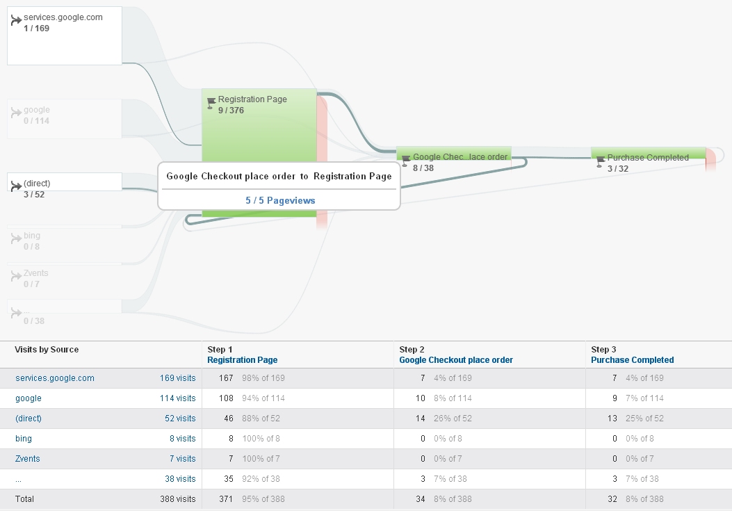
In the goal flow diagram above (click the image for a larger view), it’s immediately obvious that no visits touched the login step because the flow omits the login step and has just 3 nodes instead of 4. The 3 green nodes cover only the steps that visits actually touched: registration, order, and purchase completed. Since I’ve already checked my goal setup, I know the login node isn’t missing for other reasons.
Intuitive visual elements include not only the number of nodes, but also:
- the size of the nodes and connectors, which relate to the amount of traffic flowing through them
- the color red for traffic leaving the funnel
- the connections, which skip intermediate nodes and also loop back to earlier nodes
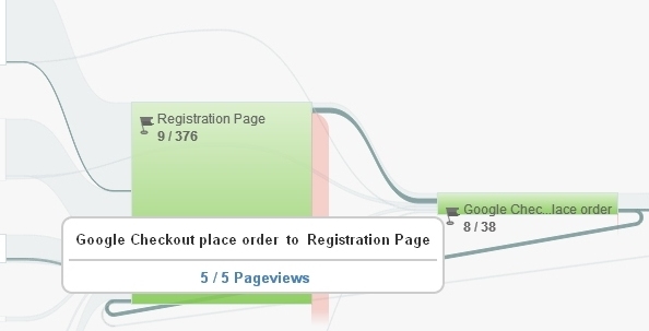
In the closeup below, I’ve highlighted the connection that loops back from the order step to the registration step. You can also see the lighter gray (not highlighted) connections for funnel traffic that skips the registration step and starts on the order step.
Importantly, the goal flow diagram lets me see what’s happening page by page, in contrast to the funnel diagram which focuses on visit level data only.
Pageview numbers shown in the nodes above represent:
- 376 total pageviews for the registration page
- 9 total pageviews for the registration page when part of the highlighted loop
- 38 total pageviews for the order page
- 8 total pageviews for the order page when part of the highlighted loop
- 5 “pageviews” = 5 repetitions of the loop from order page back to registration
What else can we learn?
Let’s put pageviews in context with the number of visits for a even more complete picture.
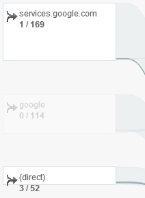
Visit numbers shown in the first column represent:
- 169 visits to the funnel from services.google.com
- 1 visit from services.google.com included the highlighted loop
- 52 visits to the funnel from direct traffic
- 3 visits from direct traffic included the highlighted loop
In other words, 4 visits accounted for 5 loops from order back to registration, so 1 of those visits actually did the loop twice! Here’s the true path of those visits, impossible to see in the standard funnel report:
- 3 visits = register > order > register > order > purchase > exit funnel
- 1 visit = register > order > register > order > register > exit funnel
Notice that the visit that does the loop twice ends up exiting from the register step. The goal flow diagram assigns this to the red exit flow on the node for the registration page, but the standard funnel will assign the exit to the order page. The standard funnel considers the exit to be the farthest funnel step reached, and disregards the actual order of steps in order to simplify the funnel path representation.
We could discover similar insights by examining other loops in the goal flow. Entrances can be misrepresented for the same reason that apply to exits – the standard funnel disregards the order of steps. Multiple loops around certain steps can reveal user frustration, or perhaps a typical shopping behavior, depending on the conversion and type of site you have.
And don’t forget to dig further with custom segments or even just by editing the dimension shown in the first column.
By digging into the Goal Flow report, you can find more ways your visitors get hung up in the conversion path, and truer indications of where they enter and exit, compared to the standard Funnel Visualization report.
What insights have you discovered in your goal flow data? Is any of your funnel data particularly vexing? Do you still prefer the standard funnel report for specific use cases? Please share in the comments.