5 Features Of Google Analytics You Probably Are Not Using
Google Analytics is a big tool, loaded with lots of features. It’s possible, even for experienced users to not have discovered all of the nooks and crannies where features hide in Google Analytics. As someone who trains and consults in the tool, I’ve used everything at least once, but sometimes I forget these features are there as well.
- Term Clouds – Term clouds are a great way to visualize the relative importance of words. It can also spice up an ordinarily dry Analytics presentation. This option is especially useful for search terms people used to find your site, which is why I suspect it’s only available in the Traffic Sources area (Remember to exclude “(not provided)” and branded terms).
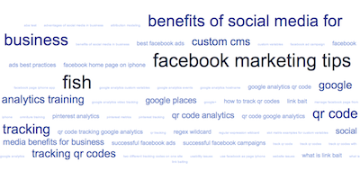
You can find the Term Cloud function by clicking this button:

when you are on a Traffic Sources report. To see more words, change the results per page drop down.
- Motion Charts – I’ve already sung the praises of Motion Charts in Google Analytics before, so I won’t go into these again, but check out that linked article to understand the power of these.
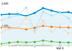
- Plot Rows – I didn’t even realize this feature existed until Google updated their interface to make it more obvious. Essentially you can graph separate lines for individual dimensions in a report.
I find this useful for understanding a traffic spike on a single day. Just check the boxes next to any dimension and click the Plot Rows button at the top of the table, and you’ll see all dimensions selected graphed at once (color coded). Keep in mind you are limited to 6 dimensions at a time.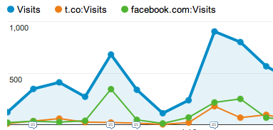
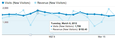
- Compare Metrics – This was another one that was not very obvious before the latest UI update. It lets you change the graph to have not one, but TWO metrics (You did know you could change the graph’s metric used right?). You can find this option right above the graph on the upper left hand side.
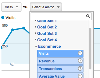
In this case, I’m comparing Visitors to Revenue, to see if my theory about the correlation of Traffic and Revenue is correct. The lighter line is always the one you’re comparing the first metric to.
BONUS ITEM! – You can really Get Analytical™ by combining the last two features! Curious what traffic has the best correlation to revenue? Just setup your compare, and then plot rows!
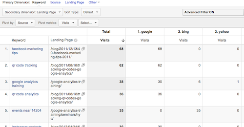
- Pivot Table – What? I love Pivot Tables in Excel. Are you telling me I can do this in Google Analytics? Yes. Yes I am. Say you want to see keyword by search engine and landing page. Pick: Organic Search, make a secondary dimension of “Landing Page”, then click this little button:

and watch the magic unfold.