How To Increase Your Website Conversion In 30 Bajillion Ways Or Maybe Just 1

The sheer number of blog posts out there on how to increase your website conversion rate are overwhelming.
10 Ways to Improve Your Website Conversion Rate
9 Time Tested Ways to Increase Website Conversion
25 Ways to Increase Conversion Rates
7 Basic Ways to Improve Your Conversion
And you know what, they all make great points. There are some really talented conversion people out there working to make websites better, but if you’re reading this, you’re either a LunaMetrics regular, or you’re reading this post looking for SOMETHING SIMPLE you can do to start out.
Those big lists are so generic. Try a different button, add a contact form, A/B test different header images, change your logo, do a usability test, add related products, blah blah blah. Maybe some of them apply to you and maybe they don’t. Maybe one of the lists says “add a contact form to your top landing pages” and you say “well I have one of those.” Maybe they say to do something generic like “display trust” and tell you to clearly show your privacy policy and you say ‘well I’m doing that.”
How can I possibly give you one thing you can do to help improve your conversions that can apply to YOUR site, as well as THEIR site, and HER site, and HIS site?
Maybe you have a commerce site, or maybe you have a site that relies on advertising so you want to increase pageviews, or maybe you’re a lead generation site and you need people to submit their contact information to you. There are literally a bazillion things general you can do. Ok maybe metaphorically given that bajillion is a goofy number word. But here’s what I think is the first and top thing you can do to increase your conversion rates, regardless of what your website goals are.
Ready? Here it is. Ask yourself this question:
“What do I want my visitors to do on my site, and is it absurdly obvious how to do it?”
I can’t tell you how many usability tests I’ve performed where users simply couldn’t figure out what to do. “go buy a product” or “look for all the posts on a certain topic” or "submit your contact information" You know what also drives me wild? When you get that transparent overlay when you go to a site SHOWING YOU WHERE TO CLICK. Guys and Gals, you shouldn’t have to yank your users out of your website and say “oh hey by the way if you want to do X the button is right here.” That’s taking ibuprofen for your headache day after day and ignoring what the actual cause for the headache is.
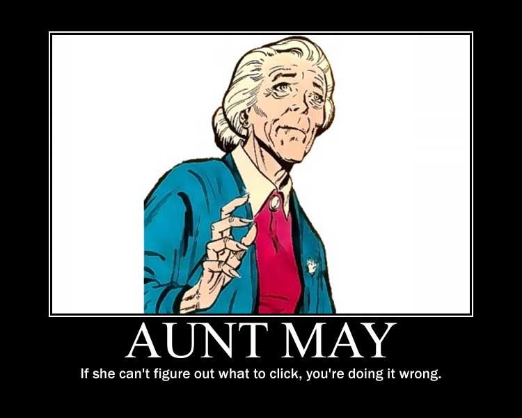
So look at your website and just ask “What is it that I am trying to increase here? What do I consider a conversion?” and then ask yourself “If my mother/father/elderly aunt that raised me after my uncle ben was shot came to this site, would they be able to point in 5 seconds to how they can convert?”
If they can’t, then there you go. There’s your first goal with your conversion rate optimization. Make it brutally clear how to convert. Once it’s clear for your users how to convert, then you can start worrying about whether your logo looks professional enough, or whether your site loads fast enough, or whether you’re driving the right qualifying traffic, or whether you should change to a red button rather than a green button.
Before you do anything else: Know what a conversion is, and make it obvious for your users what they need to click in 5 seconds of looking at the site.
And if you want a specific list of other things you can do to improve your conversion rate for your specific website, we can help you as well. Just drop us a note and we’d be happy to talk to you about how we can increase your website conversion for YOUR website.


