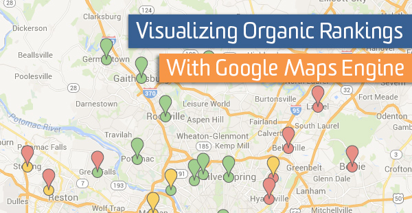
Visualizing Organic Rankings With Google Maps Engine

Google Maps Engine is a great way to visualize spreadsheet data. If you have an idea and can link it to some location data, the engine will map it.
Recently Google has been retooling this product to cater more toward small businesses. Companies like Pure Fix Cycles are using Google Maps Engine to visualize distribution locations and which helps their customer service direct customers to the store nearest them with the products they’re seeking,
I’ve used it to overlay organic search rankings over top of the service areas my client deems most valuable. What I ended up with is a color coded map which shows where rankings do not match geographical market value.
This implementation accomplished three things. First, it allowed me to see where my client operates, something that can be hard to visualize when you’re not from their area. Second, it gave me direction as to where we should be focusing our efforts, allowing me to budget our time for the coming months. Third, the additional Google Analytics data included in the map allows for interactive analysis of problem areas.
Here is the setup.
Create Your Spreadsheet
The only thing you need to create a map is location information, but you’ll want to include much more to get the most from it. The location information can be a city, zip code, or longitude and latitude. I also recommend you include some Google Analytics data like sessions, bounce rate, pages/session, and average session duration for each location (these metrics can be found in Audience > Geo > Location). For this use I have also included organic and local rankings of my clients site as well as a column that contains high, medium, and low market importance for each location.
Create The Map
Go to Google Map Engine and “Create a new map”. The map will automatically create a new layer and provide you with a link to import your data. Google allows you to import an excel file or use a spreadsheet in Google Docs. Choose your preference.
Using the “Style by” functionality, you are able to style by a certain column of data in the spreadsheet imported. I used that to style by the priorities my client gave me for each location. The following map was the result.
I got excited when I saw this for the first time. Asking my client to use their 30+ years of experience to rank cities yielded a simple and effective way for me to see exactly where our marketing efforts can get the best return.
Import Organic Rankings
The next step was to find where they were performing organically in each city. There are many services out there for pulling rankings, use whatever you’re comfortable with or just pull them manually. I used an identical query format for each location.
Ideally, you have already included this organic rankings data in the spreadsheet you used to create the market value layer. If so, create another layer in the map, import the same spreadsheet data again, then use the “Style by” feature to style organic rankings. Styling local rankings was not as easy as the market value data set. While the map engine does have a “style by range” feature, it didn’t work very well for me. I used “style by categories” and change the color of each SERP position manually.
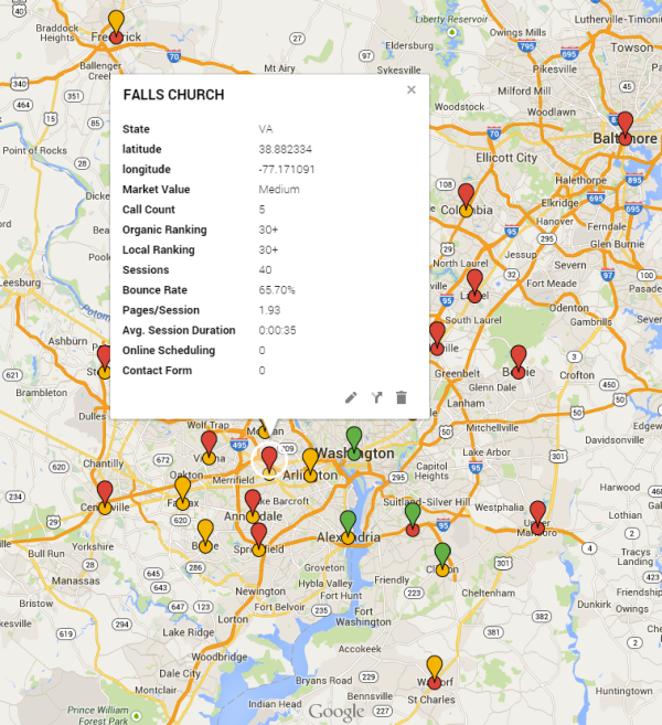
Cities where the company ranked on the first page (results 1-10) were colored green, second page rankings (11-20) were colored yellow, and anything over 20 was colored red. When you do all that you get this.
If you are wise you will take the extra time to include GA data in your spreadsheet. Because while it’s cool to visualize where there are discrepancies between market value and organic rankings, it is even cooler to click on those locations and see the corresponding GA data.

If you use map engine for other types of data visualization, shoot me a link. I’d love to see it.