How To Make YOY Bar Charts In Tableau
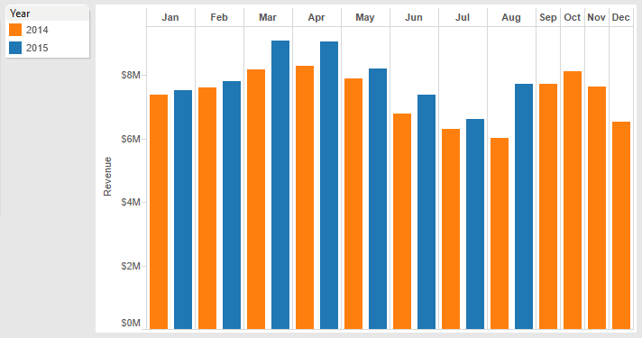
The Goal: Chart side-by-side bars for each month
Here’s what I want: Revenue for each month for the year to date, vs. the same month last year. By including the months at the end of last year, I can see what’s coming if this year follows the same trend.
Step 1: Connect to the data
I’ll start with an Excel file that has a flat table of data with 3 columns:
- Month = Jan, Feb, Mar, etc.
- Year = 2014 or 2015
- Revenue = amount of revenue for the month and year in the first 2 columns
When I connect the Excel file to Tableau and go to my worksheet, I see Month and Year under Dimensions, while Revenue is under Measures. Tableau makes an educated guess where each item belongs, and this time it guessed right.
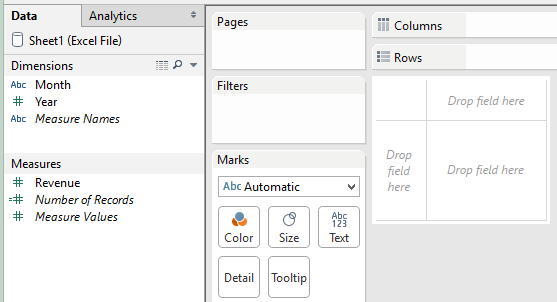
What’s not so easy to see is that Month is blue, while Year and Revenue are green. This will turn out to be important!
Step 2: Drag and drop Month and Revenue (or other measure)
I know I want revenue by month, so I’ll drag and drop the Month pill onto the Columns shelf, and the Revenue pill onto the Rows shelf. This gives me a bar chart by month, but it’s not quite what I want.
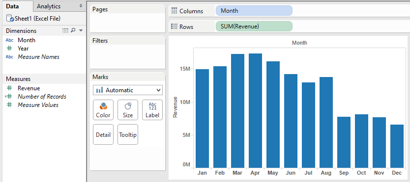
Notice that the bars for January through August represent the total revenue for both 2014 and 2015. I still need to separate the data by year.
Here’s where things can go wrong, if you don’t have a guide to warn you. Lucky you, here I am. “Danger, Will Robinson!”
Step 3: Convert the Year dimension from continuous to discrete
Before you drag and drop Year anywhere, you need to change its data type. Tableau made Year a continuous data type because it’s a number. For our bar chart, though, we need to change it to discrete.
If you’re not familiar with the terms continuous and discrete, just stick with me and you’ll see why this is important.
Under Dimensions, click Year and select “Convert to Discrete” as shown below.
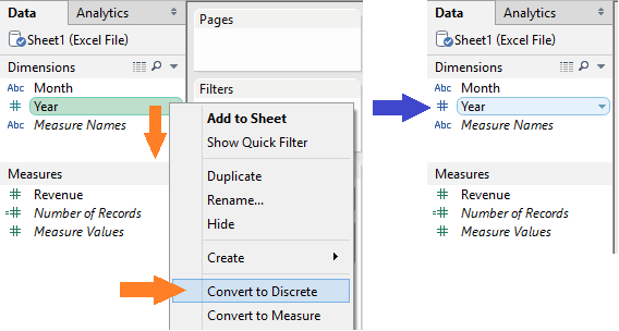
Notice that Year has changed from green to blue, indicating that its data type is now discrete. “Discrete” means that a dimension can take a countable number of values, in our case, exactly two: 2014 or 2015.
“Continuous” means the dimension has an infinite number of values, e.g. from 2014 to 2015 and all the decimal numbers in between. Tableau will not make bar charts with a continuous dimension; it will make line charts instead. (Try it and see!)
Step 4: Drag and drop Year
Drag and drop the Year dimension onto the Columns shelf. Both Month and Year should be blue pills, indicating they are both discrete data types. And your bar chart should look like the one below. Almost there!
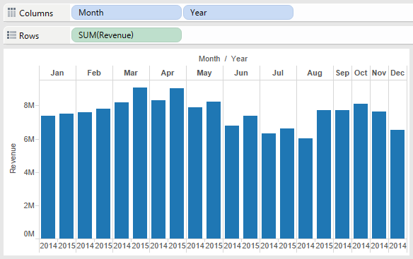
All that remains is to change the color for each year and do a little cleanup.
Step 5: Add color and clean up
Give each year its own color by dragging and dropping Year from the Dimensions list onto the Color field under “Marks”.
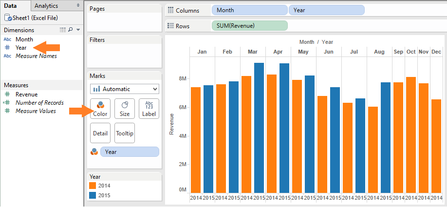
I’ve edited the colors to match the way Google Analytics shows YOY comparisons, with orange for last year and blue for this year. To edit colors, click the top right corner of the Year legend.
To clean up the unnecessary labels at the top and bottom of the chart, do two things:
- At the top of the chart, right-click Month/Year and select “Hide Field Labels for Columns”
- In the Columns shelf, click Year and un-check “Show Header”
The result should look like the chart at the top of this post.
Bonus Step: Add % Change to the tooltip
For year-over-year data, you may want to add the percent change from the previous year. It’s easy with Tableau’s table calculation feature.
I recommend adding percent change to the tooltip, which you’ll see when you hover over each bar in the chart.
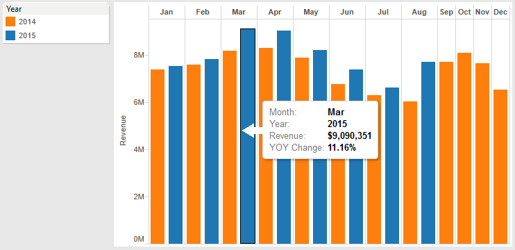
First, drag and drop Revenue from the Measures list to the Tooltip field under “Marks”. Then click on the Revenue pill and select “Add Table Calculation”.
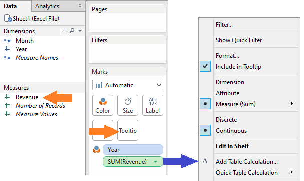
For the table calculation, choose “Percent Difference From”. Calculate the difference along Year, and display the value as a percent difference from Previous. Click OK.
To change number formatting, click the pill for that measure and select “Format”. To edit the wording of the tooltip, click the Tooltip field under “Marks”. And that’s it!
Have you run into any issues creating year-over-year or other side-by-side bar charts in Tableau? I’d love to know how you’ve created Tableau charts like this or related visualizations. Please share in the comments.


