Visualizing The Customer Journey With Google Analytics Data
“How do people use my site?” If you work as a web analyst, you have probably been asked questions around understanding the “Customer Journey” (or “User Flow” or “Clickstream Analysis”). This question can take many forms and can come from any department – marketing, sales, development, you name it!
For this post, I’m specifically discussing how users move through your website only, not the traffic sources and marketing interactions that led to a conversion. When people hear “customer journey” they often imagine or expect a visualization component that makes it easy to digest and helps communicate information to others within the organization. I’ve put together four great ways to accomplish this, however, first, I have a few tips to think through before putting together your report.
Set Expectations
You will never be able to visualize every single action that has ever been taken on the site in a single chart. You can, and should, be filtering, segmenting, grouping, aggregating, and doing everything you can think of to get a simplified view. Yes, this absolutely means that many of the details will be hidden.
Are you trying to answer a specific question or are you hoping for a golden nugget of insight? Hint – the more specific your questions get, the easier they are to answer. Know that going into this exercise.
Plan Your Visualization
As with every analysis, you should, at the very least, be able to answer a few key questions before you get started such as:
- Who am I making this visualization for?
- What are they planning to do with it?
- What specific pieces of information do they need to take that action or make that decision?
Your answers to these questions should help you determine which visualization to use or if a visualization is even needed.
Simplify, Simplify, Simplify
Through Google Analytics, we are given an incredible amount of information on how people navigation our website. It can be tempting to try to visualize as much of this information as possible. However, never do this at the cost of understandability. Your final visualization should not only be easy to read and understand, but it should also tell a story, or illustrate a few key take-aways for your audience. Keep simplifying your visualization until those key take-aways are easy to spot.
But Don’t Simplify Too Much
As with any other analysis, think through follow-up questions that your audience might have. What additional pieces of information should be included (maybe in a separate chart)? Also, think through any caveats in the data that might impact how your audience uses the results. Given those caveats, can your audience still use your conclusions to make decisions?
*While customer journey visualizations often include both online and offline activities and may be informed by industry research, in this post we are focused specifically on visualizing flow through your site using Google Analytics data.
Now that you know what you want to visualize and why, here are a few examples to spark your creativity on the “how”.
Go with the Flow – Sankey Charts
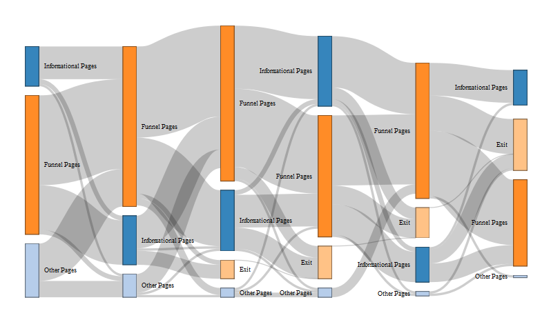
What Do Sankey Charts Show?
Sankey charts are a natural way to show how users progress through a series of steps.
What Are Some Example Take-aways I Could Get from This Sankey Chart?
The example Sankey chart above shows how users navigate through a hypothetical funnel and which other pages they look at on my site. We can learn a few things from this chart:
- Users do navigate back and forth between funnel pages and informational pages.
- While many users go directly from one navigational page to the next, they typically do not navigate between informational pages. Instead, they typically navigate back into the funnel or exit the site.
- While other pages on the site may lead users to the funnel, once users enter the funnel they are likely to only view funnel or informational pages.
Can I Use Sankey Charts in the Google Analytics Interface?
Yes! There are several reports in Google Analytics featuring Sankey charts. The most popular is the Behavior Flow report which shows how users navigate between different pages on your site.
What Should I Watch out for When Using a Sankey Chart?
The Behavior Flow chart in Google Analytics is notorious for being one of the more confusing and stress-inducing reports. It displays such an overwhelming amount of information that it can be difficult to focus on any one insight. Any time you use a Sankey chart, make sure you have simplified your chart as much as possible. In Google Analytics, this could include using a relevant content grouping, adding a segment, or highlighting / exploring traffic through a specific node. If you are still having a hard time reading the Behavior Flow report in Google Analytics, you may want to export your data to another tool for additional customization.
What Happens Next – Heat Maps
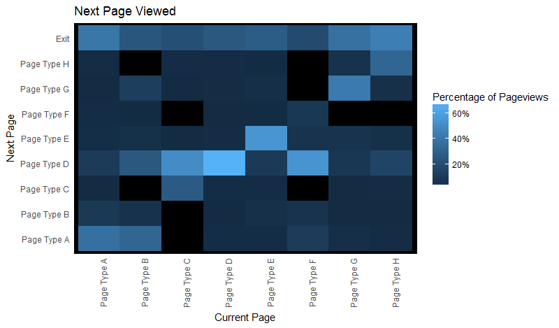
What Do Heat Maps Show?
Heatmaps help you quickly spot trends and associations between two variables. In this case – which types of pages are users most likely to click to from a given page (or page type) on our site?
What Are Some Example Take-Aways That I Could Get from This Heat Map?
The chart above visualizes which pages a user is most likely to click to, given the page they are currently on. I see a few trends:
- The diagonal of this graph pops out as being popular. That means that users are likely to stay on a specific page or page type, rather than navigating to different types of content.
- Page Type D is a popular next page. In particular, users on page types F and C are more likely to navigate to this page than any other page type (including another page of the same type).
- Users on Page Type B are likely to navigate to page types A, D, or G.
- Users on page types A and H are more likely to exit the site than users on other page types.
Can I Get This Information in the Google Analytics Interface?
Yes! You can use the Navigation Summary and Entrance Paths reports in Google Analytics to view a list of next pages (and previous pages) for a specific page or content group. You can also create a custom report that displays a list of previous pages and next pages. This information is not visualized in a heatmap, but you can easily export the data and visualize in another tool.
What Information Is Lacking in This Heat Map?
While this is a great tool for viewing the next page clicked to, we do not have any context in this visualization about when in the session each page type was viewed.
Representative Journeys – Timelines

What Does This Timeline Show?
This timeline shows a “representative” journey through the site by mapping out which pages were viewed and in what order.
What Are Some Example Take-Aways That I Could Get from This Timeline?
- The Marketing Landing Page, Home Page, Product Detail Pages, and Services Pricing Page were viewed by many users before the conversion occurred.
- The Search Page, About Company Page, Product Comparison Chart, and Blog Content were viewed less frequently.
- The chart shows a common ordering for when these pages were viewed.
Can I Get This Information in the Google Analytics Interface?
It is possible to see all of the interactions that specific user took on the site by using the User Explorer report. However, the trick will be finding an appropriate user that is “representative” of a group of users. This is much easier to do using the BigQuery integration with Google Analytics to sort through and cluster interactions from all site users.
Introducer vs Closer – Ridgeline Plots
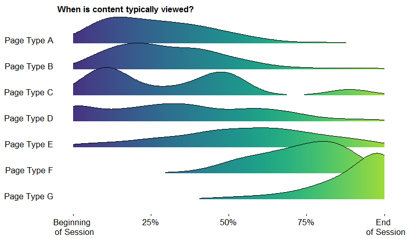
What Does This Ridgeline Plot Show?
This ridgeline plot (formerly known as joyplot) shows when, during a user’s session, is a type of content typically viewed.
What Are Some Example Take-Aways That I Could Get from This Ridgeline Plot?
- Page types A and B are typically viewed early in the session while page types F and G are viewed towards the end of the session.
- Page types D and E are more spread out in the middle of the session.
- Page type C has an interesting bimodal shape indicating it is usually viewed early or in the middle. Keep in mind that shorter sessions will tend to concentrate area at even breakpoints. For example, sessions with two pageviews will concentrate all of their pages at either the start of the session or the end of the session.
Can I Get This Visualization in the Google Analytics Interface?
Unfortunately, it will be difficult to get this visualization without the BigQuery integration and the use of external reporting tools. However, the Entrances / Pageviews metric can give you a good idea of how often a particular page is an entrance page versus an internal page. Similarly, the % Exit metric can tell you how often a page is the last page in the session.
What Is Lacking in This Visualization?
The ridgeline plot does not show you specific navigation paths. For example, even though we know that users typically view Page Type A early in their session, we do not know which pages users typically navigate to next, or which, if any, internal pages are driving traffic to Page Type A.
No Visualization Needed

So how do you determine which visualization to use or if a visualization is even needed? Each of the visualizations above illustrates different points, requires different levels of technical expertise, and even different types of data.
I can’t stress enough how important it is to talk through your expectations and what you hope to accomplish with an analysis like this. Additionally, there are steps you can take to help prep your data.
What Types of Users Do You Have?
We all have different types of users and, no surprise here, we expect their journeys will be different. Think about your audiences. New vs Existing Customers? Doctors vs Patients? Students vs Faculty vs Prospective Students? Is your data set up properly to segment users this way? Take a look at Defining Audiences with Google Analytics Custom Dimensions.
What Types of Content Do You Have?
In some of the examples above, I’ve used content grouping to help group pages together, like Marketing Pages, Blog Content, Product Pages, etc. You can set these up with custom dimensions or content groups. If you’re looking to compare marketing landing pages against each other, perhaps you don’t need a full-blown customer journey visualization, and you can find other simpler metrics like Bounce Rate, Page Value, and Goal Completions to compare performance.
Do You Care About Linearity?
Or another way to say it, does it matter when a page was viewed? Or just that it was viewed at all?
We completed a case study for The Leading Hotels of the World, where there wasn’t necessarily a straightforward path or order that most people followed. Instead, we were just interested in finding out how these individual pieces of content contributed the overall goal, which in this case was making a booking. We used a custom analysis and content attribution to determine the most valuable types of content and features, read more about that here. Visualizing this data wouldn’t have necessarily improved the understanding of the results.
What Is the End Point of the Journey?
Are you interested in understanding what people do intuitively? Or if they’re doing what you want them to do? A customer journey might be as simple as entering and exiting the site, but will often be more valuable if you’re trying to understand why a customer reaches a certain page or outcome and why other customers do not. In this case, your segments of visualizations might be separated into Converters and Non-Converters. Google Analytics helps with this, but again, it requires a bit of setup. Read more about using Google Analytics goals and events.
Consider these different types of visualizations when trying to answer questions around how people move through your site, what content they view after other pieces, or when pages or particular groups of pages appear in a typical user path. Remember to invest the time upfront to set expectations and drill down into what you hope to answer or accomplish with this type of analysis.
News & Insights
Related Perspectives