Understanding And Interpreting Data Types In Google Analytics
There are different types of data visible in Google Analytics. Even if you’re not involved in the technical aspects of Google Analytics, it’s helpful to know and understand these different types and terms when talking with analysts, using data to make business decisions, or knowing what can and can’t be done with different data sets.
Getting to know your data should be done before doing any analysis. We will first talk about the different data types seen in Google Analytics, and then move on to identifying patterns.
Data Types
Qualitative data
We have categorical data, which we see for example, as Sources, Mediums, Gender, Country, and Device.
Categorical data is qualitative data, and it represents characteristics. If there is a natural order or ranking in your categorical data, this would be considered ordinal data. Examples of ordinal data are: class level (beginner, intermediate, advanced), star-values (1-star, … , 4-stars), or answers to survey questions such as:
Note that these data points have a number associated to them, but they do not have any mathematical meaning.
Quantitative Data
Then there is numerical data, such as number of sessions, pageviews, bounces, and revenue.
Numerical data is what we call quantitative data, and is any data where our data points are exact numbers, and are not ordered in time. There are both continuous and discrete quantitative data types. Simply put, continuous data is data that can take any value within a range, such as time, money, and temperature. Discrete data is data that takes on whole number values, and can be counted, such as units sold, or pages viewed.
There is a type of quantitative data call time series. Time series data is data collected at regular intervals over some period of time. For example, the number of sessions a day on your website over 3 months is time series data.
Google Analytics collects and categorizes most data for us. Before starting an analysis process, it is important to look through the data and see what information is available to us, and keep in mind a specific question or questions we want to answer to make sure that the data we need is in fact being collected. Data is exciting, and it’s easy to get carried away. Once we have the data and our guiding questions, we can start to look for patterns in data.
Time Series
Let’s look further at time series data. The numerical data reports in GA should have timelines on top. Now, let’s pick a large enough date range and consider the timeline report. There are lots of ways to analyze this data (see one of them here). What we’re going to look at are the trends that might be apparent in these graphs. The possible components of a time series graph are:
Trends – trends are long-term increases or decreases in data. They do not need to be linear, and they may change directions.
Seasonality – seasonal patterns are of fixed and known periods, and are influenced by different seasonal factors, such as the day of the week, the month of the year, the quarter, etc. and it is possible for a time series to have more than one seasonal pattern.
Cyclicity – cyclic patterns are caused by rises and falls in data, but are not of a fixed length. Cyclic fluctuations may be long (over many years).
Random – Random fluctuations are very unpredictable, and do not exhibit any other trends, seasonal, or cyclic patterns. These can be referred to as “error” or “white noise”.
Unless we export this data, it’s not possible to get a decomposition of these different parts. For education purposes, here is a graph of the component decomposition (done in R) of a time series. Note that the “trend” component of the graph is actually the trend-cycle component, and includes both the trend and cycle. The remainder component contains anything else in the time-series.
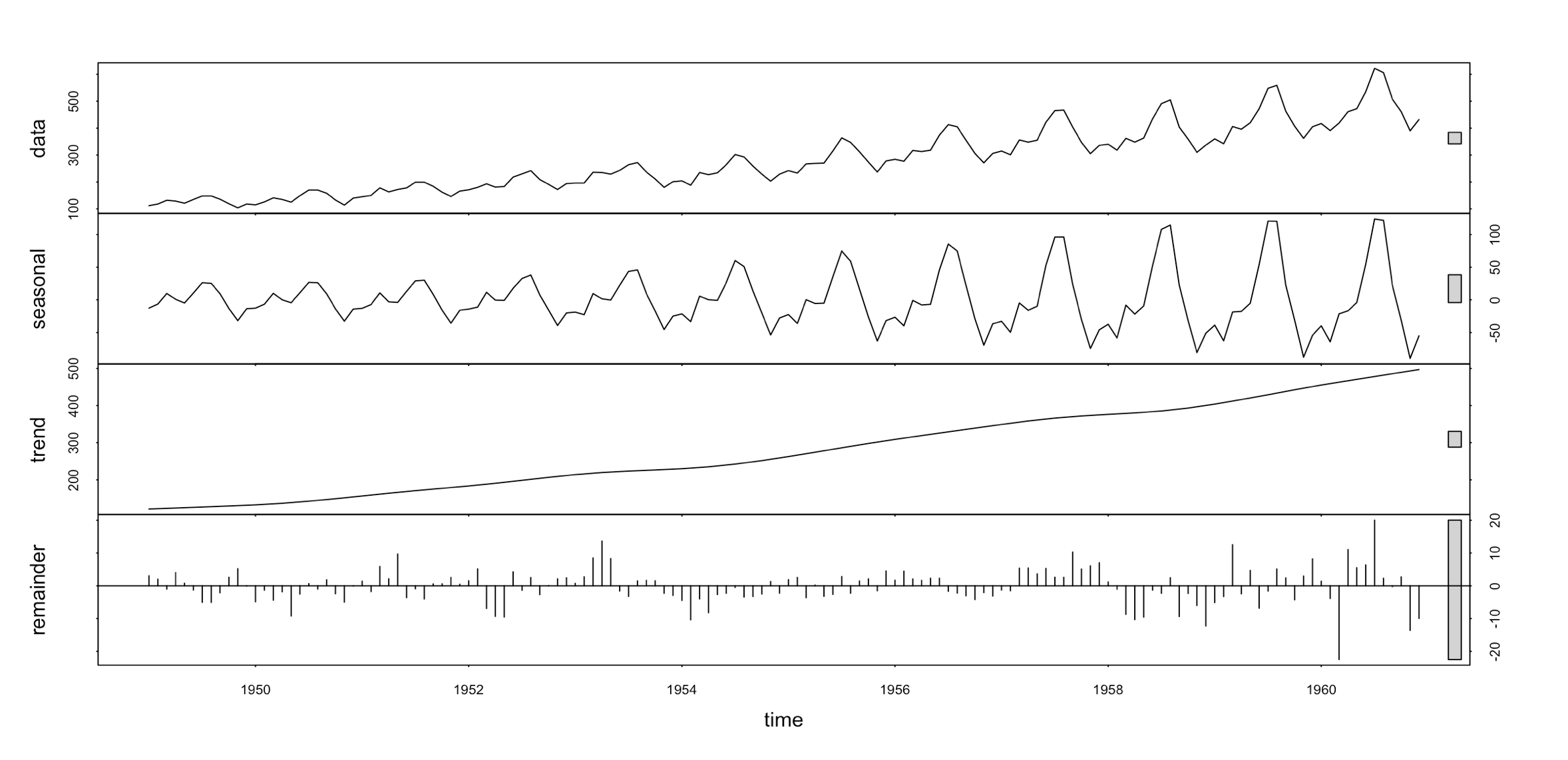
Components of monthly air passenger numbers from 1949-1960. The grey bars on the right side of the graph show the relative size of the component. Data from the fma R library, airpass dataset.
This data has an upward trend, a strong yearly seasonal component that changes over time, and the remainder is what is left over after the trend and seasonal components are removed from the data.
Let’s do a little exercise, to help us see different components in our graphs without doing a decomposition. Which of the following plots have seasonality, cyclicity, upward trend, downward trend, or only white noise?
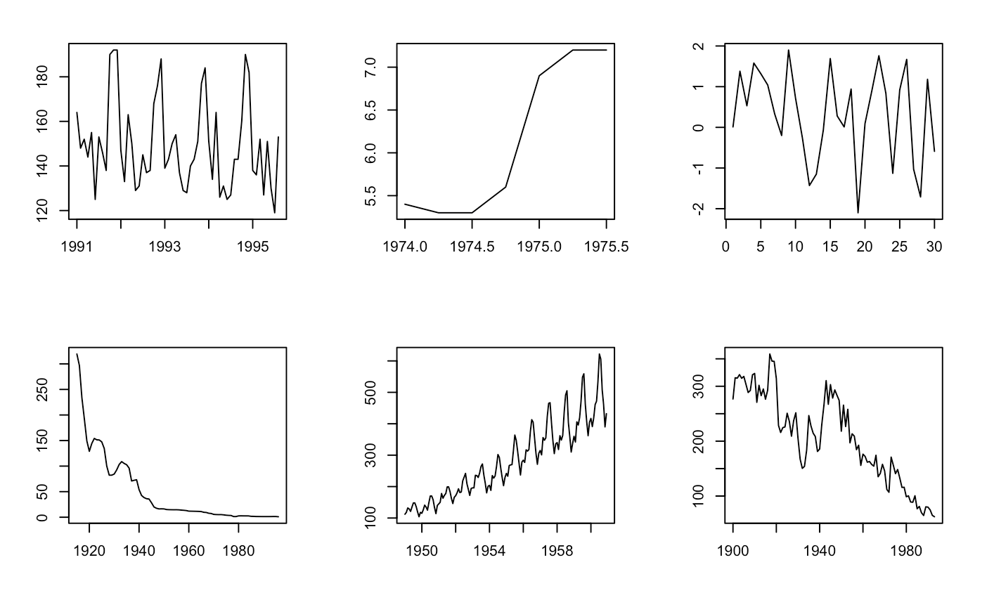
Datasets from fma R library.
Let’s go through each graph, reading left to right along the rows:
- The first graph has a seasonal component, with a spike right before the year mark. There is no obvious trend or cyclicity.
- The second graph starts with a downward trend, and ends on a strong (non-linear) upward trend.
- The third graph has no apparent seasonality or trends, and this is what is referred to as white noise.
- The fourth graph has a downward trend that includes small periods of cyclicity, but no apparent seasonal trend.
- The fifth graph is what we saw in the decomposition above, and has both an upward trend and seasonality.
- The last graph has a downward trend that includes cyclicity.
It’s important to consider these different aspects when analyzing your data. Consider seasonality; There might be an effect by season of the year, but also by the day of the week. When comparing two data points, we need to make sure that these points align with the seasonality. For example, blindly comparing the number of pageviews for an ice cream parlor’s website on a Wednesday in January to the pageview numbers corresponding to a Saturday in July, might imply that the business is tanking. But that’s not necessarily true, and we can test this when we take hidden factors, such as seasonality, into consideration.
A good way to do data comparisons in Google Analytics is to use the comparison option found in the date-range selector, and match it to the seasonality you might have in your data (of course, your data needs to be clean for this to work appropriately).
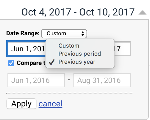
Here is an example of a timeline comparison:
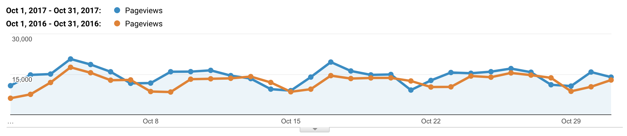
Data from Google Merchandise Store’s Demo account.
Note that the day of the week won’t line up when doing a previous year comparison (it will be off by one or two days), but it will give us a good idea of what’s going on, and is easy to correct for visually. We should also check that our historic data isn’t being sampled.
Learning these techniques to read trends in your data is useful to understand the bigger picture and what is actually going on. Identifying trends and seasonality can influence long term business decisions, or help us make quick changes in the short term.