Google Analytics Commerce Dashboard for Data Studio
We’ve created a Data Studio commerce report that shows only data from Google Analytics because it’s based on the free Google Analytics Demo Account. If you don’t have your own commerce data, the demo data lets you experiment and learn Data Studio with our free template.
Instructions
1. Make a Copy
Go to the File menu and click to make a copy of the report. If you have never used Data Studio before, click to accept the terms and conditions, and then redo this step.
2. Do Not Request Access
Click “Maybe Later” when Data Studio warns you that data sources are not attached. If you click “Resolve” by mistake, do not click to request access – instead, click “Done”.
3. Switch Edit Toggle On
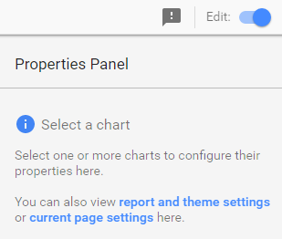
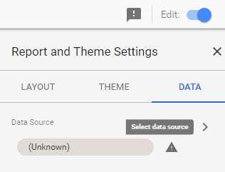
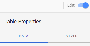
Make sure the “Edit” toggle is switched on (see screenshot). Click the text link to view the current page settings. The GA Demo Account data will appear as an “Unknown” data source there.
4. Select Data Source
To view the list of available data sources, click the tiny arrow that looks like an angle bracket in the screenshot below. This will open a pane from the right side of the page.
5. Create New Data Source
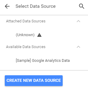
If you have not created any data sources yet, you’ll see only sample data under “Available Data Sources” – in that case, scroll down and click “Create New Data Source” to add your own GA data to the available list.
6. Select Your Google Analytics View
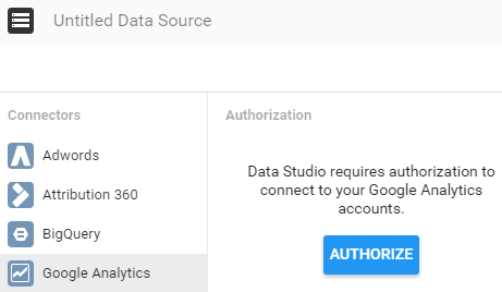
Choose the Google Analytics connector, and authorize access if you aren’t signed in to GA already. Then select your desired GA account, property, and view from each column.
7. Connect to Your GA Data
Name your data source (at the top left), or let it default to the name of the GA view. Click the blue “Connect” button at the top right.
8. Add Data Source to the Report
Next, Data Studio shows you a table of all the fields available in your data. You can rename them, change their type, and create new calculated fields – but for now, simply click “Add to Report”. And confirm.
Because you’re doing this step under Report Settings, you’ve just created the default data source for the entire report. You can change a data source on any page (or on any chart or filter!) – but if you don’t specify a change, then the default data source is used for every new element you add to the report.
9. Check out the Sparklines!
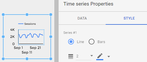
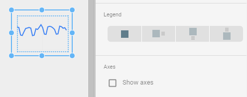
Data Studio comes with nine chart options. A sparkline isn’t one of them, so we created our own. Sparklines under each of our top row metrics give a quick snapshot of those trends for the past month. (See that mid-month spike? Better investigate!)
To create a sparkline, choose the Time Series chart option. On the Style tab, un-check “Show axes” and select “No Legend”. Re-size. It’s that simple!
10. Try a Bar Chart with Two Axes
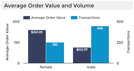
Our bar chart conveys a lot of information in one visual. Using two axes, you can easily compare the relationship of average order value vs. the number of transactions for two different groups. (Women buy less often, but spend 2X more per purchase!)
We’re comparing based on gender because the demo account has Demographic Reporting enabled in Google Analytics. But you can replace “female/male” in this chart with any dimension that has only a few values. For example, you could compare User Type (New vs. Returning). You could also use one of your own custom dimensions to define audiences for this purpose.
Click the Edit toggle at the top right of the report and then click the chart to see our bar chart options. On the Data tab we added a second metric, and on the Style tab, we checked “Show data labels” and “Show axes” (Double). For both the left and right axis we checked “Show axis title”.
11. Build a Table with Product Data
Product data in Google Analytics comes with its own special set of metrics. We’ve chosen to show Product Revenue and Quantity. (Water bottles are the most popular item, but notebooks make more money!)
You can also sort the table Product Revenue by clicking on that column header. (Try it and see which product made even more money than notebooks!)
If you have Enhanced Ecommerce data, you can add metrics like Buy-to-Detail Rate, which show how often someone who viewed a product actually bought that product. Or you could change the Product dimension to Product Category, for a roll-up view of your product performance.
It’s easy to change the metrics and dimensions in Data Studio – make sure your Edit toggle is in Edit mode and then select a chart to change the options on the Data tab.
12. Don’t Forget the Filters
We kept the filters from our original Data Studio template so you can explore your commerce data the same way! You can edit the filter options as well. Add another filter or revise an existing one.
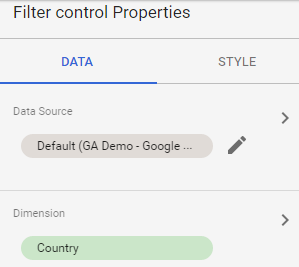
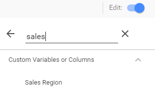
For example, you might want to create a filter based on a custom dimension. The Google Analytics Demo Account has a custom dimension for “Sales Region” which you can try with this template if you have access to the demo data. The screenshots below show how to change the Country filter to a filter for Sales Region – edit the Filter control properties and choose the custom dimension by searching the list.
Search for your own custom dimensions and change the filters to make them more useful and relevant for your commerce reporting!
