Using and Interpreting the Adobe Analytics Fallout Visualization

Pinpointing a specific visitor journey and understanding where those visitors are falling off or potentially converting can help identify potential issues and pain points, improve user experience, and positively influence business metrics.
The Fallout visualization in Adobe Analytics Workspace offers a wealth of insights to the business user. Understanding these visualizations can tell you a great deal about your visitors and offer insights to improve conversion. The key, however, is to make sure you are interpreting the data accurately.
Let’s walk through how to properly build and interpret findings from the Fallout Visualization in Adobe Analysis Workspace.
Answering Business Questions with Fallout Visualizations
There are a lot of reasons why having analytics and data at your fingertips can help improve your business — from revealing design insights to solving business problems. Here are a few examples of questions that can be answered with the Fallout visualization:
- Are visitors going through the expected steps to conversion? If not, where are they getting hung up?
- Are visitors getting to each step within a single hit or just eventually?
- Are any pages within my conversion flow causing a higher than normal drop off?
- Are visitors coming back to convert within multiple visits?
- Are more customers taking X path to conversion or Y path to conversion?
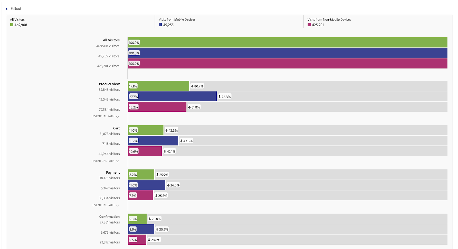
- Do my mobile and desktop visitors have the highest fallout on the same page? Or are these two segments behaving differently? Do certain pages need additional optimization to enhance the mobile experience and encourage mobile conversion?
As you can see, the possibilities are almost endless!
How to Build a Fallout Visualization in Workspace
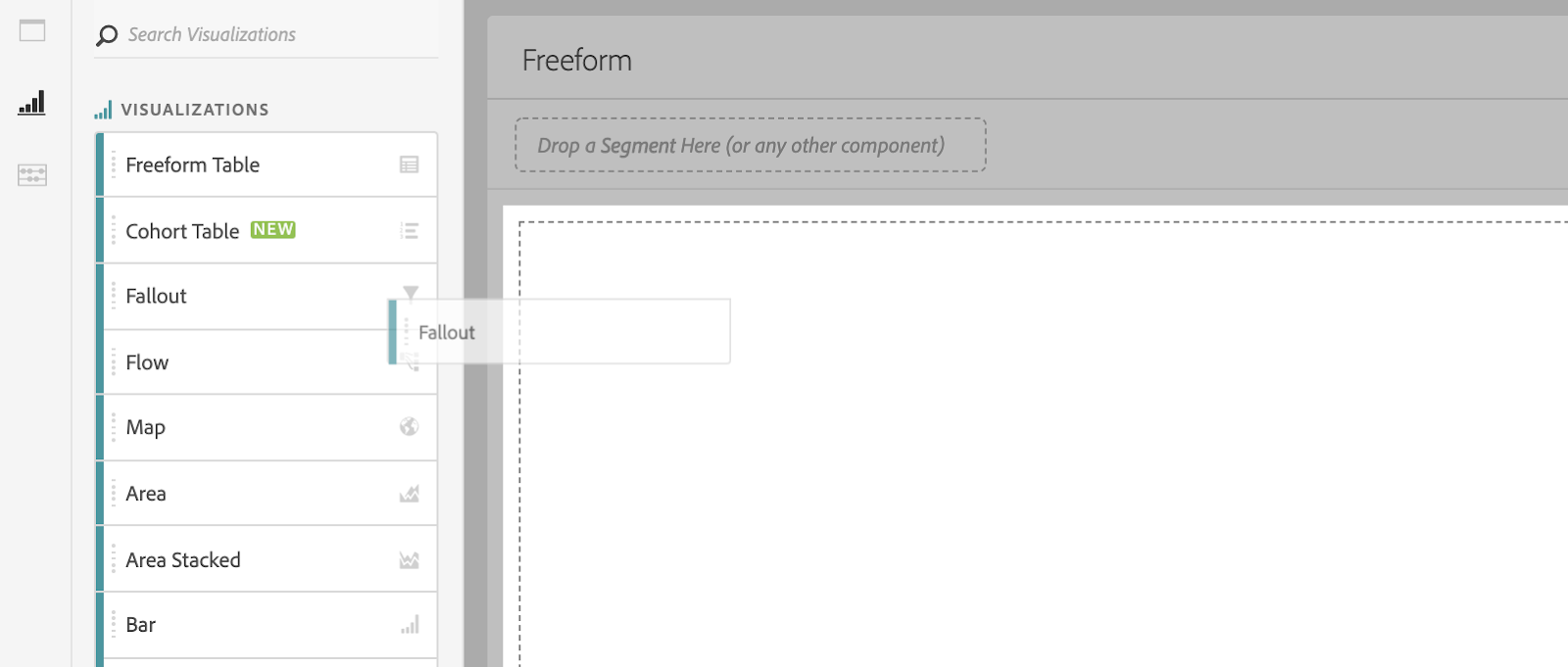
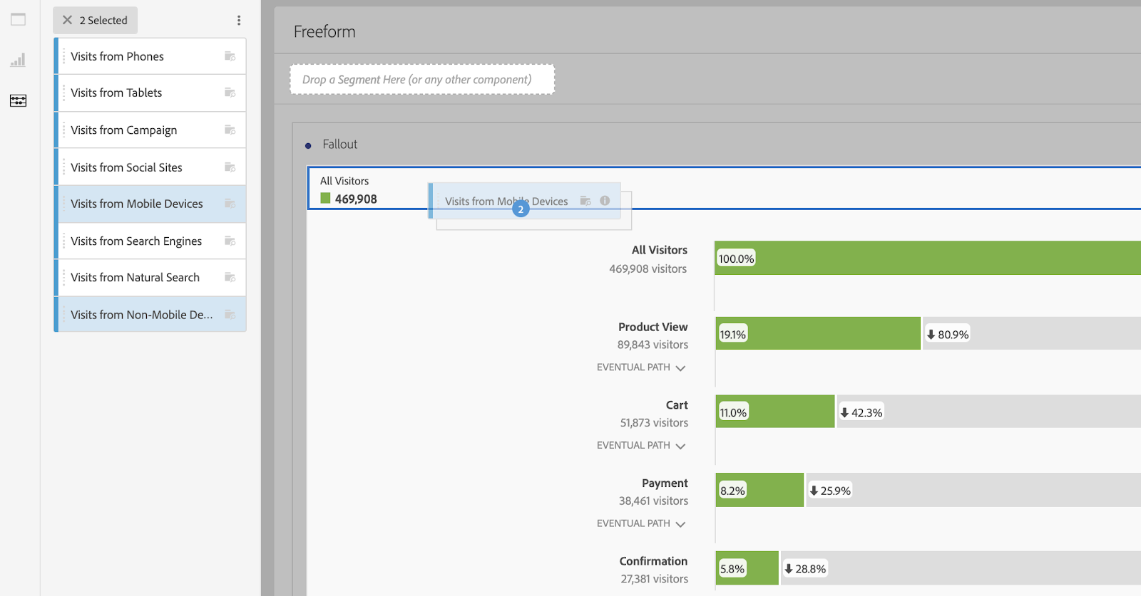
In the Visualization panel in Adobe Workspace, drag the Fallout visualization onto a freeform table.
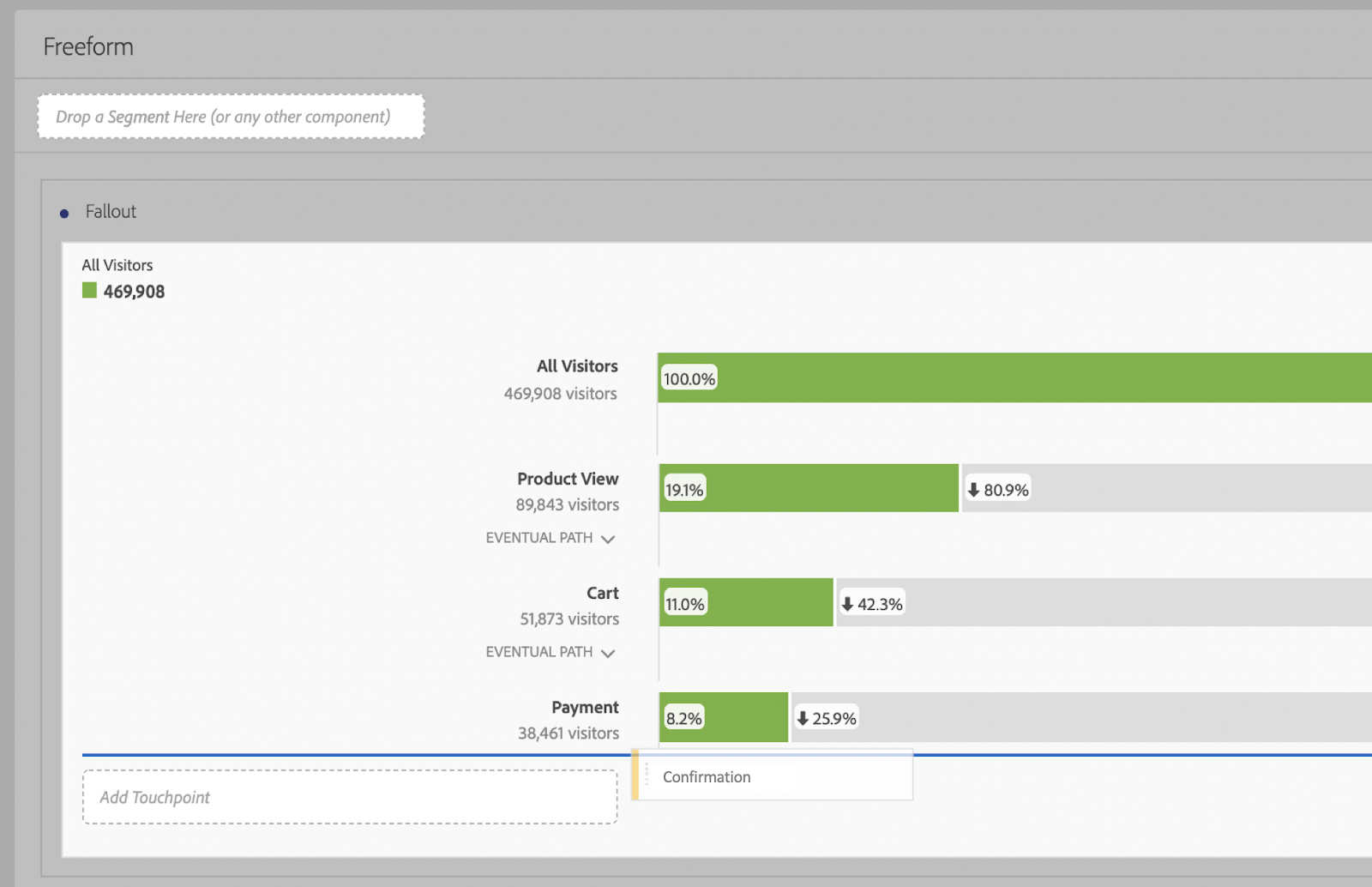
Next, from the Components panel drag specific pages or events onto your Fallout in the order you’re interested in targeting. For an eCommerce retailer, this may look something like Product View, Cart, Payment, and Confirmation.
You can fully customize the Fallout visualization to depict the journey you want to analyze. Keep in mind that the pages or events you select and the order in which you put them matter.
Your Fallout will only look at visitors who took the specific journey you specified in your Fallout.
Here are a few helpful things to note before getting started.
Your Fallout will default to a Visitors view. You can adjust this to Visit level by selecting the gear icon at the top right of your visualization.
Additionally, your Fallout will default to “Eventual Path” between steps. This means that you are looking at visitors who eventually made it to the next step (potentially within a single visit). You can select the caret beside Eventual Path and switch to Next Hit. This will reduce your inclusions significantly, sometimes bringing your inclusion group down to zero if it’s not possible to complete the next step within one hit. Eventual Path is recommended for most use cases.
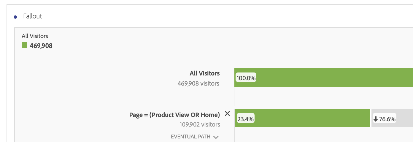
You can create an “Or” statement within a single step by dragging multiple pages or events onto the same line within the visualization.
You can drag segments (like device) on top of All Visitors/All Visits at the top left of your visualization to view the Fallout broken out by those segments. Each segment will appear in a different color.
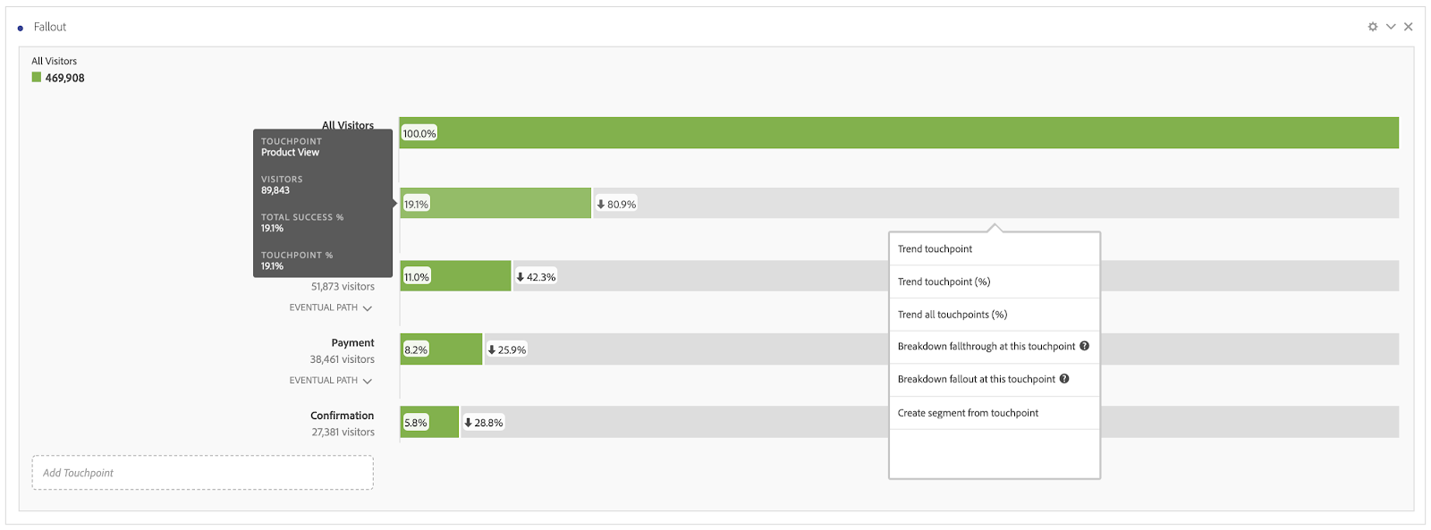
Dive into specific fallthroughs or fallouts by right-clicking on the graph to trend, breakdown, or create a segment at any point.
Remove the All Visitors/All Visits bar entirely using the gear icon at the top right.
How to Interpret the Fallout Visualization in Workspace
Interpreting the Fallout visualization in Adobe Workspace can be challenging if you’re new to it. An incorrect interpretation can skew the findings you report to upper management, so let’s get this straight.
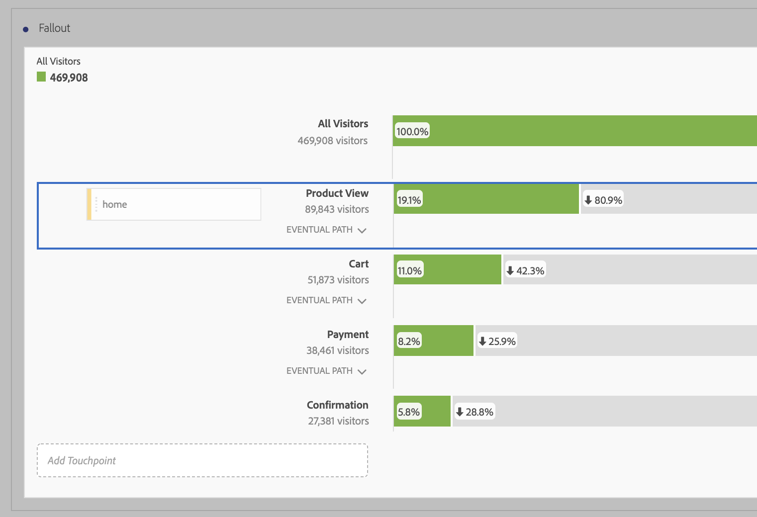
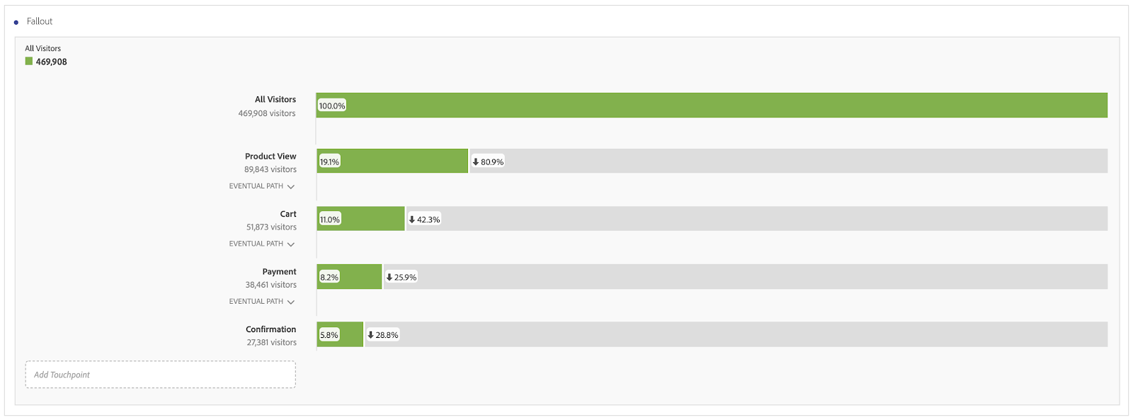
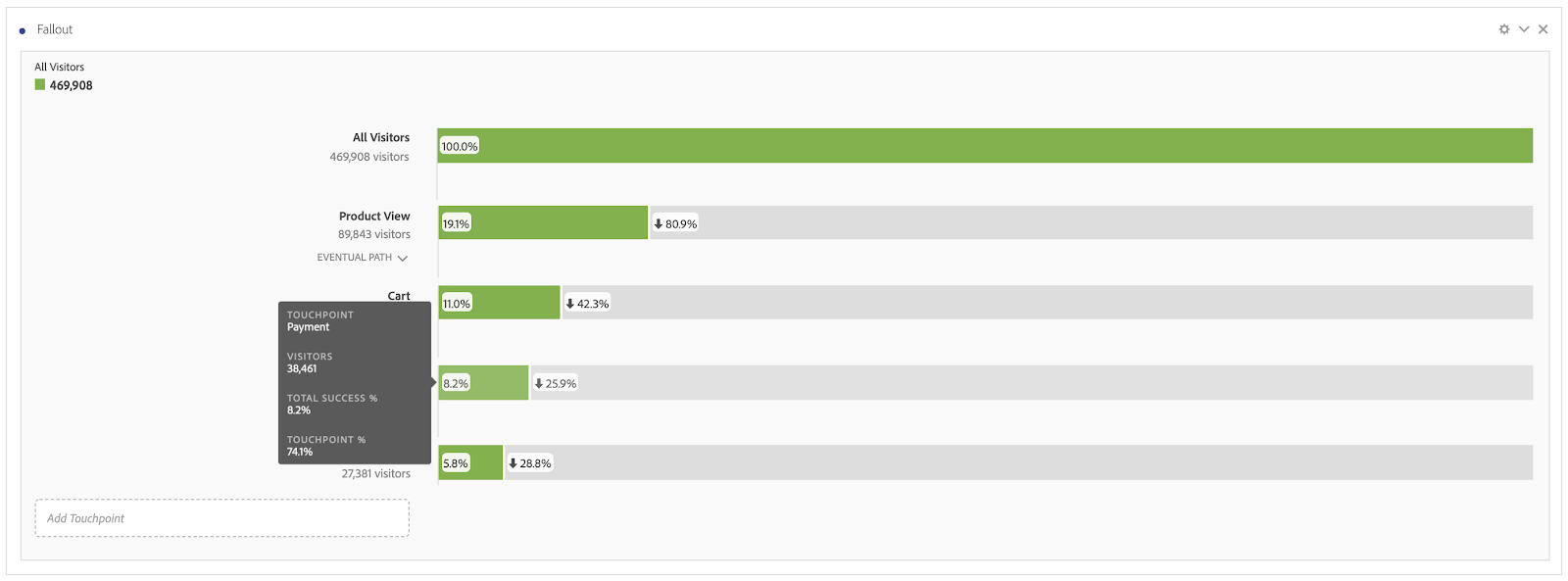
Our first green bar shows 100 percent. This tells us that 100 percent of visitors fall into the grouping of “All Visitors.” Easy so far!
The second green bar, to the right of Product View, shows 19.1 percent. This is the percentage of All Visitors who made it to a Product View page.
The third green bar is where things get more complicated. Right below Cart, we see 51,873 visitors. 51,873 visitors made it to a Product View page and then eventually to Cart. (Note: if it’s possible to get to Cart without passing through a Product View page, then 51,873 will not be equal to the total amount of visitors who viewed the Cart page.). 51,873 divided by the All Visitors number of 469,908 gives us 11 percent.
The fourth green bar, to the right of Payment, has a value of 8.2 percent. 38,461 visitors made it to this page after first going through a Product View page and then the Cart page. 38,461 represents 8.2 percent of All Visitors.
The fifth green bar, to the right of Confirmation, has a value of 5.8 percent. 27,381 visitors made it to this page after first viewing a Product View page, Cart page, and then Payment page. This represents 5.8 percent of All Visitors.
Perhaps more telling than these total success percentages on the green bars are the “touchpoint” percentages. To view these percentages, hover over each of the bars.
As mentioned above, the “total success %” for the Payment page is 8.2 percent. 8.2 percent of all visitors who first saw a Product View page, and then the Cart page, then saw the Payment page. The “touchpoint %,” however, is 74.1 percent.
Touchpoint percentages are percentages of the previous step.
So rather than dividing 38,461 by our All Visitors number of 469,908, we divide it by just those visitors who made it to the Product View page and then the Cart page (51,873).
So to recap...
Total Success %: # of visitors (or visits) who made it to a certain step in a specified journey/All Visitors (or All Visits)
Touchpoint %: # of visitors (or visits) who made it to a certain step in a specified journey/# of visitors (or visits) who made it to the previous step in the specified journey
Note, that the step right after All Visitors (Product View in our example) will have a total success percent and a touchpoint percent that are the same. This is because the previous bucket IS the All Visitors (or All Visits) bucket.
The percentages shown on the grey bars should make a lot more sense now that you understand the touchpoint percentage. When we look at the bar for Payment, you might expect the number in green (8.2 percent) and the number in grey (25.9 percent) to add up to 100 percent. Spoiler Alert: They don’t. The number in grey is the Fallout, the namesake of our beautiful visualization! The fallout percent + the touchpoint percent = 100 percent.
In the last example of the Payment page, we saw that 74.1 percent of visitors who went through our desired journey (Product View → Cart → Payment) eventually made it to the Confirmation page. 25.9 percent of people who visited the Product View page, the Cart page, and then the Payment page did not make it to the Confirmation page. We had a fallout of 25.9 percent in this step.
Troubleshooting Your Fallout Visualizations
So now, you may be asking yourself, “Why doesn’t my final success percentage equal my conversion rate?”
We recommend asking yourself the following questions:
- How are you calculating conversion? If it’s orders/visits and your fallout chart is based on visitor, you’re not comparing apples to apples.
- Are all steps in your fallout required to reach your final step? Can anyone get to the final step without first hitting all of these touchpoints? If so, your final success percentage will not equal your site conversion.
- Have you selected “Eventual Path” or “Next Hit” between steps? If you’ve selected “Next Hit” between any two steps, you’ve likely excluded some visitors/visits.
It’s ok for your final success percentage to not equal your conversion rate! It’s just important to understand why it doesn’t.
Make Data-Driven Adjustments with Fallout Visualizations
We hope you now feel more comfortable using the Fallout visualization in Adobe Analysis Workspace. This highly customizable feature can help you understand your customer journey and enable you to make data-driven adjustments by tackling the funnel steps with the highest drop-off rates first.
