Getting Started with Data Visualization Using Google Data Studio
The most important aspect of calculating statistical significance is ensuring the overall picture is clear. Data visualization tools provide an efficient way to visualize data and communicate findings. A key factor in data analysis is to not only create reports, but to be able to both understand and explain the captured conclusions.
Data visualization provides the opportunity for companies to understand complex reports in a simple visual graph, allowing easy interpretation. While Google Analytics provides helpful reports, spotting patterns and gaps may not come easy. With visuals such as pie charts, bar charts, and line graphs, interpretation becomes much simpler.
Psychologist Albert Mehrabian has shown that 93 percent of communication between human beings is in the nonverbal area. Studies revealed that language is decoded on a linear level, while images are deciphered on a simultaneous level. This means that images, or graphs, can be interpreted immediately, while language requires more time to analyze. Data visualizations help cut to the chase, saving critical time in getting you to the next step—developing solutions.
Let's take a look at some of the top reasons data visualization is so important and the tools you can work with to create visualizations. We'll also take an in-depth look at Google's free tool, Data Studio, and some of the basics you need to know in order to get started creating reports.
Why Is Data Visualization Important?
With data visualization, the visual summary of information commonly displayed is easier for the human brain to understand. Since the purpose of data analysis is to find insights, making sure data is being clearly understood is a key factor in successful reporting.
While reading through numbers and charts can also be a way to identify trends within data, oftentimes important information can be overlooked or missed, leading to a less valuable interpretation. Even with an accurate understanding of the data without visualization, communicating its meaning may not be as easy as we think. Without a visual representation of the insights, the audience may find it more difficult to grasp complete understanding.
According to Tableau, "[data visualization is] one of the most useful professional skills to develop. The better you can convey your points visually, the better you can leverage that information."
Data Visualization Drives Better Business Results
Data visualization provides more efficient delivery of information to your team. It's important to keep in mind that not all clients have the same technical background. While some clients may have no issue understanding complex reports, this may not be a smart risk to take. Visualizing data ensures a higher chance of being on the same page as your clients and any other stakeholders involved.
By putting it into a graph, table, or other types of visualization, identifying trends will become significantly easier and leads to a quicker transition into the next step. The quicker you identify issues, the quicker you can address them. Adding efficiency to the cycle ensures higher success.
The following reasons are why data visualization is important for your business:
- Helping clients understand how their site's data is being analyzed to determine business decisions.
- Reporting large amounts of data in a visual format to present an overview, or story behind it all.
- Visualizing data in order to convert trends into strategy.
- Finding errors in a more obvious way, eliminating room for gaps of information.
Tools for Data Visualization
Fortunately, the market offers multiple paid visualization tools to work with. Some tools include:
Tableau
This is a Salesforce tool that serves as an interactive data visualization software. Tableau software works to connect and extract the data stored in various places, from any sort of platform. This tool can pull data from any database ranging from Excel, PDF, Oracle, or even Amazon Web Services.
Learn more about Tableau.
Looker
Looker is a cloud-based business intelligence (BI) platform designed to explore and analyze data. Similar to Tableau, looker offers convenient data visualization for users. However, Looker's 100 percent browser-based experience eliminates the need for desktop client software installation and maintenance. Bounteous is also a Looker partner.
Learn more about Looker.
Power BI
Power BI is a business analytics service by Microsoft. This tool provides interactive visualizations structured simple enough for end-users to create their own reports and dashboards. This tool helps connect data sets, transform and clean the data into a data model, and create charts or graphs to provide visuals of the data.
Learn more about Power BI.
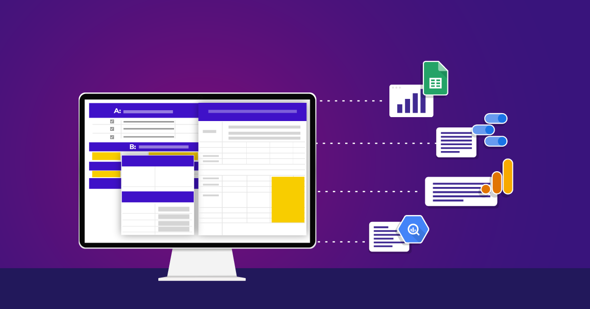
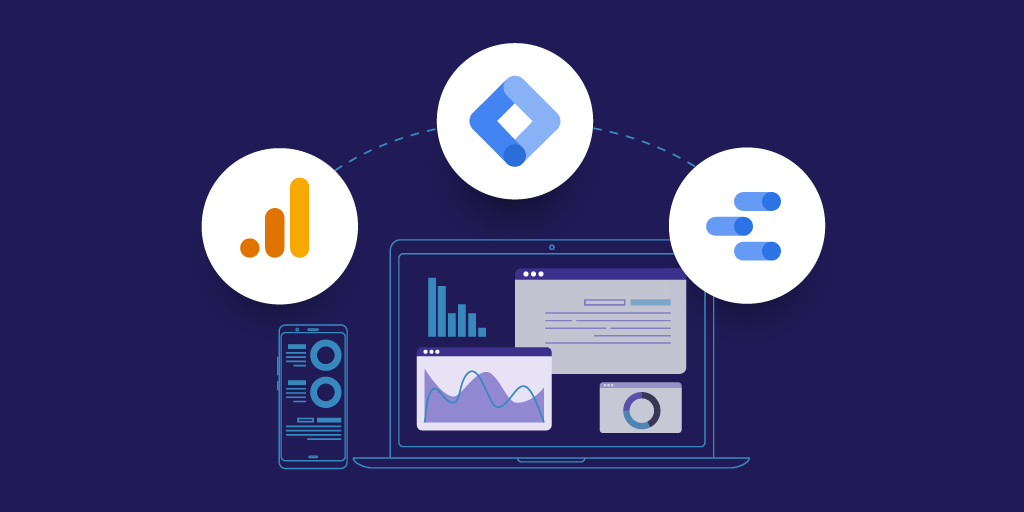
Google Data Studio
If you're new to data visualization, Google offers a free tool, Google Data Studio. Data Studio grants you easy access to customizable charts, graphs, and reports and provides many features, all easily accessible, in order to create shareable reports.
Benefits of using Data Studio include:
- Built-in connections to over 200+ data sources eliminating the need to schedule periodic data refreshes for reports.
- No licenses and it's free for anyone.
- No downloads are necessary since everything is online.
Below I'll expand on some of the key perks Data Studio offers.
Data Blending
Data Studio allows data blending, which gives you access to create reports from more than one data source.
Data blending can help in revealing relationships and trends between different data sets. Since everything happens within Data Studio, you now have the opportunity to present new findings as well as save time and effort on data manipulation.
Blended data is created by joining the records in one data source to the records of up to four other data sources. In order to join the data, each data source in the blend needs to share a set of one or more dimensions, known as a join key.
For more information regarding how to blend data, check out Will It Blend? Google Data Studio Rolls Out Data Blending.
Conditional Formatting
Conditional formatting allows you to coordinate your data with certain colors and fonts as well as create clarity within your data using visualizations to illustrate your findings.
One feature of conditional formatting is single color conditional formatting. This applies a specific font color and background color to your data. Single color conditions can include:
- Dimensions
- Metrics
- Multiple conditions using AND/OR logic
Another feature deals with color scale conditions. This allows you to evaluate a single metric compared to its percentage or absolute numeric value.
Conditional formatting can be applied to any row, field, or any specific dimension or metric within your chart. However, there are certain rules and limitations that need to be taken into consideration when formatting.
To learn more about conditional formatting, take a look at Google's official documentation.
Filters
Filter properties are a great way to reduce the data shown to report viewers. Filters let you focus on the data that best communicate the story you want to tell, adding relevancy to the reports you're presenting to your audience.
You can apply a filter to a chart, control, page, or the entire report using the DATA properties tab.
Data Studio offers two types of filters:
- Include filters retrieve only the records that match the conditions.
- Exclude filters retrieve only the records that DON'T match the conditions.
Data coming from Google Analytics into Data Studio stays consistent. That means filters that are applied to your Google Analytics View are also applied in Data Studio. A big difference is that filters in Data Studio are saved, meaning you can select them again without building out the filter previously chosen.
Some filters that can be applied to Data Studio include:
- Date
- Custom, nearly any dimension
- Google Analytics data sources
Calculated Fields
With Data Studio reporting, you have the option to create calculated fields. Calculated fields allow you to create new dimensions and metrics pulled from your data.
A calculated field is a formula that completes a numerical action on the chosen fields in your data source. Calculated fields are important because they can change the text, date, and geographic information, to conclude different results within your data.
For example, say you create a calculated field called Total that multiplies a unit price field (Price) by a quantity sold field (Qty Sold):

When used in a table, the calculated Total field shows the product of that multiplication for each row.

Source: https://support.google.com/datastudio/answer/6299685?hl=en&ref_topic=7570421
When used in the scorecard, the Total field displays the sum of the products for all rows in which quantity is multiplied by price.

Source: https://support.google.com/datastudio/answer/6299685?hl=en&ref_topic=7570421
To learn more about this example and grasp the deeper meaning of calculated fields, visit Google's Data Studio help page.
An example of some basic calculations include: COUNT(), Simple Math, UPPER(), LOWER(), CONCAT().
- (Sessions-New Users)/Sessions
- Pageviews/Users
- Sessions/COUNT (Date)
Refer to the following link for further explanation on enhancing your data studio report with calculated fields.
Themes
With Data Studio being completely customizable, creating a report that fits your client's needs is simple. To make things even better, Data Studio gives you the option to upload your site in order to capture a theme that fits.


Dimensions and Metrics
To cover the basics, Metrics are measurements, and Dimensions are what you're measuring. Data Studio makes it even simpler to distinguish metrics vs. dimensions by coloring the metrics blue, and the dimensions green. Data Studio also offers drill-down options.
A dimension in Data Studio is usually text, geographic coordinates, a Boolean choice, a date or time, or a URL. A metric can be a number, a percentage, a duration, or an amount of currency.
For example, to run a chart that covers the user's top product categories, you can set the dimension to the product category, and add the metrics as users. To make it even more specific, you can add another metric as new users, to compare how the different users interact with products. This is shown below:

Google Analytics Report Vs. Google Data Studio Report
Below is a Google Analytics dashboard, using the Google Merchandise Store's data.


While Google Analytics does in fact provide an overview of data, comprehending trends requires sorting through the crowded report.
Let's compare it to a Google Data Studio report.

Not only is the report simpler to look at, but the viewer can also easily identify trends within each category.
Based on the screenshots above, you can clearly see trends within certain graphs. For example, the data clearly indicates consistency with desktops being the top device being measured.
Another identifiable trend is shown in the "Top Product Categories" graph. This clearly indicates that users are consistently higher in volume throughout all product categories, compared to new users.
Now that we've seen the difference in the overview, let's think of a specific case in which Google Data Studio allows for more efficient data interpretation.
Say you or your client has an eCommerce site that wants to see their conversion rate by state/region.
Below is a picture of the Google Analytics report.

Yes, all the information is there, along with 116 pages of it to go through one by one to see all data.
Yes, you can edit the report by adding filters and making other adjustments, but with visual reporting, coming to a conclusion is much simpler.
Compare the Google Analytics report to the Google Data Studio visual posted below.

Now, let's say you want to reach a bottom-line conclusion. Most can agree that visualizing the data, as shown in the second graph, leads to a much easier and quicker interpretation of data, as opposed to the Google Analytics report. Why is that? A study conducted by the University of Minnesota revealed human brains process visuals 60,000 times faster than they do text.
Get Started Creating Data Visualizations
Data visualizations allow you to communicate data and findings to stakeholders more efficiently, helping to cut to the chase and save critical time in developing solutions. Now that you're familiar with data visualization and the basics of Google Data Studio, you're ready to get started creating your own visualizations!
If you'd like to dive deeper into the world of data visualization, check out the below list of helpful resources to further expand your knowledge on Google Data Studio and its visualization properties.
Resources:
- Using Community Visualizations in Google Data Studio
- Multi-Channel Funnels In Google Data Studio
- Will It Blend? Google Data Studio Rolls Out Data Blending
- Google Data Studio 101 and 201 training, conducted by our data visualization experts