Measuring & Communicating Major Changes with Digital Metrics

Major events, good and bad, have a tendency to thrust the spotlight onto individuals who may not be accustomed to taking center stage. Analytics professionals and digital marketers, with their penchant for robust and accurate data collection, can become rock stars overnight, and the years invested in preparation have hopefully readied these individuals for the monumental tasks they’re now given.
Every industry is at risk for disruption, some more than others. Travel, entertainment, and sports industries have a little more experience being flexible and adapting quickly to the results of last night’s game or awards shows. But when change happens on a larger scale, virtually everyone must hone these skills of flexibility and adaptation. Whether it involves economic challenges, national and global political and cultural currents, tragedies, victories, and even global pandemics, reality can demand a lot from us.
Urgent questions can come quickly like, “How will this change affect our bottom line?,” and “How can we monitor changes most effectively?,” and “What will the rest of the year look like?” How will you respond?
During times of change and uncertainty, it’s more important than ever to be able to build a clear, accurate big picture, and then drill down into the most relevant and consequential metrics. In this post, we focus on what you can do with Google Analytics and related tools, but the overall process can be applied to any digital metrics you are evaluating: Transactional, Advertising, Social Media, Utilization, etc.
Accurate Data Collection and Flexibility
Let’s start with the data. Given the times we’re in, our goal here is not immediate perfection, but it’s absolutely critical to do an honest assessment of your digital data collection. Ask big questions about what data you have access to, and more pointed questions about the true quality of the data:
What Data Are We Currently Collecting? Does It Capture Everything We Need Right Now?
Most folks reading this post will have access to the common digital data points that can be great indicators of performance. Let’s use Google’s tools as an example, and outline some of the information you might already have access to, or need to consider configuring.
Google Analytics Default Data
- Traffic to your website and/or app
- Source data on where your traffic is coming from
- Behavior data about what users are doing on your websites
- Conversion data like donations, purchases, content consumption, etc.
- Configured goal conversions
Google Search Console Default Data
- Organic search impressions and clicks for your website
- Core keyword rankings and phrases driving organic traffic to your website
Google Ads / Search Ads 360, Display & Video 360 Advertising Data
- Clicks, impressions on ads
- Conversion data
- Daily and monthly ad cost data
Social Data
- Likes, follows
- Post impressions, clicks, engagement rate
- Ad metrics
Every industry and organization also has specific data points in addition to these defaults. Offline customer data, loyalty data, purchase histories, donation metrics, etc.
Have We Configured Any Custom Enhancements to Our Data Collection?
Let’s talk about web analytics platforms. Out of the box, tools like Google Analytics will give us information about how a visitor arrived on our website, basic information about what pages they visited, and surface-level information about visitor details like geographic location, device, type, etc.
Companies that take the time to customize these tools to match their business are in a much better place to use a tool like Google Analytics as an aggregator of advertising effort and success, detailed behavior at an interaction level, and success towards business objectives through goals and eCommerce reporting.
Think about what data is unique to your business and how that information might help analysis and reporting.
- Product IDs and customer behavior for eCommerce
- Login usage and loyalty for travel
- Author ID and readership information for publishing
How Much Do We Trust This Data?
Data integrity is key, and your ability to use and make decisions from data is only as good as the trust your organization has in its data.
A robust analytics implementation will include basic filters to help organize and cleanse data, for example helping to separate out internal traffic or fixing casing on fields to allow for better aggregation.
Let’s drill down on an example like employee traffic—while we hope that every website has taken pains to separate out their employee traffic, unexpected events can challenge our initial assumptions. The amount of traffic coming from employees that are working from home is at an all-time high, so the basics of employee traffic filtering may not have been enough.
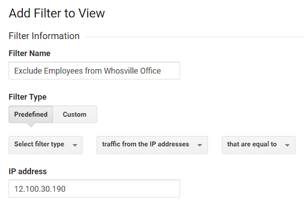
In the past, we’ve used IP filters to separate out traffic from our physical locations, which are easy to set up and change infrequently. It might look something like this:
Example of an internal traffic filter
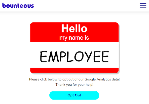
But what happens when everyone stops coming into the office? Some of the best practices and more advanced methods for filtering out employee traffic can be crucial. Configuring an internal opt-out page is a great way to record employee traffic for data filtration. This is what ours looks like:
Our opt-out page
Take the time to annotate major changes in Google Analytics and potentially other outside tools. While major events are easier to remember as you look back on a previous year, proper annotations will leave context and effects to help others understand big picture changes with more clarity. Did everyone at your company just start working from home? Has demand skyrocketed for a certain product or service line?
Questions to Ask and Address
“How quickly can your team assess and address” can be an indicator, positive or negative, of the internal changes processes you have in place, with your teams or agencies, and the ability to react quickly. Now is the time to both focus on immediate needs and reporting, but also building the processes necessary to be more prepared in the future.
Consider the following questions:
- How quickly can we bring in new data?
- What are the most efficient ways to incorporate it into our current big picture metrics?
- How quickly can we react to new data needs/report requests?
Lastly, here comes the tough part—how quickly can you add tracking to your site? Tag management tools like Google Tag Manager and Adobe Target have long touted their flexibility and separation of duties for mission-critical moments. As industries introduce major pivots, the ability to immediately track and report on that information is essential. Having a combination of the right tools and processes in place is paramount.
Transforming Your Data Sets
Once you feel comfortable with your data sets, you might consider additional export capabilities. We love the following tools for taking digital data sets out of their native homes and empowering analysts to perform advanced analysis:
Google Analytics for Sheets, Supermetrics, and Outlier are some examples of tools that take digital data sets out of their native homes and empower analysts to perform advanced analysis.
Communicating the Right Information the Right Way
Our teams think of data by time-bound comparisons; day over day, week over week, quarter over quarter, year over year. Combining a short view of data points alongside a long view can be really helpful in key discussions with organization leaders. It allows you to set a historical comparison while also identifying the most recent trends.
However, it’s important to put data into context. The following questions can be:
“What is our baseline now?” can be a challenging question to answer. Simple reporting on data itself is not predictive, it’s a historical record. Providing current trends against year over year or month over month data can help convey that nuance.
Seasonal or demand changes: Seasonality exists, even in times of major data change. Factoring that into analysis matters.
When doing date comparisons, be mindful of weekends, typical slow days, or other outliers in your data. The month is an irregular and inconsistent time frame, so consider using a set number of weeks or days in your frequent reporting. For the more advanced, consider calculating moving averages to normalize and understand data trends over time.
Above all, don’t lose sight of business objectives. Tying data, insights, and recommendations to business outcomes will make the most of your analysis.
How Will Your Stakeholders Consume Your Analysis?
The way that you present data is just as important as the numbers themselves. Know your audience to deliver the right insights in the right way.
Email Reports are great for exported tool spreadsheets, PDF dashboards, or top-line Excel reports. However, you miss the opportunity here to add context or analysis, and run the risk of someone misinterpreting the data.
Dashboards using tools like Google Data Studio, Tableau, or Microsoft Power BI are big favorites of the Bounteous teams. But no, not just that one ‘default’ report that everyone has access to. Consider role-specific dashboards that provide need-to-know information in a consumable interface, with the ability to apply filters and drill-down for deeper analysis.
Address the big questions proactively. Consider a high-level report for your C-suite that can review each week to identify the macro trends, without getting bogged down in the details.
How Can You Add Meaning Through Analysis and Insight?
Providing a report or a dashboard isn’t just enough, especially when the stakes are high and things change from week to week, much less day to day. There is no ‘set it and forget it’ — don’t forget to update and enhance existing dashboards for maximum effect.
Add value through analysis. With most dashboarding tools, you can use text boxes and annotations to add the important context and notes. We wrote a lot about that here: Don’t Be a Reporting April Fool. Speak to WHY a particular number has changed, and suggest how that information may have tangible impacts and what they may be.
Need a Dashboard? Here’s A Free One
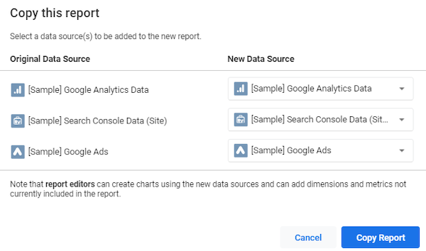
Data Studio is free and really easy to use. We’ve put together a number of common metrics in various time views to help you communicate insights quickly. Make a copy of this Data Studio report and add YOUR data sources. We started with Google Analytics, Google Search Console, and Google Ads, but the possibilities are endless.
Select Your Data Sources under New Data Source
Go Forth & Report!
You’ve got this. Take pride in your abilities to communicate your data, follow our tips, and don’t forget to learn. Data preparation work that you perform today will help you be ready for the next business cycle, product launch, or promotion—and will make you uniquely suited to jump in during times of rapid change with ready-to-go reporting and analysis.
Thanks to Beth Janairo, Lauren Malley, Samantha Barnes, and Jon Meck for key contributions to this post.


