Web Analytics And Regression: Put A Line Through That Data
I do lots of key performance indicator and dashboard work. Much of it is longitudinal (this is stat geek speak for “over time”), and customers say, “I see the little dots, what is the trend?” If you have a big gorilla package like Sitecatalyst, you can ask to see the graphs smoothed. But we are not all so lucky, so smart or so rich as to have Omniture on our
side – so I finally figured out how to do it in Excel.
Although Microsoft keeps the ability to do linear regression, even with basic Office XP, pretty well-hidden, it is trivial once you figure it out.
First, create the data, or use mine:
57
68
48
52
78
79
58
80
83
98
67
64
93
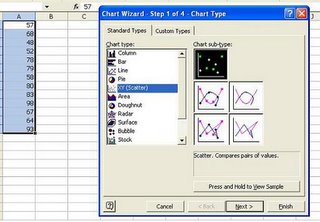
Then, highlight the data in Excel and choose the graph wizard with the little chart wizard icon that is on the top of your screen or just choose Insert>Chart. The graph you want is Scatter, like the picture on the left, and you want the subtype that has the little dots only (it will probably already be highlighted, as it is in this screenshot.)
Click Next, Next, Finish (although you can add any options you like along the way, such as a title, legend, etc.)
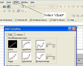
Now comes the moment of truth. While your graph is highlighted, look at your Excel toolbar, and you should see a new menu, Graph, probably to the right of tools. Choose Chart>Add Trendline>Linear>OK.
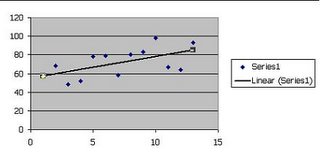
Excel will will do the linear regression and add a line showing the trend of your datapoints. It should look something like this the screen shot on the left.
This is somewhat of a statistics hack. After all, we don’t know how well the data fits the line, which a package like MiniTab would tell us. But it’s free if you have Excel. You can do it tonight on your computer.
Robbin
LunaMetrics


