Double Shopping Carts For Poorer Conversion?
I would give the world to see Rolling Stone’s web analytics and to know for certain if they are converting as poorly as I think they must be.
A friend got on their website to buy a gift subscription and was completely unable to do so. Here is how the conversation went:
Robbin: I can’t wait to look at their site to see what they are doing wrong.
Would-be purchaser: Maybe it has nothing to do with their site, maybe it is just that I’m unable to do it.
Robbin, somewhat incredulously: You mean, you had your credit card sitting next to your computer, you were unable to give them your money, and you think maybe it’s your fault?
Well, I love a challenge, so I got on the site and saw the problem immediately. Here is what their home page looks like (and that is how I started, by typing their address right in and landing at Home):
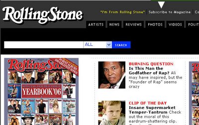
“Subscribe to Magazine” is right up there on top and I chose it. (I marked it with a white arrowhead in the screenshot in case the screenshot came out too tiny.) But when I got to their very nice, compact form, it did not give me the opportunity to enter a giftee’s address, or including a note to the recipient.
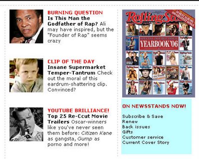
Hmm, there must be a way of doing this, I thought. So I poked around and further down the page found all the ways you can subscribe (blue highlighting added by me):
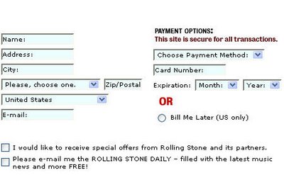
I also found that they have not one, not two, but three different checkout carts: one for new subscriptions for yourself, one for renewing subscriptions, and one for gift subscriptions. Oh, I forgot to mention the one that you use to purchase back issues.
Maybe they’ve tested it and found that it converts better this way, but I’ll bet that it’s just easier for them to administer this way. And then you have to ask, is the goal of my site ease of administration (sometimes it is) or is it making money on my print publication when the whole world is moving to digital media?
Robbin Steif
LunaMetrics
News & Insights
Related Perspectives


