Conversion Analysis: VistaPrint
It is always hard to know how many options to give a user. Too many and you lose the conversion; too few and they can’t achieve their goal (and you lose the conversion.)
VistaPrint is a well-known Internet printing company and is arguably best-known for their business cards. I clicked first on the product I wanted, “premium business cards” on the home page and landed here:
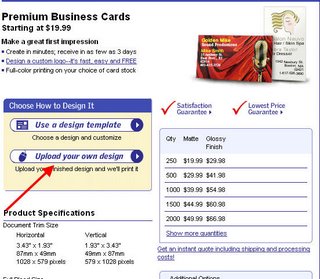
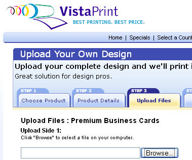
So this was the first moment of frustration. It didn’t matter whether I scrolled up or down, I couldn’t find any action buttons except the opportunity to upload my artwork or choose one of their templates. (And I really wanted them to tell me that they would walk me through a process.) But anyway, I uploaded my file (using the link that I have the red arrow pointing to) and was very frustrated to see that they had taken my vertical card, assumed that it was horizontal, and then yelled at me (electronically) because the aspect ratio of my image did not match the “chosen template.”
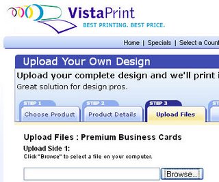
Eventually I realized that I had landed on tab 3 of a four tab wizard, as you can see below:
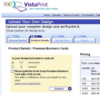
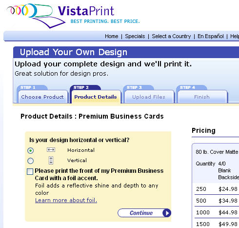
Finally, by making them back up (i.e. choosing Tab Two), I got to tell them that I wanted a vertical, not horizontal card:
While writing this post, I noticed that there *is* a business card wizard, right at the top of the home page. (I never saw it and it is a great example of ad blindness.) Even if I had, it is a “free business card” wizard, whereby you choose one of their templates and get their advertising. There truly is a way to do this right, just not a very intuitive way…


