Flow Visualization In Google Analytics
I need Red Bull. Seriously, I can’t keep up with all the new features and announcement coming from Google Analytics lately. In the last few months, they’ve released a new interface, real-time data, multi-channel funnels, Google Analytics Premium, Google Webmaster Tools integration, plot rows, site speed report, new mobile reports, social media tracking, and now Flow Visualization. You can read their official announcement, but ours is much more informative (and we have video!).
What is Flow Visualization?
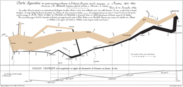
Flow visualization is not a new concept. Take a look at the map above, drawn by Charles Joseph Minard in 1869. That’s a flow map of Napoleon’s march to Russia, showing the French army’s location and direction, where units split off and rejoined, the declining size of the army (as the size of the army gets smaller, so does the line), and also the temperatures during the retreat. Hmmm… if only we could see a similar visualization of “armies” of visitors as they march through our website. (Spoiler alert: that’s exactly what the flow visualization reports do).
Traditional path analysis reports don’t do a good job of providing insights. It’s a visualization problem, and a “user” problem. The “user” problem isn’t so much a problem, it’s just that users are individuals that tend to each do things differently and follow their own unique paths through our websites (and life). Sure, there are some common paths that people take (hopefully this is the case if you’ve diligently designed your site with clear calls to action and obvious path choices). But after the handful of common paths, when you start drilling into the data you just get a lot of unique paths taken by single users.
Flow visualization is a way to understand how visitors flow through your website. It uses intuitive imagery, along with the ability to segment your visitors, to make insightful analysis easier. These reports better help you understand how to optimize your landing pages, navigation, conversion funnels and more. They can help explain the behavior of segments of visitors after they land on a page, and see where there might be commonalities and differences between key segments.
Flow Visualization reports
There are three reports that are included in Flow Visualization:
- Visits Flow: provides a graphical representation of your traffic sources, and the paths through your site that your visitors follow.
- Goal Flow: provides a graphical representation of the paths your visitors took to successfully complete a conversion and where they dropped off. This flow requires that you have already defined goals. Currently, only URL destination goals are supported. Goal flow improves upon the existing “Funnel Visualization” reports.
- Navigation Flow: provides a graphical representation of your start/end nodes, and the paths to or from your site that your visitors follow. When you create a navigation flow, you have the option to identify a single page by URL, or to create a node that represents a group of pages whose URLs match a condition, for example, all pages whose URL contains a particular product identifier like shirts or jackets.
Using Flow Visualization
Sometimes, things are best explained with video. This is one of those times, so sit back, relax, and enjoy this brief tour through this new feature.
News & Insights
Related Perspectives


