Motion Charts, The Silent Star Of Google Analytics
You use Motion Charts in Google Analytics, don’t you? Wait, you don’t know what I’m talking about? This guy, with all the pretty colored balls?

No? You’ve never even heard of it? Well it’s not surprising that most people don’t even realize this feature exists. Until the most recent UI update to Google Analytics it was hidden in a small icon you wouldn’t have noticed unless you were looking for it. They’ve made it a little more obvious now, and you can get to motion charts by clicking the “three circle” icon

The first time you try out the motion chart, it might seem bewildering as to it’s purpose. In fact, out of people who are aware of motion charts, usually people absolutely love them or don’t understand why you’d ever use them. Again, it’s not surprising to understand why, here’s what most people experience:
Wow a video of a bunch of circles moving around? Woo. Where are my graphs again?
Digging a little deeper though, I’ll give you a great use-case or two for the power of Motion Charts over traditional graphs.
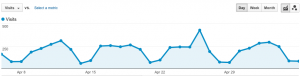
Take my referrers report (please!). I see a pretty typical traffic fluctuation, looking at this graph it’s hard to tell if I’m getting an even amount of referrers from all sources equally in that time period or not.
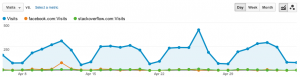
Ok, I can take an educated guess about what referrers might contribute to what and use the “Plot Rows” feature, but that doesn’t appear very helpful either…
Now let’s try analyzing this with Motion Charts, but first a quick screenshot to explain the parts of a motion chart

Essentially what the Motion Chart video is showing you is fluctuations in your X-Axis metric (which can be changed by clicking on it) over time. So let’s watch our video again:
Now we see on some days one of the “balls” flies dramatically to the right, and then returns back to it’s place among the others. This means there was a traffic spike on that day from that source. If you click the balls, it will add a label, so if you slowly advance the motion chart, and click to label each of the ones that zooms to the right, you’ll now understand why this is so useful…
Ah! So Facebook, StumbleUpon and Twitter caused huge jumps in referrals during specific days of last month. That would have been a little more tricky to discover without the joy of Motion charts. It’s also useful to pay attention to the Y-Axis, and make that something like Conversion Rate.
Some other interesting uses of Motion Charts we’ve used for our customers is watching a change in content to see the effect of new code. You can notice the day a code changed by watching as one content page swaps for another in popularity on the X-Axis.
So next time you want a new view of your analytics, give Motion Charts a try.
News & Insights
Related Perspectives