Dynamic Data Viz: A Better Way To Plot Rows In Google Analytics
Have you ever tried to use the “plot rows” feature in Google Analytics and it literally falls flat?
It happens because you can’t keep the chart from graphing the metric total. That thick blue line across the top of your chart flattens everything else. It keeps the size of the chart static, rendering it useless.

Wouldn’t it be great if you could graph only the rows you want and the chart would dynamically resize?
Here’s the key to turning those flat, plotted rows into dynamic data visualizations: motion charts.
I used to think that motion charts were all flash and no substance, and then I found out they were more than a bunch of colorful, moving bubbles. Motion charts deliver insight “in motion”, and they plot rows better than “plot rows” can.
Resizing data is as easy as Alice’s “Drink Me” potion. Read on to find out how it works.
The Problem: Flat Data
In case you’ve never seen this before, let’s look at an example. Suppose you want a visual comparison of transactions for the first two weeks of July, when you targeted users from four states. You go to the Audience > Geo > Location report and drill into the row for United States.
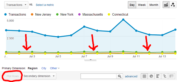
Here’s what you get if you tick the check boxes next to each state and then click “plot rows”: four very flat lines.

The blue line (total transactions) controls the size of the chart and cannot be removed.
The Solution: Plot Rows with Motion Charts
With a few simple steps, you can change the chart to show exactly what you want.
Step 1: Decide how many rows to show.

Change “show rows” so you can see everything you might want to compare. If the states you want are already visible in the top 10 rows, you can skip this step.
But if you need states past the top 10, or you need to compare other states, too, go ahead and show more rows now.
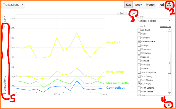
Step 2: Click the motion charts icon.
The motion charts icon has three bubbles and is just above the chart area, on the far right.
Step 3: Select the line graph tab.
Change from bubbles to lines by choosing the tab with the line graph in the top right corner of the chart.

Step 4: Change opacity settings (wrench) to 0%.
Click the wrench just below the chart, on the far right, and drag the slider all the way to 0% opacity. When you start selecting states, all the other states will appear to vanish, leaving you with just the data you want.
Step 5: Select your metric on the left side of chart (sideways).
In this example, you want to change the chart metric to Transactions. The chart metric is the one that appears sideways on the left side of the chart.
Step 6: Click states to compare.
Ready for the good stuff? Start clicking the states you want to compare. What a difference! Each trend line, and several daily spikes, are now clear.
Step 7: Curiouser and curiouser!
What more will you discover, now that the basic setup is done? Try these:
- Hover for details or to focus on one trend line
- Switch back and forth quickly by checking and unchecking rows
- Motion charts are not limited to 6 lines (plotted rows are)
- Magnify lower trends by switching from linear to log scale!
Campaigns, keywords, landing pages, products, articles… what would you like to visualize? Have you used motion charts like this before? Do you have tips to share? Let me know in the comments.


