Using The New Cohort Analysis In Google Analytics
The cohort was the basic tactical unit of Roman Legions following the reforms of Gaius Marius in 107 BC. Initially a Roman legion consisted of ten cohorts, each consisting of 480 men. Today we use the term cohort to distinguish between groups of consumers to help us make them spend more money on things they probably don’t need.
Progress? I guess I’d rather live in a world where we try and get people to spend more money on shoes, than die violently by taking a spear to my chest while fighting Carthaginians; but it’s close.
And now Google Analytics has a fancy new Cohort Analysis Report that lets us analyze the death rates from the Second Punic War… Er… no… it helps us analyze the consumer/shoe thing.
Ok, So What are Cohorts?
For our purposes – cohorts are a way of grouping together people (or content), usually, based on date, and for our purposes it’s grouping them by their first session on a website. If you first visit a website on February 19th, 2015 then you are part of the February 19th, 2015 cohort, as well as the 3rd week of February cohort, and the February month cohort.
You can be part of more than one cohort in this manner, but it’s all still based on that date you were first acquired. You’d never be part of the March cohort.
What is Cohort Analysis?
Cohort Analysis is looking at these groups of people, over time, and seeing how their behavior differs. Think about it this way. If you send out an email to 100 people, some may buy your product on day 1, less on day 2, even fewer on day 3, etc. But if you then send another email out to 100 people weeks later, they’ll be buying your product on their “day 0” while the other email had days prior.
A Cohort Analysis can help you compare these people by the way/time they were acquired, in order to make comparisons on their behavior.
Maybe the first email converted people better on the first day, but considerably worse on day 2 or 3. Maybe The people who arrived in the 2nd week of February have a much higher rate of Retention (they keep coming back to your site) than any other week. Why?
Cohort Analysis can help point out differences in metrics like engagement, retention, acquisition, or response to marketing efforts and trends. These differences can lead you to ask the right questions.
Up until this point, doing a cohort analysis in Google Analytics was a tricky proposition. It usually consisted of setting a Custom Dimension (or Variable prior to that) with the user’s first date of their first visit. You could then use those Custom Dimensions in your reports to compare behavior, but usually it would mean exporting that data out of Google Analytics into a Google Sheet or Excel in order to make real sense of it.
The New Cohort Analysis Report
Now appearing in accounts in beta is the Cohort Analysis report. You may not have access to it yet. It’s still marked as a beta, but it’s appearing in many people’s Google Analytics accounts within the Audience section. It has four ways to modify the report, and two major data visualizations.
The options are above the first visualization:
Cohort Type – Currently restricted to “Acquisition Date”
Cohort Size – You can choose to look via day, week, or month
Metric – The default is “User Retention” which basically means users that had additional sessions in later days/weeks/months. Other options currently are:
- Goal Completions per User
- Pageviews per User
- Revenue per User
- Session Duration per User
- Sessions per User
- Transactions per User
- Total Goal Completions
- Total Pageviews
- Total Revenue
- Total Session Duration
- Total Sessions
- Total Transactions
- Total Users
Date Range – This modifies based on your Cohort size. For a ‘day’ cohort size you can have a date range of 7 days, 14 days, 21 days, or 30 days. For a ‘week’ cohort size your date range can be last week, the last 3, 6, 9, or 12 weeks. For months you can currently look at the last month, or the last 2 or 3 months.
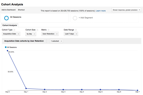
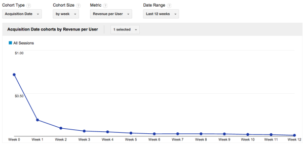
Lines and Triangle Charts
The first of the two data visualizations in the report is a chart that you can plot the various selected cohorts onto their own lines for comparison over time. It defaults to the average of all of them.
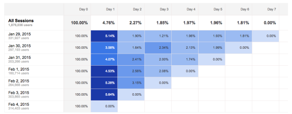
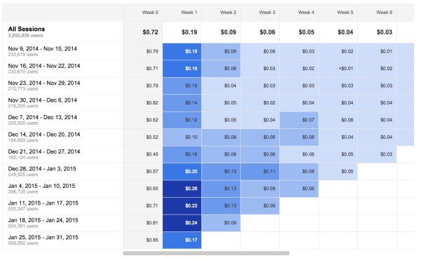
The second visualization is a Triangle Chart, or probably more specifically an “Impact Plot” which shows each cohort, and their cohort metrics per following week, with color added to show intensity. For instance below, we can see that the average revenue per user was much stronger in week 1 in the first few weeks of January than they were in all of December. What caused such stronger revenues in Week 1 for those cohorts?
You can also see that the November cohorts were fairly weak going into weeks 2 and 3, and even 4, compared to those that started in mid-December.
Types of Analysis From Cohort Analysis
Google Analytics calls out several specific types of analysis that one can do with these reports on their cohort analysis support page.
Micro Trends – Maybe you are increasing overall users and transactions, but you are losing many more in week 5 than you were before. Without a cohort analysis you might just see growing users/sessions/transactions/revenue. Now you have an idea to target the week 4-5 cohort with a new marketing email. “Buy more shoes!”
Consistency, Improvement, or Deterioration – Do you have a “consistent” user experience. If you are retaining users at the same rate in week 5 and 6 across cohorts, or maybe you’re gaining more users in week 5, or losing them more often, it could indicate that your content is slipping, or getting better, etc. You’re not just looking at bounce rates anymore.
Engagement, Retention, and Acquisition – When do users disengage from your site? Do they stick around for a few weeks, or more, or less? Maybe your shoe sales revenue declines in week 3, that might be a time you want to target with remarketing ads for a specific product. Or if you can understand your “churn” and how often you are losing users, say 10% a month, you know how many new users you need to generate through other means to replace them.
Response to Short-term Marketing Efforts – If you run a really short one day email campaign, you can look at that cohort to see how it operates differently than the ones around it. Are your emails getting better at acquiring customers that stick around and keep buying shoes in week 5 and 6? Maybe the email generated a lot of users, but they all bailed by week 2.
Possible Complications with the new Cohort Analysis Reports
I would be remiss to not mention a couple of things. These new reports rely on when a “user” first lands on your site. It’s important to remember what counts as a “user” in Google Analytics. This isn’t specifically talking about a person, it’s referring to a unique set of cookies stored on a particular person’s browser on a particular computer.
Keep in mind how tracking issues like cross-domain or subdomains can impact your data, or why this report won’t necessarily help with cross-device retention (unless you’re using a UserID view!)
Also for many users, this report is only truly useful by also applying a segment of some kind. Sessions with Transactions, or Organic Traffic, etc. Yet applying a segment to these reports can kick off sampling as they are not standard reports. So be aware of sampling here if you have a high volume site.
One possible way around this, depending on your property, is to have custom dimensions set up to filter into views. Take a user’s first source on their first visit and place it into a “First Source/Medium” custom dimension, and then filter a view on that, so that even if an organic or paid visitor later comes back via Twitter they’d remain in the cohort in that view. (idea thanks to Jon Meck)
I also recommend still pacing a custom dimension value on all your users named “Cohort” that has their first time/date session as well, because the Cohort Analysis Report does not have an export option. If you’d like to do your own analysis in Excel or another tool, you’ll need to have that date tied to the user/sessions in some other way.
Otherwise it depends on your site, your data, and your questions that you’d like to look at.
Learn More About Cohort Analysis
Check out our previous blog post about using Cohort Analysis for content using Google Tag Manager!
There’s also a great video from Google Ventures Startup Lab Workshop on Cohort Analysis which can also help you get thinking about doing some analysis on your own data. It’s almost an hour long, but if you’re interested in learning a little more about cohort analysis, and some other visualizations that are possible, take a look.
More Reading on Cohort Analysis
In the video he references a bunch of different visualizations from a variety of blogs. Here are the links to them all if you’re interested in just reading:
Start-up’s golden triangle of customer loyalty – cohort analysis Part 1
https://news.ycombinator.com/item?id=5247115
Retention, Cohorts, and Visualizations
Visualizing “good retention” and “bad retention” in retail (scroll down)
3 Rules to Actionable Metrics in a Lean Startup
Cohort Analysis: Metrics for a Scalable Business
Using Cohort Analysis to Optimize Customer Experience
He also has his own neat cohort analysis tool which while it’s not in GA, is worth checking out:
Final Thoughts
Cohort Analysis is an interesting new tool in Google Analytics, and I look forward to seeing how it develops as it moves out of beta and expands on where it started. I also hope that someday we’ll be able to export data from these reports our selves so we could easily do other cohort analysis visualizations outside of Google Analytics such as Cycle Plots.
For many users though, this report will give you a quick and easy way to start doing some in depth analysis of your users, their behavior, their retention, your marketing trends, and more.
Learn More About The Second Punic War
Educate yourself: The Second Punic War
(Hint: it’s the one with Hannibal and the Elephants)