2015 Design Predictions TL;DR
Each year it seems every website comes out with their own list of design trends they expect to see in the coming year. 75% of the articles contain the same bullet points, then the author throws in several opinions that will hopefully spark someone’s need to share the article.
Most articles tend to be checklist articles of elements that designers will be adding to websites this year. Where is the objective strategy articles or honest trends?
Instead, I wanted to distill this trend-mash and use those bullet list items to support some actual trends in 2015. After reading listicles by Designmondo, The Next Web, Hubspot, Site Point, and Creative Bloq I came to the conclusion that the only “trend” is to remove the flash (both technically and figuratively) and focus on the message.
Immersive Minimalism
Everything I’ve read lead me to these two words. There were variations of how browser real estate will be developed but every single list item pointed to designs that keep styling simple and content engagement high.
- Background imagery and background videos will be large and prolific
- Illustrations will work to add a human touch to the web
- HTML5 elements will be used to visualize data
- Color palettes will be flat
- Navigations will dissolve
- Typography will be large
- Design will put content first
Design Blog Summaries from the following sites:

Designmodo – http://designmodo.com/

Hubspot – http://www.hubspot.com/

TheNextWeb http://thenextweb.com/

Creative Bloq http://www.creativebloq.com/

Sitepoint http://www.sitepoint.com/
Imagery – Types of Photos

Natural Stock Photography Natural stock photography was huge in 2014 and we will see this trend coming a long way as we keep getting amazing photos by the community with very empowering “do whatever you want” type of licenses.
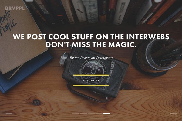

Professional High-Quality Custom Photography Stock imagery still has its place in design, but for most new websites these days, stock imagery has taken a backseat to high-quality professional photography that is unique and custom to the site and purpose. Using custom photography takes the design step a bit further than just picking stock imagery, and no one else will have those same pictures on their site.
Imagery – Image Sizes

Huge & Beautiful In 2014, we saw larger, high quality images make their way into more designs. Thanks to free unique stock image sites, as well as faster broadband speeds, the images improved in quality and diversity. Humans are visual creatures, and in 2015 we’ll see bigger and better images.

Make it Big The reasons for this trend are both visual and pragmatic. You’re able to give users maximum impact as soon as they land on your site and it’s easier to code, so it works well on mobiles and desktop computer monitors. With growing access to high quality images and speedier technology we’re seeing websites take these “Book Cover” layouts to the next level.

Huge Background Images. Front-end developer Benjamin Hollway expects more massive background images in 2015, “used alongside rich typography and subtle parallax effects”, largely due to the lead taken by massive brands such as Apple and Google Nexus.
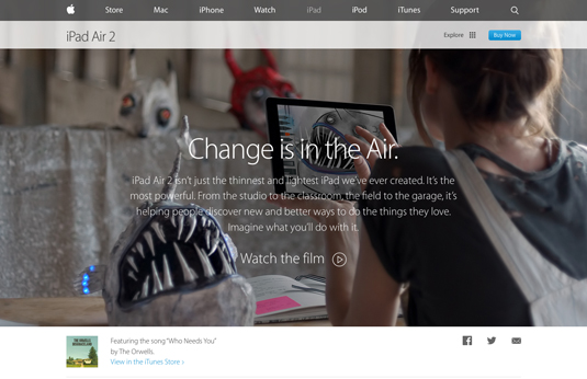

Absence of Large Header Background. The trend over the last few years have been large header background images, often with text on top, and it is the first thing most visitors see when they come to a site. So how can you stand out from the crowd that has embraced the large-header-background-image trend? By doing the opposite.
Imagery – Video Backgrounds

Make it Big Keeping with the theme of maximum impact, the “Cinematic” trend relies on fullscreen (or almost fullscreen) video with a few words and/or elements overlaid on top of it.

Video Backgrounds A video background is the ultimate experience for portraying emotions and intentions and communicates way more than any picture. We saw this trend rise quickly in 2014 but the real peak will be in 2015.

Background Video If 2014 saw large high quality images show up everywhere, 2015 will see large backgrounds explode onto more sites. With broadband speed ever increasing, it makes more sense to add to that rich experience. It shows the soul of a company, without in-your-face video. An ambient, ethereal feels that doesn’t get in the way.
Imagery – Other Types of Imagery

Illustrations & The Human Touch Illustrations have always been a part of web design but we’ll see even more beautiful illustrations implemented in website experiences to represent the brand, tell a story and connect with the visitor.

Big Data/Graphs Big data is becoming more important in the tech industry as well as in web design. We’ll be seeing more graphs, charts and interactive data projections in 2015. Sophisticated, complex, unknown but beautiful and engaging.

Geometry Yes, geometry is coming from math but it can be less boring as math if used properly. Beautiful geometrical shapes and patterns will hit the web design scene harder in 2015.

Illustrations This is a bolder prediction because we’ve seen small illustrations pop up throughout the years. But with large images, strong fonts, and pleasing colors becoming standard, designers will look to differentiate with designs that take hard work: unique hand-drawn illustrations.

Cinemagraphs More difficult to make than pure video or images, and more unique than either, designers looking to stand out will use cinimagaphs in their interactive storytelling in 21015. Although not brand new this year, with more adoption of rich content experiences, they will be the new classier, version of GIFs.
Imagery – Use of Color

One-Color Dominance. We’ll see more websites using one color heavily. Backgrounds, type, image overlays, buttons. Strong accent on one color puts emphasis and makes it more memorable as well as easily associates that color with the brand.

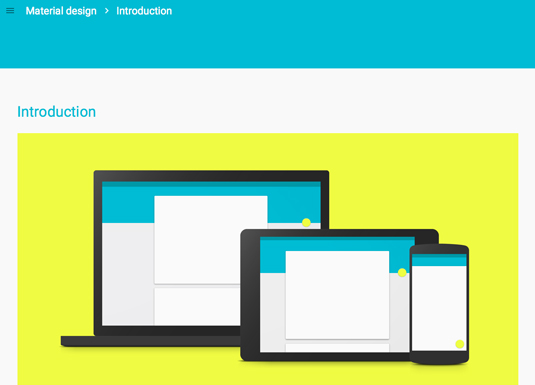
Vibrant Design. BaseKit co-founder Richard Healy believes Google’s Material design specification will inspire designers. He tells us: “Think bold, graphical and intentional. We’re talking vibrant, unexpected colours, contrasted with subdued and muted environments; large-scale typography, soft directional lighting and shadow; the use of responsive design best practices; and meaningful motion – carefully choreographed animation that provides fluid, seamless touch transitions and, more importantly, delights users.”
Design – Typography

Big & Bold Typography. We’ve seen oversized headlines and we’ll be seeing more of these in 2015. Just because it works and has an impact on the visitor, we’ll be having large punch lines hanging around for some time. Straightforward, powerful and effective.
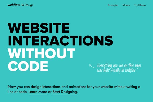

Very Large Typography. Large typography is likely going to be key in 2015 as a way to enhance the visual hierarchy of the page by ensuring visitors read the largest type on the page first, because that is what grabs our attention first.

Better Typography. It seems that more designs are incorporating better typography. Better visual hierarchy, more unique fonts, and strong statements. Look for more of this in 2015.
Design – Layout

Cards & Tiles. Card or tiles design will continue growing in 2015. With Pinterest being the leader in this design trend, we’ll see more blogs and ecommerce websites popping up that use this design technique.
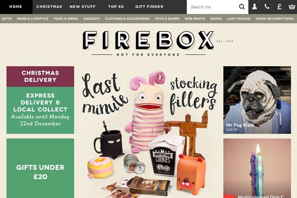

Card-based Design. Creative director Haraldur Thorleifsson says card-based design will be big: “Content needs to fit on different types and sizes of screen, and cards are the easiest way to make that work across platforms.” He adds this presents a design challenge, since cards can be dull, “but we’re seeing fun, clever takes on this from companies like Google”.

No More Boxes. Contrary to the other blogs, Sitepoint sees rectangles and boxes going away. One could call this trend “Draw a box and prove you can break it”. A rectangle screen is the frame for every web design (as far aw we know, we don’t have circular monitors yet). Every HTML element of the page is a rectangle too. The ultimate way of defying a rectangle is placing the user inside an infinite space where scrolling means flying, rather than, well… scrolling.
Swiss airlines challenge your understanding of website navigation. Browsing their page, you can feel how conventional our understanding of document space is. Here, instead of scrolling up or down, we dodge our way between the clouds.
Design – Scrolling

More Scrolling. Some of the latest research, including “Everybody Scrolls” conducted by Rebecca Gordon of Huge, shows that people scroll and they love it. Long one-pagers with various interactions and transitions will take place next year as digital storytelling is all about that unified experience and easy flow that scrolling enables.

Longer scrolling sites. As mobile devices become more popular, it’s becoming more commonplace for sites to opt for scrolling instead of linking as a means to display content, especially on their home pages. It is easier for users to simply scroll through a page to get their information than it is to constantly click to find information.
Design – Navigation

Unique Navigation Menu. Starting with floating and sticky menus we’ll see even more creative solutions to website navigation. Slide down, slide up, pop-up, spiced up with imagery, secondary information and dynamic animations will help create memorable browsing experiences.
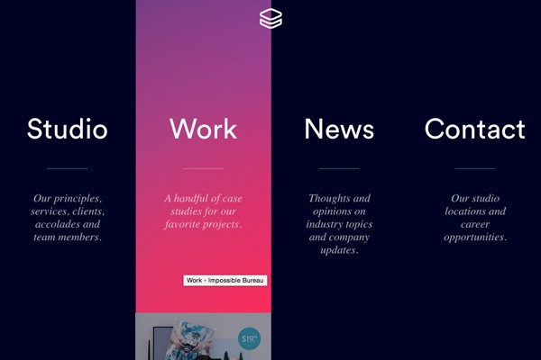

Flyout/Slideout App-like Menus. Up until recently, most design emphasis was placed on making the site look great on desktop devices, and just ok on mobile and tablet devices. RWD has moved toward making every experience look great no matter the device. With this move, we are starting to see design elements that take what works on mobile devices and implementing it site wide.

Hidden Main Menus. Anticipate seeing more sites hiding their main menus all together when visitors first visit the site. These hidden menus will only become visible when the visitor is ready to move on and clicks the appropriate icon. This is also a technique of responsive design that is starting to be carried over into all of a site’s design instead of just small viewports.
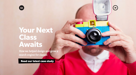

Navigation Widgets. Edgier navigations have been on the rise again, thanks in part to new web design potential and the growing inefficiency of existing navigation models in using across multiple devices. This is made easier thanks to the wide use of JavaScript through Java’s constant evolution (via frameworks and plugins) and the more consistent interpretation of modern CSS across all important browsers. Examples: Stick menus, sticky navigation attached to all 4 corners of the screen, street view type of navigation
Content – Type of Messaging

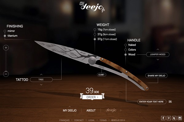
Product First. There are many startups that produce physical products and it is way more complicated to portray that experience and feeling of tangible product on the web. However, we’ll see more interactive, 3D based experiences that allow visitors to move products and observe even the smallest details.

Rich Content Experiences. It’s taken long enough, but big media players have started to use the unique advantages of the web to create emotional visual experiences within long form articles and content. What started with Snow Fall by the New York Times in 2012 has proliferated since then. Storytelling has been more intimate and visual.

Material Design. Material Design, invented by Google, is a subtle modification of the flat design movement, but more sophisticated, unified yet universal and very promising. This is definitely the year when we’ll see a huge rise of material design usage.
Content – Telling A Story

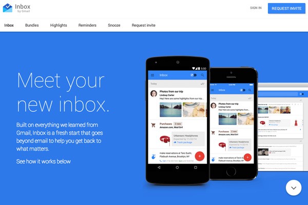
Interactive Journeys. Interactive digital experiences will get more exposure. More interaction websites are creating unique and personalized experiences by playing sound, connecting camera and microphone and allowing interaction and storytelling based on the viewer’s actions.

Storytelling and interaction. While having amazing content is always crucial for your website, being able to tell a story through your content is a big plus. Web design in 2015 will likely focus around helping tell a story for users.
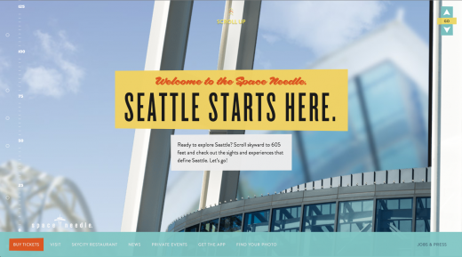
For example, the Space Needle’s website beautifully tells the facts of the Space Needle through the use of storytelling and a design that helps support it (it also goes in line with the long scrolling trend discussed above).

Animated Storybook. An animation sequence starts when a user reaches a certain scroll position. Often, it is just a few elements that slide into the page or use a fade-in effect to appear.
The Boldking product page uses lightweight SVG and Java Script to present a visual metaphor describing the way their product works. Not only is the idea and animation amazing, but equally notable is the fact that it was achieved within 1.5 MB total page weight. Sometimes a single JS library has this size. One of the animated sequences is even interactive.
Final Thoughts

Final ThoughtsThe Next Web made a final comment in their article which I thought was worth repeating. Many of the predictions made are driven by mobile usage, therefore speed and site performance are essential to the success of a website in 2015. Designers are beginning to explore the real capabilities of HTML5 and CSS3 and as they do, it will be important to mind the impact interactive elements have on the sites performance.

Removing Non-essential Design Elements in Favor of Simplicity. There is an idea in design that a design is complete when all of the non-essential elements have been removed. In 2015, I believe we could be seeing more of this idea come into fruition as sites look to find ways to simply their designs by removing non-essential design elements.


