Compare Actual Vs Predicted Data With Google Analytics And CausalImpact

Google Analytics (GA) is a great tool for collecting and analyzing web site data, but it’s not without its limitations. If you need to run more advanced analyses, you probably find yourself pulling the data out of GA and putting it into other complementary tools, such as R, Tableau, Shufflepoint (and more!). Today’s focus will be on CausalImpact, an open-source package in R developed by the data gurus themselves (Google).
CausalImpact Overview
CausalImpact allows you to measure how different ad campaigns, such as paid search, affect ROI outcomes, such as sales. You may be thinking, But Google Analytics already has that data. And GA does that have data! However, it doesn’t account for something very peculiar…
Peculiarities in Paid Advertising
Let’s say that, on average, you get 100 sessions/day from organic search traffic without any advertising efforts. Then, your team decides that it would be a good idea to run a paid search advertising campaign for a new product or service that was just launched. After beginning the campaign, your sessions increased, on average, from 100 sessions/day to 200 sessions/day. Your team is super excited! Why wouldn’t they be? Your average sessions/day doubled!
Now let’s look a little closer… In Google Analytics, you can see the number of sessions/day that came from your paid advertising efforts. You notice that it says 125 sessions came from your ad. Wait a minute! It appears as though 25 ((200 combined organic and paid sessions) – (125 paid sessions)) of your sessions from organic search were “cannibalized” by your ad!
In other words, based on the history of your site, you could’ve expected to get approximately 100 sessions/day without advertising. Therefore, although it may seem that you got 125 sessions from your ad, you actually paid for users who would’ve come to your site regardless.
So how can you see the number of additional sessions that actually came from your ad, especially since you don’t know what would have happened to your traffic if you didn’t run the ad? Glad you asked!
CausalImpact Saves the Day!
CausalImpact looks at the net difference between the total number of a certain metric, say sessions, that you would have received without the advertising campaign (model predicted value) and the number the same metric that actually occurred (data in GA).
CausalImpact is majestic in that it uses causal inference, which looks to see if something is likely to be the cause of something else, to predict the value of your desired metric. In this case, it uses Bayesian statistics in structural time-series models to determine whether or not the causes are related.
It is important to note that CausalImpact does make the following three assumptions:
1. The control is not affected by the marketing intervention.
2. There’s a stable relationship between the control and the affected segment from pre.period through post.period.
3. You have an understanding of the spike and slab prior in the time-series model.
How Does it Work?
Any number of extraneous conditions (anything besides your advertising efforts) could cause an increase or decrease in your web site traffic. So as per my previous example, you may indeed receive 100 sessions/day, on average, but what if your traffic increased to 200 sessions for a few days due to an extraneous condition (such as bad weather leading more users to be online). I’m sure you can see how this could skew your results!
In order to get around this, the time-series model allows you to use a control for more accurate data. One of the most popular ways to get this control is to create it! Thus, it is deemed your “synthetic control”.
Consider the following… Looking at the entire month of March, you ran an ad that targeted users in Pittsburgh from March 15 through March 31; however, New York City was a similar metro that didn’t have an ad running at any point during the month of March. As a result, your control would be a segment of traffic from New York City from March 1 through March 31, and your actual data would be a segment of traffic from Pittsburgh from March 1 through March 31.
Essentially, you need to compare similar segments in order to yield accurate predictions: One segment with the marketing intervention and one segment without.
A Step-By-Step, How-To Guide
Now you may be thinking, This sounds great and all, but it seems too complicated. Alas, have no fear! The explanation is here.
1. The basics.
You’re going to need to know how to pull the data you need out of GA and put it into R. Becky West, a fellow Lunametrician, wrote an easy-to-understand, step-by-step process on how to do so here. Pay attention to the following in her blog:
- Downloading R/RStudio
- Installing RGA/Authenticating GA
- Choosing your view in GA (and storing it in a variable, such as viewId)
- Exporting via Graphic into R
2. Getting things ready.
Once you have a basic understanding of those concepts, you’re ready to move along! After opening RStudio, do the following:
library(rga) # Load RGA library every time you start RStudio
rga.open(instance = "ga") # Authenticate
install.packages("devtools") # Install devtools
library(devtools) # Load devtools
devtools::install_github("google/CausalImpact") # Install CausalImpact
library(CausalImpact) # Load CausalImpact library every time you start RStudio
viewId <- "XXXXX" # Put your own view ID here
3. Pull the data.
If you have trouble, feel free to reference Becky's post. For this blog example, we'll use the following code:
# Affected Segment (i.e. Pittsburgh - Combined paid & organic sessions)
gaDataIntervention <- ga$getData(viewId, start.date = as.Date("2014-01-01"),
end.date = as.Date("2014-04-10"), metrics = "ga:sessions", dimensions = "ga:date",
segment = "gaid::3zuSKS6VKr2tn0er00KeVQ")

# Synthetic Control Segment (i.e. New York City - Only organic sessions)
gaDataNonIntervention <- ga$getData(viewId, start.date = as.Date("2014-01-01"),
end.date = as.Date("2014-04-10"), metrics = "ga:sessions", dimensions = "ga:date",
segment = "gaid::tD0Y9cEFTSi0xUVVFddjRG")
Please note that you need to pull your segment of data by its ID, which is admittedly tricky to find! One way to find your segment ID is to apply the segment to the All Pages report, and then look towards the end of the page URL. Everything after the word "user" is your segment ID, and should be added into the following format: gaid::segmentID.
4. Cleaning the data.
In R terms, you now have two lists stored in two different variables (gaDataIntervention and gaDataNonIntervention). If you don't believe me, you can type in the following code to see what I mean:
head(gaDataIntervention) # Shows column names and first couple of rows
mode(gaDataIntervention) # Shows data type (in this case, list)
head(gaDataNonIntervention) # Shows column names and first couple of rows
mode(gaDataNonIntervention) # Shows data type (in this case, list)
When you run the CausalImpact() function, you can only have one set of data. As a result, we'll combine the two sets into one:
# The order is important here! Make sure it's cbind(Affected Segment, Synthetic Control)
combinedData <- cbind(gaDataIntervention, gaDataNonIntervention)

head(combinedData) # Data set must be in this format: Date Column, Affected Column, Synthetic Control Column
workingData <- combinedData[ -c(3) ] # Storing code to eliminate the second date column
head(workingData) # Now we're talking!
5. Defining the variables.
Define your pre.period and post.period!
Reminder, pre.period = date range in pulled data before intervention, and post.period = date range in pulled data after intervention. Use the following as an example:
pre.period <- c(as.Date("2014-01-01"), as.Date("2014-03-11")) # Define pre.period as c(startDate, endDate)
post.period <- c(as.Date("2014-03-12"), as.Date("2014-04-10")) # Define post.period as c(startDate, endDate)
6. Run the package!
Warning - Nothing will show up on your screen just yet.
impact <- CausalImpact(workingData, pre.period, post.period) # Run CausalImpactInterpreting Your Results
CausalImpact makes interpreting your results relatively easy! As you found that nothing showed up when you ran the CausalImpact function, you can use the following code to actually see your results:
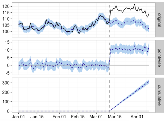
plot(impact) # Plot your results & get a graph similar to below
Isn't it B-E-A-U-T-I-F-U-L?! For the purposes of keeping Google Analytics data confidential, we used the same simulated data that Google used.
Original (First) Graph:
Solid, Black Line: Observed data before the intervention
Dotted, Blue Line: Model predicted values for what would have occurred without the intervention
Pointwise (Second) Graph:
The net difference between the observed and predicted response on the original scale, or the difference between the solid, black line and the dotted, blue line on the original graph.
Cumulative (Third Graph):
Dotted, Blue Line: Individual causal effects added up in time, day after day.
For all three graphs, the light blue shaded area represents the results in a 95% confidence level. The farther that the graph extends past the beginning of the intervention, the less certain of the causal effect; hence, the larger the shaded area.
Statistics in the Report
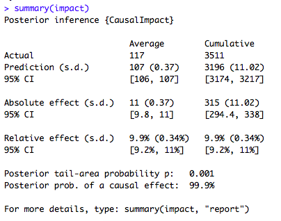
What's a graph without some Bayesian statistics? To see these statistics behind the graph, just enter the following:
summary(impact) # Get a summary of your graph
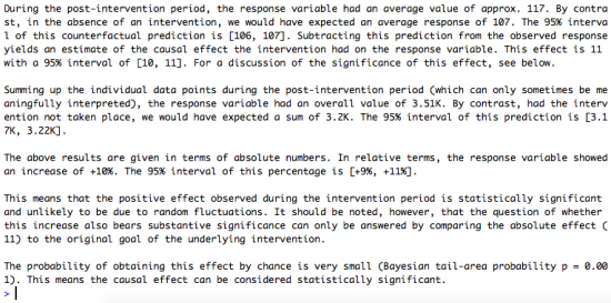
summary(impact, "report") # Get a detailed report of your graph
Furthermore, the summary function coupled with the report argument describes the summary results in a report format! Pay special attention to the last paragraph. Recall the concern with extraneous reasons for differences in traffic? This paragraph lets you know the calculated likelihood of the effect being caused by an extraneous reason. If you need help understanding these statistics, try the following:

Moving forward, CausalImpact can help you better understand the peculiarities in paid advertising by determining how much additional traffic you actually receive from running your campaign. With this information, you can see a strong prediction of how many organic sessions were cannibalized by your advertising efforts. Therefore, you can refine your advertising campaign strategies accordingly. Taking it a step further, you can use these strategies to compare the data you received with the expected data predicted by models with synthetic controls.


