Getting Started With R And Google Analytics
R is a statistical tool that can enrich you website data analysis. Unfortunately, R has a steep learning curve and can be intimidating to a first time user. However, the payoff is worth the effort. In this post I will help you get started by demonstrating some of the most useful R commands.
First, you need to import your Google Analytics data into R. In this post, I’ll be using the rga package to download the data directly into R from the Google Analytics API. If you haven’t done this before, take a look at these instructions. You can use this package to pull in unique pageviews to each of your blog posts.
library(rga)
library(curl)

rga.open(instance = "ga")

id <- "Your View ID Here"

gadata <- ga$getData(id, start.date = as.Date("2016-01-01"),
                   end.date = as.Date("2016-01-31"),
                   metrics = "ga:uniquepageviews",
                   dimensions = "ga:pagePath",
                   filters="ga:pagePath=~/blog/",
                   batch=TRUE)
If you are using other data sources, or are having trouble with the API, you can also import data from a csv file using the command:
gadata <- read.csv("myFile.csv")In contrast to a program like Excel, in R you will not immediately see your data after it is downloaded. Although this may be disconcerting at first, this issue is easily addressed if you know what to look for.
If you are using RStudio (which I recommend), you can easily view the dimensions of your dataset in the Environment tag. Clicking on the calendar icon in the Environment tag will print out the entire data set above the console.
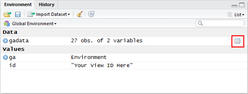
This will help you confirm that you pulled the correct data and that there are no glaring errors in the data. However, if you have a large data set, the process of printing out the data can take a long time. Here are a few other quick commands that will show you a snapshot of the data you downloaded:
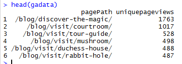
head
This command will print out the first 6 rows of your dataset.
head(gadata)
str
This command will show you the structure of your dataset. The key points of information available are the number of rows in your data and the labels of each of your columns. The first few values of each column are also listed.
str(gadata)

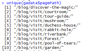
unique
This command will print out a de-duplicated list of values.
unique(gadata$pagePath)
Summary Statistics and Histograms
The Google Analytics interface is the best place to find traffic and engagement totals for the whole site and broken out by different dimensions. However, it is difficult to get certain descriptive statistics like averages or standard deviation. These statistics help you answer questions like, “How is the average blog post performing?”, or “How much does performance vary between different posts?”
The summary command gives you a quick view of the range and average of the data set. Here you can see the minimum value, the maximum value, each of the quartiles, as well as the median and mean. This should give you a good feel for the average performance of a blog post. Also, you will get a good idea for the range of performance between your best and worst performing posts.
summary(gadata$uniquepageviews)

You can also compute the standard deviation using the function sd.
sd(gadata$uniquepageviews)

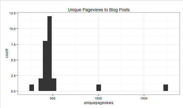
If you want to get a better feel for how different posts are performing, you can visualize your data in a histogram. You can use a popular package called ggplot2 to make the histogram.
library(ggplot2)
ggplot(gadata, aes(uniquepageviews)) + geom_histogram() + theme_bw() + ggtitle("Unique Pageviews to Blog Posts")
Trends over Time
The Google Analytics interface offers great tools for plotting trends by day, week, or month. Hourly timelines are also available in a few reports like the Audience Overview. However, you can use R to graph trends by hour or minute by any dimension. This could be particularly useful for investigating when a particular article was trending on Twitter, or when problems relating to a particular browser arise. In order to create the plot, first pull the appropriate data by hour:
byHour <- ga$getData(id, start.date = as.Date("2016-06-01"),
end.date = as.Date("2016-06-01"),
metrics = "ga:uniquepageviews",
dimensions = "ga:hour",
filters="ga:pagePath=~/blog/discover-the-magic/",
batch=TRUE)

byHour$timeStamp <- strptime(byHour$dateHour, format="%Y%m%d%H")
Then create the line graph using ggplot2:
ggplot(byHour, aes(x=timeStamp, y=uniquepageviews)) + geom_point() + geom_line() + theme_bw() + ggtitle("Unique Pageviews by Hour on Feb 17")
Hypothesis Testing
R is a great tool for running statistical tests. For example, you can check if the conversion rate or bounce rate for a certain landing page is significantly better than another landing page. You can check for statistical significance using a difference of proportions test. First, you need to pull the number of conversions and the number of observations for each landing page:
sessionsA <- ga$getData(id, start.date = as.Date("2016-01-01"),
                        end.date = as.Date("2016-01-31"),
                        metrics = "ga:entrances",
                        dimensions = "ga:landingPagePath",
                        filters="ga:landingPagePath==/blog/landing-page-A/",
                        batch=TRUE)


conversionsA <- ga$getData(id, start.date = as.Date("2016-01-01"),
                           end.date = as.Date("2016-01-31"),
                           metrics = "ga:goal1Completions",
                           dimensions = "ga:landingPagePath",
                           filters="ga:landingPagePath==/blog/landing-page-A/",
                           batch=TRUE)

sessionsB <- ga$getData(id, start.date = as.Date("2016-01-01"),
                        end.date = as.Date("2016-01-31"),
                        metrics = "ga:entrances",
                        dimensions = "ga:landingPagePath",
                        filters="ga:landingPagePath==/blog/landing-page-B/",
                        batch=TRUE)

conversionsB <- ga$getData(id, start.date = as.Date("2016-01-01"),
                           end.date = as.Date("2016-01-31"),
                           metrics = "ga:goal1Completions",
                           dimensions = "ga:landingPagePath",
                           filters="ga:landingPagePath==/blog/landing-page-B/",
                           batch=TRUE)
Next, use the R function prop.test to check for significance:
prop.test(c(conversionsA$goal1Completions, conversionsB$goal1Completions), c(sessionsA$entrances, sessionsB$entrances))

There are several important pieces of information here, but if you are new to hypothesis testing, the thing you should pay attention to is the p-value. This tells you how likely you would see a difference in performance that extreme if the inherent convertibility of each page is actually the same. A lower p-value gives you more confidence that there is a real difference between the two pages (checking for p-values under 5% is typical). Quick tip: R will sometimes print out the p-value using scientific notation. Don’t let this fool you.
These are a few tips to get you started working on the many tools and packages that R makes available.