Managing Multi‑Tenant Component Styles
In this article, we’re going to trace the path we took to accomplish a unique, cohesive design system for multiple sites within a single Content Management System (CMS) platform installation. While some of the details in the Workflow section are specific to the CMS platform we’re using (Adobe Experience Manager or AEM), the concepts are platform agnostic. Along with defining multitenancy and its structure, we'll explore the importance of a dynamic style guide, the necessity of a theming tool for better collaboration, and the efficiencies we achieved by introducing both into our workflow.
Multitenancy
Multitenancy is a software architecture in which a single instance of a software application serves multiple tenants. As an analogy, that single instance is like an apartment building: Each ‘tenant’ in that building shares common infrastructure like electricity and gas, but are otherwise their own unique entity. From a CMS perspective, the software application, AEM in our case, powers multiple tenant websites that share components and image assets while each has its own structure, content, and assets.
The more that needs to be shared between sites, the more ideal it becomes to utilize a multi-tenant system. This shared structure allows us to rapidly create new feature-rich tenant sites, reinforces a common nomenclature across all teams, and reduces development effort.
Benefits and Pitfalls
There are several practical benefits to a multi-tenant system (including cost savings from a shared infrastructure), but let’s primarily focus on the design and development benefits. Designing for the responsive web is extremely difficult because there are no guarantees to the size and capability of the browser being used. This difficulty is amplified in a CMS platform because the content itself can no longer be guaranteed. Breaking content down into logical components shared between all tenants creates a common nomenclature shared between design and development. It’s easier to think and design in terms of the components that make up a page than trying to consider all possibilities at once. From a development perspective, building a component once and having that functionality available to all tenants is a powerful abstraction.
There are, however, inherent complexities involved when trying to design and build for a multi-tenant CMS. Developing a component that’s configurable enough and with a layout malleable enough to be useful across all tenants, present and future, is a tall order. The value of shared components is reduced if they need to be completely restyled for each tenant, so if efficiencies are to be gained in the design process, layout constraints must be set and standardized. The next two sections detail tools we’ve used to mitigate these complexities.
Dynamic Style Guide
A style guide is basically a table of contents for all the elements and components that make up a website, consolidates all the available options, and documents the visual language.
Why do we need one?
Having a style guide:
- Ensures brand and code consistency;
- Creates a reference that informs future additions and enhancements;
- Helps with code reviews and QA;
- Helps identify where styling attention is needed before it’s needed;
- Reinforces a system of reusable modular components independent of pages.
What makes it dynamic?
A style guide can be made dynamic by including its code within the website codebase so they share the same stylesheets. Within a CMS environment we can build the style guide using the elements and components that it defines, making the style guide itself a dynamic representation of them. Any style or script changes are immediately reflected in both the site and the style guide, which further enhances its value to help with QA and maintain brand and code consistency.
A style guide is a great substitute for little to no available content when starting a new tenant site—it already includes all the same building blocks that are used to add content.
(So many great articles, tools, and references are available regarding the concepts of style guides and pattern libraries. I’d recommend checking out Website Style Guide Resources for more information.)
Theming Tool
With each tenant site that is added to a multi-tenant CMS, it becomes increasingly important to enforce as much consistency between them as possible. Unwilling to build cookie-cutter sites that all look the same, we developed the concept of standardized variables for colors and fonts and created a tool that could act as the bridge between design and development when building each new tenant site. The theming tool is a single HTML page that itemizes these variables and illustrates basic page elements in common situations (default, on a dark background, in a sidebar) and looks like a simplified, single page style guide.

Why do we need one?
This theming tool may appear to be an unnecessary overlap with the style guide, but there are two important reasons why it has to be separate. First, taking the tool out of the CMS means that it has no external dependencies and can be shared and updated with as little barrier as possible. This gives the design team free rein to incorporate new styles in this tool before development kicks off. Second, including only the site-wide standardized variables and basic page elements encourages a laser focus on nailing these fundamental details first. This is especially important because these fundamentals are the foundation that everything else, including all our custom components, is built on.
Our Workflow
We knew from the beginning that our AEM instance would be multi-tenant, so we started with a base content project that contains all shared components and their default styles and scripts. Each tenant site’s content project inherits and extends the styles and scripts of the base content project to support the branding and unique needs of the site. Because each site also needs to support i18n, the root of each tenant site contains language-based homepages with all other pages as their children.

Style Guide
This tenant site root is also an ideal location for the style guide because it’s unique to the site but does not need to be publicly accessible or specific to a language. This way, each site has its own implementation of the style guide to illustrate its unique styles and components.

Each site’s style guide is split into three sections that loosely match its LESS folder structure: Base, Layout, and Component. These sections are then further split into subpages:
- The Base section itemizes all the color and font variables, as well as displays all the styles and variations of basic page elements, links, buttons, forms, images, and icons.
- The Layout pages illustrate the grid system, header, footer, sidebar, and mobile navigation styles.
- The Component section contains a page for each custom component that is developed and shared. These pages contain an instance of the component for each possible configuration variation. For example, we include an instance of a component with and without an optional background color or alternate content positioning. The ability to see all the possible ways a component can be rendered is extremely helpful in QA after code changes are made. It’s very easy to neglect styling an optional sub-headline that accounts for no images or missing calls to action.
Because the style guide content is not authored and updated for public viewing, it's stored and deployed from the codebase. We do this both to maintain version control of the style guide content over time and to automatically keep developers’ local copies of the style guide in sync. With AEM, we use FileVault to sync any changes made in authoring back to the codebase so we are still able to use the authoring UI.
Theming Tool
The underlying goal of our multi-tenant AEM instance was to build a library of shared components and styles that each tenant site could benefit from while also maintaining a unique visual language and site structure. By the time we completed the second site, we had amassed dozens of shared components and the sites were so visually unique that it was difficult to tell they came from the same instance. Mission accomplished… sort of.
We received PSDs from the design team that outwardly appeared to mirror existing components and required little development effort to create, but in actuality, the minor functional and visual changes took considerably longer than expected. The time dedicated to these changes negated the time saved utilizing the shared components. We didn’t want to sacrifice the unique designs but needed a way to enforce some consistency.
To simplify common style changes, we started with the concept of standardized variables representing common colors and fonts, then introduced a default font size to which all set font sizes were made relative. The theming tool is a combination of these variables and basic page element styles. We were also able to use the same LESS stylesheets that each tenant site shares and left them largely unchanged so any modifications in the theming tool can easily be added back into the site.

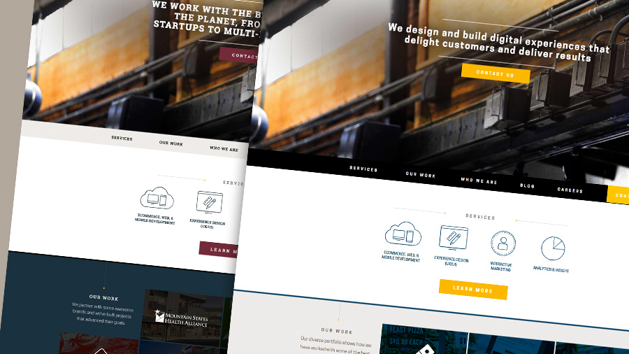
The image above illustrates the changes to default typography in the theming tool after changing the font and color variables.
To combat the design limitations imposed by this standardization, we gave our components multiple configuration options that can change their appearance dramatically.
Process
To further expedite the process, we created a generic template tenant site and a script to generate a new maven project that copies it. This template site is complete with its own style guide and the standardized variables mentioned above.
When we start a new tenant site, we first share the theming tool with the design team. While they're working on that, we use the script mentioned above to create the new site. Once the theming tool is ready, we copy the handful of stylesheets from it into this new site. With these two steps, we have a new site and its foundational styling complete and ready to preview in the style guide.
Results
While this is still very much an active work in progress, we’ve already noticed significant improvements in workflow and a reduction in development time. Because the style guide is synced with the codebase, as it was introduced into our workflow and populated with content, we started to have a common point of reference to use for code reviews and QA. Being able to test new components or code modifications here meant we didn’t have to spend additional time building a new page for testing. This was especially true in the early stages of a site when content authoring was just beginning.
The most striking improvement, however, can be seen when comparing the first tenant site developed with the theming tool and the one before it. Jira issues were reduced from 95 to eight and development time was reduced from three developers logging 710 hours collectively down to one developer logging 70 hours. That's what we call efficient!
Interested to Learn More?
Hear Steve speak about Multi-Tenant Components at the 2016 AEM Developer's premier event, CIRCUIT.
Thanks to Catrina Ahlbach, Brett Birschbach, Seth Dobbs, Robbie Forer, Paul Foster, Heather Gantz, Brian Langeland, Dan McClain, Ericka Seastrand, John Telford, Jamie Vonk, Brendan Walsh, and Leah Weyandt!