Free Data Studio Template: Ecommerce Edition
Our first free Data Studio template for Google Analytics focused on high-level metrics for a monthly overview of site performance. But if customers spend money on your site, you’ll want a report that highlights commerce metrics, too. We’re happy to help!
If you haven’t used Data Studio yet, allow me to introduce you to this new tool from Google. Data Studio makes it easy to create and share interactive reports with your colleagues, using data from one or more sources in the same report.
We’ve created a Data Studio commerce report that shows only data from Google Analytics, because it’s based on the free Google Analytics Demo Account. If you don’t have your own commerce data, the demo data lets you experiment and learn Data Studio with our free template.
Our Data Studio report for commerce adds a few new tricks to the overview template!
Get Our Free Data Studio Template
Step 1. Add Your Own Data Source or Use the Demo Account
Click the template button, but do not request access. Instead, add your own data source following Steps 1 through 8 for our Data Studio overview template. Or you can use the Google Analytics Demo Account as I did throughout this post. Read the linked article to get demo-account access if you don’t already have it.
Step 2. Check out the Sparklines!

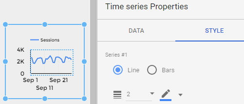
Data Studio comes with nine chart options. A sparkline isn’t one of them, so we created our own. Sparklines under each of our top row metrics give a quick snapshot of those trends for the past month. (See that mid-month spike? Better investigate!)
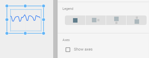
To create a sparkline, choose the Time Series chart option. On the Style tab, un-check “Show axes” and select “No Legend”. Re-size. It’s that simple!
Step 3. Try a Bar Chart with Two Axes
Our bar chart conveys a lot of information in one visual. Using two axes, you can easily compare the relationship of average order value vs. the number of transactions for two different groups. (Women buy less often, but spend 2X more per purchase!)
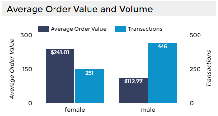
We’re comparing based on gender because the demo account has Demographic Reporting enabled in Google Analytics. But you can replace “female/male” in this chart with any dimension that has only a few values. For example, you could compare User Type (New vs. Returning). You could also use one of your own custom dimensions to define audiences for this purpose.
Click the Edit toggle at the top right of the report and then click the chart to see our bar chart options. On the Data tab, we added a second metric, and on the Style tab, we checked “Show data labels” and “Show axes” (Double). For both the left and right axis we checked “Show axis title”.
Step 4. Build a Table with Product Data
Product data in Google Analytics comes with its own special set of metrics. We’ve chosen to show Product Revenue and Quantity. (Water bottles are the most popular item, but notebooks make more money!)
You can also sort the table Product Revenue by clicking on that column header. (Try it and see which product made even more money than notebooks!)
If you have Enhanced Ecommerce data, you can add metrics like Buy-to-Detail Rate, which shows how often someone who viewed a product actually bought that product. Or you could change the Product dimension to Product Category, for a roll-up view of your product performance.
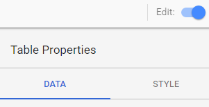
It’s easy to change the metrics and dimensions in Data Studio – make sure your Edit toggle is in Edit mode and then select a chart to change the options on the Data tab.
Step 5. Don’t Forget the Filters
We kept the filters from our original Data Studio template so you can explore your commerce data the same way! You can edit the filter options as well. Add another filter or revise an existing one.
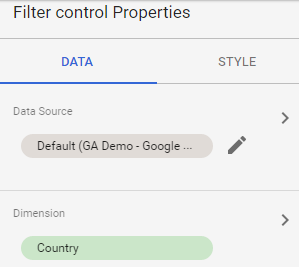
For example, you might want to create a filter based on a custom dimension. The Google Analytics Demo Account has a custom dimension for “Sales Region” which you can try with this template if you have access to the demo data. The screenshots below show how to change the Country filter to a filter for Sales Region – edit the Filter control properties and choose the custom dimension by searching the list.
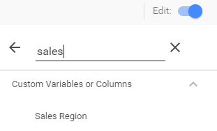
Search for your own custom dimensions and change the filters to make them more useful and relevant for your commerce reporting!
Stay tuned for more Data Studio goodness from Us!
We have lots more Data Studio ideas coming your way soon. And we’re always happy to hear from you about unique challenges or discoveries. Please share in the comments!


