Shared Component Properties
This feature extends the out-of-the-box (OOTB) component authoring capabilities of Adobe Experience Manager (AEM) to include fields that can be configured once per website rather than on every single instance of a given component. Added fields come in two flavors, shared properties that apply to all instances of a given component type, and global properties that span all components within a website. Shared Component Properties is the only tool in AEM that generically addresses the challenge of granular, shared properties within a component in a way that functions “natively” for both authors and developers.
Use Cases
Once a team starts leveraging Shared Component Properties (SCP), all sorts of use cases become apparent. It can be argued that this feature belongs as a core feature of the AEM platform.
Use cases for which we’ve found SCP particularly useful include:
- Authoring component labels such as “Share this page” or “Add to Favorites” that are used on hundreds of site pages
- Enabling default “read more” link text while also allowing local overrides
- Replacing all instances of hard-coded strings in the code (e.g. button labels), eliminating the need for a translation library in AEM
- Ensuring all instances of a component show the same content on a single site, but different across sites in a multi-site solution
- Configuring site header and footer without an inherited parsys (iparsys)
How to Use
1. Enable the Shared Component Properties OSGi Service
Enable back end support for SCP via a blank OSGi configuration of the `com.adobe.acs.commons.wcm.properties.shared.impl.SharedComponentPropertiesImpl` service, which you can deploy from your codebase as an empty `sling:OsgiConfig` node.
2. Enable the Shared Component Properties Authoring clientlib
Enable front end support for SCP by creating an empty client library in AEM within the `cq.authoring.editor` category that embeds `acs-commons.shared-component-properties` and includes an empty `js.txt` file.
3. Configure a Page Root Provider
Configure the ACS AEM Commons service for Page Root Provider, which allows AEM to keep SCP contextual to your website. This is done by adding an OSGi factory config for `com.adobe.acs.commons.wcm.impl.PageRootProviderConfig`. You can do this from the admin console in AEM, or using a config file from your codebase similar to step 1.
4. Add the Page Info Provider to Your Page Component
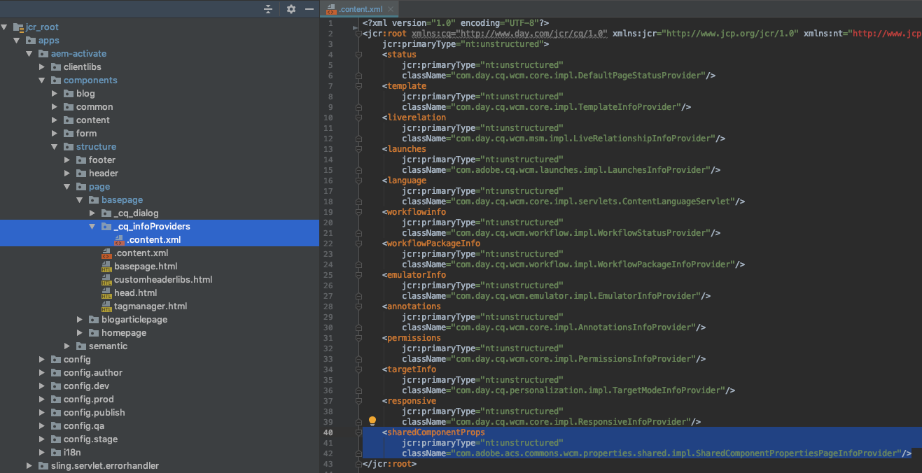
Add the SCP Page Info Provider `com.adobe.acs.commons.wcm.properties.shared.impl.SharedComponentPropertiesPageInfoProvider` to your base page component so that the authoring interface knows for which components to display icons to modify shared and/or global properties.
Tip: If you find the authoring interface is no longer working correctly after adding the SCP Page Info Provider, it could be that other `cq:infoProviders` are no longer inheriting from page supertypes. It’s a bug we’ve run into, and in that case, you can work around it by specifying all providers directly on your base page type.
5. Add a Shared And/Or Global Dialog to Your Component
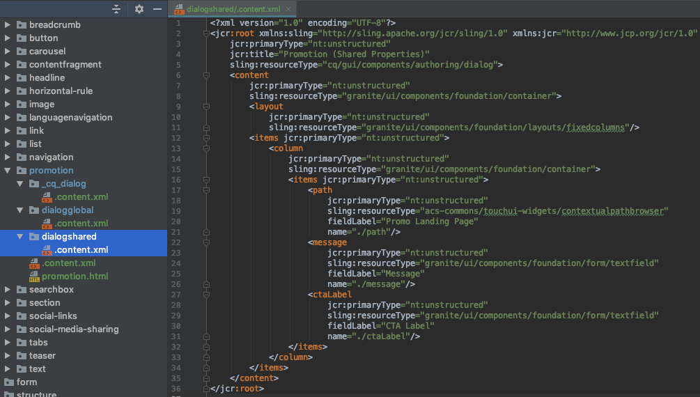
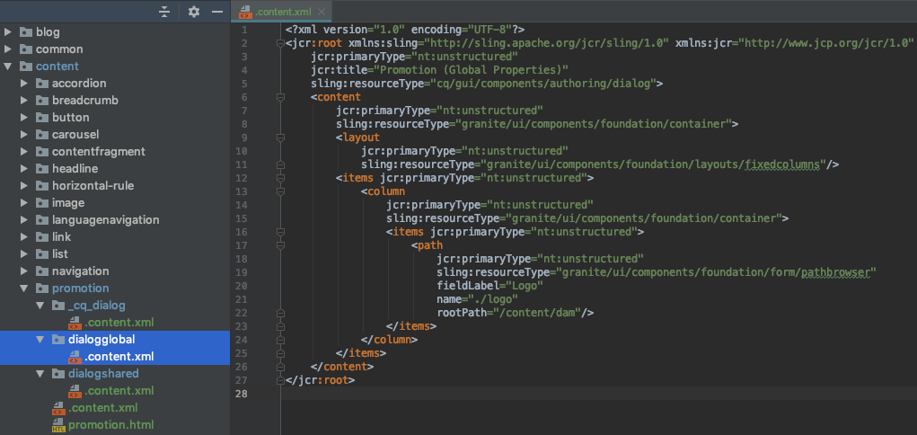
Having now enabled SCP in your AEM instance, add shared and/or global properties to your component by adding `dialogshared` and/or `dialogglobal` nodes to your component that are in every way similar to the standard `cq:dialog` node.
Example Dialog for Shared Properties:
Example Dialog for Global Properties:
These dialogs will be accessible to authors via icons in the standard authoring interface that they are already accustomed to.
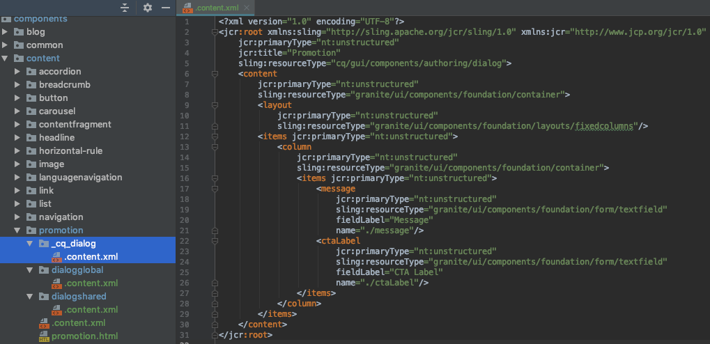
In addition, you can choose to include standard, instance-level properties via the usual `cq:dialog` node. A standard property is considered an override of a shared or global property when it shares the same `name`, allowing authors full flexibility of when to display a shared value versus a custom value.
6. (Recommended) Inject Shared/Global Properties Into Your Component Sling Model
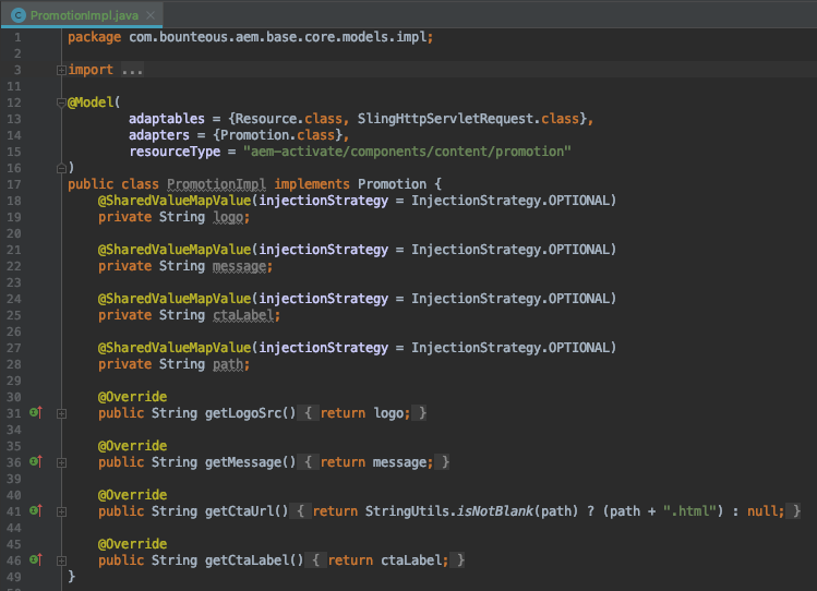
To access the values of shared and global properties for rendering the component, inject the properties into your component’s sling model using the `@SharedValueMapValue` injector from ACS AEM Commons, which is analogous to the `@ValueMapValue` injector from sling for standard properties.
Note that when injecting a property, values set at the instance level will automatically override those set at the shared or global levels.
7. Render Shared/Global Properties From Your Component HTL (Sightly) Code
Assuming you are using a sling model, render the shared and global properties into your HTML no different than standard properties. The fact that some properties are shared or global is abstracted away from the front end by the automatic injection in the sling model.
If you’re not using a sling model, however, don’t fret. You can still render shared and global properties directly from your HTL (or even JSP) code by accessing the `mergedProperties` map provided automatically by SCP.
Learn More
For a more extensive overview of the SCP, the story of how it came to be, and the use case behind the code example here, check out our original blog post on Shared Component Properties. You can also visit the official documentation for additional implementation guidance including troubleshooting.


