Using Averages To Identify Trends In Google Analytics Data

Humans are generally very good at spotting patterns in graphs. An often-used feature in Google Analytics is the timeline, which sits at the top of most reports within the interface and shows us how we are performing in some metric over time. However, without looking at the numbers, it may be difficult to see if our performance is actually where it should be.
So, what’s the problem with just using the timeline and looking at the performance over different date ranges? Well, there are many reasons why site traffic can change from month to month (read about them here). For example, a change in monthly traffic might be attributed to seasonality, the number of days in a month, or perhaps our new campaign is actually working! This makes a comparison between months misleading.
We can all admit that we’ve compared months before, we love to show our clients or boss the report with the green up arrow showing one month doing better than the last. March will always be a great report month, there are just straight up more days in the month – so generally all of our numbers look better!
A shorter time window often sees drops in numbers on the weekends only to peak again on Monday, so looking at data at a small-scale can make us lose sight of long-term trends. We don’t necessarily want to throw out any data when doing our analyses but want a way to lessen the impact of these fluctuations.
Your typical analysis over time doesn’t have to change dramatically, but let’s look at a useful way to visualize our data that also gives us additional insight into our performance. And let’s do it in an automated, easy way – that requires little effort to set up.
What About Averages?
A common first thought is to use averages. Comparing monthly averages would, however, still penalize months with fewer days. For many websites, we can even get more specific and say fewer business days.
We could compare our monthly averages with respect to our yearly average, but if our time series isn’t stationary, this might be a bad reference point to use. Or, we can look at daily values, but this could penalize weekends or holidays where website traffic dips. What we’re looking for is a happy medium; we want a nice way to visualize and compare data, that still makes some intuitive sense within our business calendar.
One solution is to use a calculation from the world of financial analysis: Moving Averages.
Keep Those Averages Moving!
I’m a mathematician, so I’ll try to describe everything while balancing the underlying math and the plain and simple results. Think of the averages in terms of a sliding window, always looking back a certain number of days.
A moving average is a series of averages taken on a moving subset of fixed length k of the full data set. Given a series of numbers, we consider a subset of fixed length and obtain the moving average by taking the average over only that subset of data. That subset of data is a sliding window that moves with every new data point.
For those of us that prefer formulas, a (simple) moving average ƤM is defined as
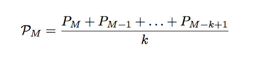
for a fixed positive integer k, where Pi , for day i ∈ {M – k + 1, …, M }, is the value of the daily metric we are interested in.
For example, to take the 10-day moving average (k = 10), we would sum up the past 10 days’ values (including that day), and divide by ten.
Benefits of Moving Averages
So why do we want to use moving averages? For a few reasons:
- Large fluctuations are “absorbed” by the previous k days, so moving averages smooth out our data.
- Moving averages are very easy to calculate, and we will provide a template for how to calculate moving averages with your Google Analytics data below.
- Moving averages are powerful visual tools, by allowing trends to appear in your data, while smoothing out outliers, and they may provide “resistance” and “support” to your data.
- They allow you to plot multiple graphs on top of each other, to compare short-, medium-, and long-term trends.
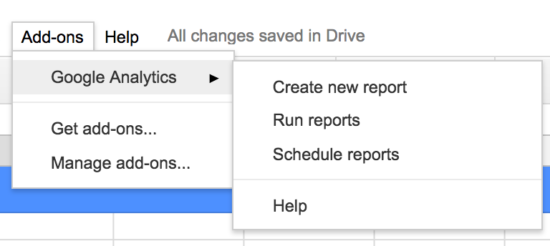
Unfortunately, these calculations are too complicated for calculated metrics in Google Analytics. A nice workaround is to use the Google Analytics Add-On in Google Sheets. There are a few different ways, but we will show a straight-forward way to calculate these moving averages, and make it easy for you to copy our work.
To see short-term trends, we traditionally use subsets up to 20 days in length. For medium-term trends, use subsets of length between 20 and 60 days, and for long-term trends, a subset of length above 60 days is used. These are just suggestions, and the subset lengths we want to use may vary based on what we’re interested in comparing, the amount of data we have, our industry, etc.
Getting the Data Into A Spreadsheet
First, we need to get our GA data into the spreadsheet. We will use the Google Analytics API Add-On to populate our spreadsheet (step-by-step instructions to install and use the add-on can be found here).
To make things easier, we’re providing a customizable Google Sheet that will calculate these moving averages. To get a copy of this sheet, click the button below. Choose the File menu option, then Make a Copy.
Once it’s in your drive, you’ll need to change a few items. Change the View ID on the Report Configuration sheet to that of our Google Analytics View. This can be found in your View Settings inside of the GA interface.
You’ll need to install the Google Analytics Sheets Add-On, using the Add-On menu. Now, you can run the report to update the report with your own info!
Looking at the Data
The data we are working with in this post is example data from a content website. Now that we have the report, we choose a metric that makes sense to plot with respect to time, in this case, we will choose Sessions. Our dimension should be “date”. When we create a new report, the configuration should look something like this:

Google report for the last 548 days, sorted in reverse chronological order.
Now we run the report from the Google Sheets Add-On menu option.
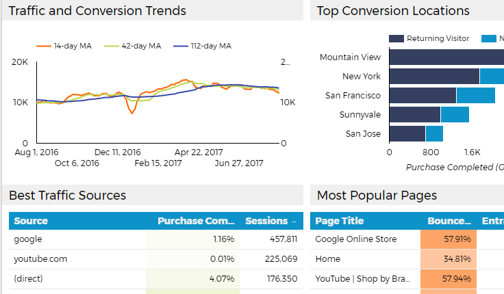
The data will populate the Moving Average sheet, and the report already provides three calculated columns (a 14-day, 42-day, and 112-day MA) in the Moving Average Calculation sheet. The calculation for cell M is done as follows (keeping in mind that our data is in reverse chronological order):
=SUM(“M th cell of data”: “(M+K-1)th cell of data”)/k
where we substitute our subset length for the k in the formula, within the appropriate column. Note that the last k cells for each column will be empty, since we do not have enough data to populate these cells with the moving average calculation.
To keep things neat, we removed these blank cells in the Moving Average Chart Data report. This isn’t required but makes it easier to compare the three graphs by having them start on the same date. There is a Moving Average Display sheet that provides one graph of the three moving averages, but we can create new charts in the Google Sheet as usual. Some additional graphs are shown in the next section below.
Note: Instead of doing this calculation in Google Sheets, we can alternatively create a custom moving average function in Google Sheets with a Google Script, which can be found here. Alternately, we can export our Google Sheet to Excel, which has a built-in moving average function option under their “Data” tab.
Moving Averages
Comparing the daily numbers to a 14-day moving average, we can already see the smoothing process that happens.
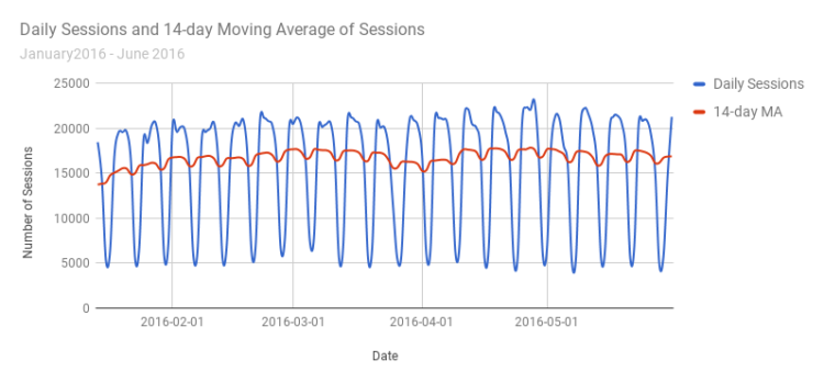
The 14-day moving average smooths out the valleys and peaks of the daily numbers.
One of the nice things previously mentioned about moving averages is that we can graph them on top of each other. This can help us determine the strength and direction of our metric’s momentum, by considering how they stack up in relation to one another. Strong upward momentum is seen when shorter-term averages are located above the longer-term averages and the averages are diverging. When the shorter-term averages are located below longer-term averages, the momentum is in the downward direction.
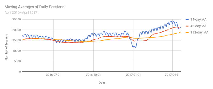
We can see the short-term moving average is usually above the longer-term averages in this graph, implying upward momentum.
When two shorter-term trend lines cross, it can be an indicator of a reversal of a trend, even temporary, or the start of a trend. We can see in the graph above that around the new year (2017-01-01), the blue line crosses the red line, indicating the start of a downward trend. Shortly after they cross again, signaling the end of this trend. In this case, we are analyzing the full year of data retroactively, but these moving averages can be done with real-time data, and these analyses can give us a heads-up on what trends are happening.
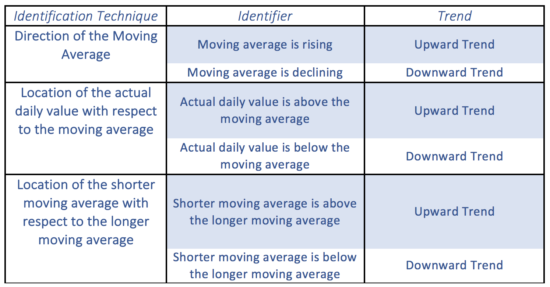
The following table gives graph indicators that imply a certain type of trend. Keep in mind that these moving averages are used to analyze trends in the data that we already have, and are not (yet) meant to make predictions about future data. It is also important to note that any mathematical model has some set of assumptions. Thus, for our interpretations to be meaningful, we need to be sure that our data is clean and that we are using metrics suitable for analysis. Further research on moving averages, how to use them, and when to use them, is strongly encouraged.
Putting These Tips To Use
What we’ve demonstrated here is a Simple Moving Average. There are different types of moving averages, including cumulative, exponential, and weighted moving averages, where, for example, we can add weights to certain terms in our sum. These moving average models allow us to do further analysis of our performance, and predict future growth or decay. But that is a topic for another blog post.
I doubt we’ll see Moving Averages replace Month-Over-Month reporting in dashboards around the world, however, it’s worth discussing the inherent flaws. With Moving Averages, we can fix many of those flaws, though we’re still susceptible to large spikes or dips in traffic.
Play around with the Google Sheet that I’ve shared and see how you can incorporate that into your reporting. With the Google Analytics Sheets Add-On, you can schedule your GA data to update every day, so this report continues to provide valuable insight to your data.
Also for another day – consider how easy it is to now add this type of information into a Data Studio report with the native Sheets connector.
You can tweak the report by changing the date ranges, metrics, moving-average lengths, etc. For the ambitious, explore the formulas and structure of the report and adjust to your heart’s content!