Enhancing Your Data Studio Report With Calculated Fields

If inconsistent naming conventions, frustration with retroactive data, or custom organizational acronyms are keeping you up at night, calculated fields in Google Data Studio may be just the solution you’re looking for!
Have you ever reconfigured a dimension in Google Analytics (perhaps a content group or an event category), only to find that your changes weren’t applied retroactively? Maybe you’ve inherited a website and uncovered poorly formatted UTM parameters. Perhaps you’re interested in ratios instead of exact numeric values, but you can’t find exactly what you need within the GA interface. When you’re looking to clean up your reporting and make things easier to understand, think Google Data Studio.
What is Google Data Studio?
What is Google Data Studio, you ask? If you haven’t read our previous post on visualizing your data with Google Data Studio, head over there first to learn the ins and outs of the tool – but please do come back. We’ll be reviewing calculated fields, custom filters, and providing a few reporting examples and scenarios that we hope will be relevant for your organization!
What are Calculated Fields?
A calculated field within Data Studio is a user-generated dimension or metric. Calculated fields should be used when you are unable to answer questions with the available fields associated with the data set. Why? Creating a calculated field is essentially the process of developing new metrics or dimensions from your existing data source.
Calculated fields come in a few basic forms, including:
- Arithmetic: addition, subtraction, multiplication and division
- Mathematical Formulas: Examples include REGEXP_MATCH(), POWER(), MIN(), MAX(), SUM()
- Data Transformation: Convert your data to text, numerical values, or even dates. Use functions like LOWER() to standardize text. Re-name fields according to company acronyms, or add unique identifiers.
- Logical Comparisons: Utilize branching, IF/ELSE or CASE/WHEN statements within your data to apply categorical connections
Why Should I Use Calculated Fields?
Calculated fields help you answer custom strategic questions for which existing dimensions simply aren’t meant.
Using the logic outlined above, let’s pick an example. You may be interested in understanding the ratio of New Users to Existing Users. Perhaps you want to understand how this ratio has changed over time by comparing the percentage to the previous year. Guess what, a calculated field can help you here! While this may not exist within your available data fields, you have all the components that you need.
The best part? Anything we create using the calculated fields tools within Data Studio can be inserted into our visualizations just like the pre-populated dimensions or metrics. That means that in most scenarios, a calculated field can interact with a standard date dimension, session metric, or goal conversion completion, giving you more control over how your data is reported and presented. You can even use a calculated field within another calculated field.
Now that we’ve covered a bit about why calculated fields are so awesome, let’s connect to our data set and work on the New User Ratio example outlined above.
Prepping the Data
After you hook up your data source to the Data Studio report (we’ll be using data from Google Analytics in this blog post, but you can use the formulas we’ll walk through on any imported data), you’ll be given immediate access to the available fields within your Analytics view.
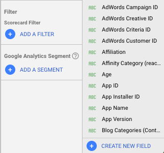
To see what’s available, we’ll need to insert a chart type or table using the top navigation bar. This will essentially ping the dataset and allow you to explore existing fields. In this example, we will insert a table.
Once we’ve drawn the table or graph, a right-hand navigation side bar containing two tabs (Data and Style) will appear with pre-populated dimensions and metrics. Take a few moments to explore what’s already available in the tool prior to creating any custom calculated fields. We’ll need to have a few initial metrics handy for manipulation, otherwise, we will run out of metrics or dimensions to calculate!
Once you’re ready, click on the blue “Create New Field” button located in the bottom right-hand corner of the interface.
Example: Calculated Metrics Using Arithmetic
Back to the New Users Ratio comparison problem that we posed above. After we’ve clicked the “Create New Field” button, a console will appear at the bottom of the screen prompting us for the Field Name, Field ID, and Formula. It is important to name these fields in a manner that makes sense to you and your organization so that your team will be able to find the fields for later use. Additionally, we recommend including portions of the data transformation within the name if possible.
In this case, we are building a ratio from the New User field, so I’ve named the field “New User Ratio.” I’ve also updated the Field ID to match my new naming conventions.
Creating the Calculated Metric
Okay, so here’s the fun part: that formula console! This section of the console is where we will be placing our logic. For this first example, we’re going to simply use the already existing “New Users” metric, and divide by total “Users.” Here’s a screenshot of this magic:

Click the blue save button and navigate back to the main canvas.
Using the Metric Within a Visualization
Select your chart or table again if the visualization is no longer selected. This should prompt the right hand navigation to appear once more. Next, we’ll search for the newly created metric in the available fields “type to search” box. We’ll simply select the “New User Ratio” metric, and drag the value to the left hand of the navigation pane. You should see something similar to the representation below when you’ve completed this step:

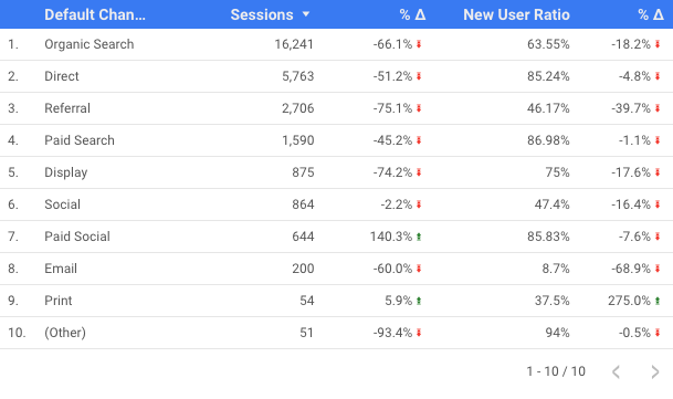
Voila! Now we have the ratio of new users who have visited our site, grouped by default channel.
But wait, your leadership team wants to see this as a percentage? No problem. Just click on the “123” next to the New User Ratio metric, and select the Type “Percent.”
One more thing: to compare this metric to the previous period or year, navigate to the “Default Date Range” section of the right-hand pane, and select “Previous Period” or “Previous Year” (depending on your analysis objectives). This will create a new column that will visualize the difference in sessions and the new user ratio we’ve just created compared to the selected period. Pretty nifty, right?
If you’ve followed along with these steps, your table should look something like this:
If you made it this far, congratulations! You’ve just successfully created your first calculated field! Ready for something a little more advanced? Let’s dive into formulas and logical comparisons.
EXAMPLE: Calculated Dimensions Using CASE()
The CASE statement is one of the most powerful operators because it can be used to manipulate both dimensions and metrics. Example scenarios where CASE statements may be useful include grouping a sales territory into a new region, creating page path or event funnels, and even recreating content groupings. The best part? Unlike in Google Analytics, these new dimensions or metrics can be applied to retroactive data – yippee!
Developing a Purchasing Funnel
Let’s walk through a quick example utilizing page paths, where each page path level represents a portion of signing up for a good or service.
In this example, our leadership team is interested in determining how many of our users purchased a ticket for our concert series. But they don’t simply what the numerical answer, because that doesn’t allow for any strategic reaction! They are also interested in understanding where users start to drop off in the purchasing process so that the company can adjust their processes & website to increase purchases.
Why Do We Need a Calculated Field Here?
We could simply use a filter within Data Studio, and select only the page paths that we are interested in. However, that won’t help the recipient of the report understand the purchasing journey. But why? Because Data Studio constricts our sorting options – within the tool, we are able to:
- Sort by ascending or descending metric
- Sort alphabetically
Neither of these options will help paint the picture of the purchasing funnel with our current data. The solution? You guessed it – a calculated field.
To do this, we’ll group the pages that a user has visited based on our understanding of the purchase process. We’ll also rename the fields, and order the fields using a numerical index so that the visualization makes sense to our leadership team.
The CASE() Syntax
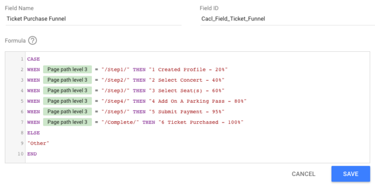
Following the same steps as we used with the New Users Ratio example above, we’ll make our way back to the calculated field console. We’ve named our calculated field “Ticket Purchase Funnel”, and began our analysis of the CASE() formula:
CASE
WHEN Page path level 3 = "/Step1/" THEN "1 Created Profile - 20%"
WHEN Page path level 3 = "/Step2/" THEN "2 Select Concert - 40%"
WHEN Page path level 3 = "/Step3/" THEN "3 Select Seat(s) - 60%"
WHEN Page path level 3 = "/Step4/" THEN "4 Add On A Parking Pass - 80%"
WHEN Page path level 3 = "/Step5/" THEN "5 Submit Payment - 95%"
WHEN Page path level 3 = "/Complete/" THEN "6 Ticket Purchased - 100%"
ELSE
"Other"
END
Note: you will have to understand the page path and page path levels associated with the purchasing steps to be able to successfully utilize the CASE() formula in this example. If you do not have this information handy, go grab it! One way to do so is to walk through the purchasing path on your own website and jot down the unique pages along the way.
Here’s how this expression looks in our console:
When you’re satisfied with your logic. Click “Save”.
A Few Notes on Syntax
The CASE() statement uses a blanket ELSE() clause which applies a default result if the page path isn’t located within your conditions. A CASE Statement can only have 1 ELSE clause – so try to capture the scenarios you need utilizing the WHEN clause.
Additionally, CASE statements work with a variety of operators, including AND, OR, equal to =, not equal to !=, greater than >, greater than or equal to >=, less than <, less than or equal to <=. You aren’t limited to what we’ve shown above, so get creative!
Visualizing our Purchasing Funnel
To see what beauty and wonder that we’ve just created with a few simple commands, we’ll insert a bar chart into our canvas. To do this, we’ve created a new bar chart from the top navigation pane. Once the chart is highlighted on our canvas, we search for the newly created dimension “Ticket Purchase Funnel,” and move the field into the chart dimension section.
Next, we select our metric of interest, and any other data formats we’d like. Moving on to the “Style” tab, we choose the number of bars that we wish to see by selecting a numerical value from the “Bars” drop down. In this case, I’m not interested in “Other” page paths, so I’ve selected 6.
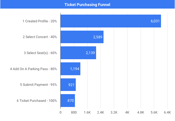
Finally, we sort the chart by Ascending “Ticket Purchase Funnel.” If you’ve followed along with the steps outlined above you should see a similar result as the purchasing funnel below:
Why is this Useful?
By working with a calculated field, we’ve transformed our data into actionable insights! How? Individuals within your company who do not have a working knowledge of your website structure will be able to immediately see the key points: 870 sessions resulted in a purchased ticket or just over 14% of those who create a profile purchase a ticket to our show. They’ll also be able to understand the metrics themselves, because “Select Seat(s) – 60%” is a lot more informative than “/Step3/”!
Now that we’ve formatted the data, we can also see that after a visitor creates a profile, there’s a significant drop off for people who end up selecting a concert. Perhaps we may need to adjust the interface to make this more seamless for our customers. Or, perhaps the profile creation process is so grueling, people quit halfway!
Remember: data is only as useful as the insights we generate from it, so make sure that you are using calculated fields to get you to those answers!
One More Example: The Content Group!
Content Groupings are a feature in Google Analytics that allows you to classify your pages into groups or categories. These can be implemented directly in Google Analytics using Regular Expressions or general logical commands. They are a great tool for reporting, and we love them because there’s no code or GTM required.
My colleagues have written about the wonders of content groups before. If you are interested in learning more, peruse the following resources:
- Classify your Blog Posts in Analytics Using Content
- Groupings Content Groupings vs Custom Dimensions
- Making URLs Better Through Content Grouping in Google Analytics
BUT, as we mentioned before, Content Groupings aren’t retroactive. So if you want to report on last month’s blog pages using internally developed Content Groupings, but you didn’t implement the Groupings until yesterday, you’re out of luck… or are you?
This is where Calculated fields can come into play!
This example is relatively similar to our last task for understanding the ticket purchasing funnel, so we’ll skip right to the code.
Recreating Content Groupings for Sections of Our Site
In this scenario, we’ll stick with the CASE() statement, but we’ll add the REGEXP_MATCH formula, which allows us to group numerous page paths together using Regular Expressions.
Let’s assume that I’ve already grouped our Homepage, About pages, FAQ and Contact pages, Blog Pages, Press, Profile Login Pages, and Ticket Purchase pages into Content Groups within Google Analytics. My goal is to replicate these content groups within Data Studio so that I’m able to look at historical data in the same manner.
Using the same logic that I’ve already built, I can recreate the content groupings in the following statement:
CASE
WHEN REGEXP_MATCH(Page, "(^/$|/home$)") THEN "Homepage"
WHEN REGEXP_MATCH(Page, "(/contact.*|/faq.*)") THEN "Contact"
WHEN REGEXP_MATCH(Page, "/gifts.*") THEN "Blog"
WHEN REGEXP_MATCH(Page, "(/about.*|/jobs.*)") THEN "About"
WHEN REGEXP_MATCH(Page, "(^/login/profile|/login$|/login/home)") THEN "Profile Login"
WHEN REGEXP_MATCH(Page, "(.*/step.*|/complete/)") THEN "Ticket Purchase Pages"
WHEN REGEXP_MATCH(Page, "(/press.*)") THEN "Press Releases"
ELSE "Other"
END
Note*: If you haven’t created content groups within GA, that’s fine too! Because Data Studio is not connected to the reporting functionality in GA, this formula works either way.
Visualizing our Content Groups
Let’s put our newly updated content groups into a pie chart to get a quick visualization of our data. The dimension will be “Content Groups Main Pages” and the Metric will be “Sessions.”
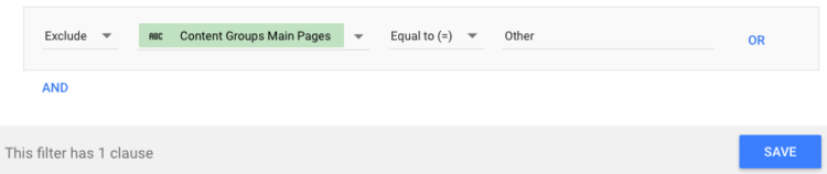
Just like we did in our ticket purchasing example, I’m going to filter out “Other” page paths because I’m just not that interested in them. This time, however, we’re going to use a custom filter.
We can create a custom filter by clicking the “Add Filter” blue link at the bottom of the right hand pane. The filter can be reused in other charts as well, so we’ll need to remember to be consistent in our naming conventions. Since I’m excluding “Other” from my content group, I’ve named the filter “Exclude Other From Content Groups” saved the changes.
Now for the fun part – let’s check out our pie chart and take a look at what we can interpret from our Content Groups:
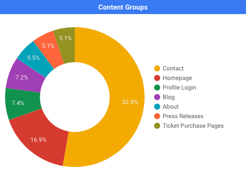
With this visualization, we are able to determine that many of our visits are heading to the contact pages. Why might that be? Maybe our contact page holds valuable information that should be moved elsewhere to make it easier for the user to access. What might this mean? Maybe we really do need to work on our ticket sales user interface! We also can see that our Press Release page isn’t getting much love from our viewers. Let’s change that by writing about more relevant content!
Again, make sure that you are creating calculated fields that help answer questions, provoke new questions, and drive insights.
Let’s Recap
Calculated fields are great! But they can be a little treacherous too. Be sure to validate your data within Google Analytics, and ensure that your formulas are working as you expect!
In addition to what we’ve talked about earlier, keep these tidbits in mind when working with calculated fields:
- Calculated fields can be applied to retroactive GA data (woo!)
- Calculated fields can be utilized WITHIN additional calculated fields (yay!)
- You can apply filters to calculated fields (awesome!)
- Calculated fields can allow you to rename and group poorly named dimensions (fist pump!)
- You can’t mix dimensions and metrics in WHEN conditions (darn!)
And so, calculated fields are another way to make the data more informative and insightful when using Data Studio.
We’ve merely scratched the surface on the possible options with calculated fields in this post, so get out there and calculate! If you have any tips or tricks that you stumble across along the way, feel free to post in the comments for others to learn from!