Visualizing Google Analytics Campaign Data In Tableau
Context is everything if you want to present your data accurately, and Tableau charts can help gain a better view of your Google Analytics campaign data. Improve a basic chart with features that guide your viewers and add context to help them see the big picture!
Got Categories? Get Bars
Bar charts are one of the best ways to visualize and compare data for members of a category. You can see at a glance which bars are largest or smallest, and differences are easy to grasp.
First, choose a category. Decide what each bar will represent. Do you want to compare the performance of Campaign A vs. Campaign B vs. Campaign C? Your chart could show a high-level view where the bars = Campaign Names.
For a more detailed view, choose a different category. Have the bars = Keywords, or something like Ad Groups or Ad Content.
Next, choose a metric – like Click-Through Rate (CTR). The length of the bars = the value of the metric. In this case, a longer bar = higher CTR = better performance.

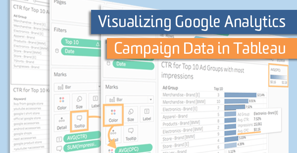
The example above shows the CTR for Ad Groups – from demo data for the Google Merchandise Store. Two features enhance the bar chart:
- Sorting – puts the best CTR on top
- Data Labels – show the CTR values
Improvement #1: Focus on the Top 10
The example chart has room for improvement. What if the best CTR is for an Ad Group that only had a few Impressions or Clicks? Since CTR = Clicks / Impressions, 100% CTR could come from 5 Clicks out of 5 Impressions.
Another Ad Group might have only 10% CTR, but it could come from 5,000 clicks out of 50,000 Impressions! You don’t want to lose sight of that Ad Group. How can you fix this?
Ratios need weight – specifically the weight of the denominator. Which Ad Groups had the most potential for a meaningful CTR? The ones with the biggest denominators, i.e. the most Impressions.

By focusing on the Top 10 Ad Groups with the most Impressions, the chart shows CTRs you should care about. Two added features include:
- Top 10 Column – ranks each Ad Group by number of Impressions
- Tooltips – show the number of Impressions when you hover
Improvement #2: What Does it Cost?
Now you might ask, “Is that CTR really as good as it appears?” How much did it cost to get there? Was there another Ad Group with a similar CTR that cost a lot less?
The chart already shows Ad Groups with the most Impressions (Top 10 Column) and the best CTRs (longest bars). There’s at least one more feature you can add to the bar chart to show how much the Ad Groups cost – and that’s color intensity or hue.
Use hue to show a third metric like Cost per Click (CPC). Make each bar lighter or darker according to its value. You’ll want to make the better values darker because the more intense hues draw your attention.

In this example, the lower cost is the better value and has a darker color. Two more features to consider:
- Include a Legend – to show the range of CPC values
- Tooltips – show the CPC for each Ad Group when you hover
Improvement #3: Explain Why
Why did certain Ad Groups have lots of Impressions or good CTR or low CPC? If possible, your visualization should show some of the factors that contributed to good performance.
Figure out where those contributing factors may be hiding, and then you can add the details to the chart. Here are some ideas:
- Add Another Chart – to show Keywords with good CTR or low CPC
- Filter – to show Keywords related to one Ad Group at a time
- Use Text – to note business events that may have influenced the data

Place the two charts together on a dashboard in Tableau, to keep Ad Group data in view while pulling up contributing Keywords. And don’t hesitate to type a sentence or two, especially if you can explain how external events (not in the data) may be relevant!
Taking it Further
You’ve seen an example showing CTR and CPC for the Top 10 Ad Groups (or Keywords) with the most Impressions. But you can do the same kind of bar chart for many other metrics, including:
- CTR and CPC for the Top 10 Ad Groups with the most Revenue
- CPC and ROAS (Return on Ad Spend) for the Top 10 Ad Groups with the most Revenue
- CPC and Conversion Rate for the Top 10 Ad Groups with the most Sessions
Note that you can apply the “Top 10” concept to any metrics that have ratios. Conversion Rate, Bounce Rate, Average Order Value, and so forth, all can be made more meaningful by focusing on the biggest denominators.
Substitute any category of campaign data in these examples – Ad Groups, Keywords, Campaign Names, or any attribute you’ve targeted and tracked.
Use all the features at your disposal in Tableau and fully visualize your campaign data!