Seeing Causality In Google Analytics Data
Companies should be making constant tweaks to their businesses to get better, whether it’s a new marketing campaign or website redesign. And ultimately, we want to know whether or not these changes have an impact on their goals – does the new landing page drive more email signups? How about articles read? Has the PPC campaign increased transactions?
Answering these types of questions is not quite as simple as pulling numbers. We can’t just look at a snapshot in time; we have to put our data into context if we want to learn about the causal relationship between the changes and the numbers.
What Is Causality?
Causality is a phenomenon through which one thing (the cause), under certain conditions, gives rise to or causes something else (the effect). However, there is a difference between “after this” and “because of this.” Thus it is important that when we study causality, we actually try and measure the influence of changes analytically.
How do we know that our new campaign is responsible for an increase in new customers? Can we be sure that our new checkout process redesign is responsible for more funnel dropouts? We’ve all heard the phrase “correlation is not causation” enough times that we don’t need to be reminded with an example. Rather I’d like to discuss some methods available to actually measure the impact of our marketing or design efforts.
Why Is It so Hard to Track?
When making changes in the real world, it is hard to account for all the different variables. Confounding variables such as seasonality, selection bias, geography, and many more, can make numbers imply one thing when the reality is different.
There are also other consequences of a new campaign or promotion, such as cannibalization or halo effects. Cannibalization is when the increase in one “thing” decreases a related “thing.” An example of this could be your PPC ad campaign is increasing paid traffic, but is decreasing (cannibalizing) your organic traffic. This example situation is sub-optimal because you are now paying for traffic that you were already getting organically.
On the other hand, a halo effect, is when the increase in one thing increases a related thing. For example, having a promotion on shampoo can also increase the sales of (non-discounted) conditioner. There are usually intricate relationships at play, and we want to be able to control as many of them as possible, to get clear answers.
What Can We Do?
Whenever a change is made, we want to think about how we are going to see the effects. It’s important to treat these changes like experiments. Ideally, we would love to have a control group. A control group is a group in an experiment that does not receive “treatment,” and is then used as a benchmark to measure how the test subjects (the group that received the treatment) do. We would have only one change made (for example, change the wording on a CTA button or change the colors on a banner), and have a measurable goal in mind. Do we want to see increased purchases? Do we want a higher average time on page?
Essentially, we need to determine what our response variable is going to be.
Controlled Experiments
In a controlled experiment, we have a random sample of participants that see or experience a new version that we want to test, and everyone else experiences the old version with no changes. The participants who did not see the change are considered the control group, and serve as a baseline in order for us to make a comparison.
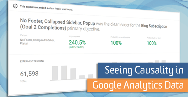
Google Optimize is a great tool to use in these cases. Read the following blog post for more on why you should run A/B tests:
Published: April 29, 2016
Google Optimize is a WYSIWYG editor that lets us run experiments on our websites and integrates natively with Google Analytics. Using Google Optimize, we get to try out design changes on our website and select a percentage of users who come to our website on whom to test the change. It then gives us feedback on which A/B variation is performing better with respect to a pre-selected goal.

Once enough data is collected, Google will determine which A/B version is the winner.
Since the Optimize change is the only thing that is different between the experiment and control group, we can say scientifically that any change to our goals was caused by that change. Note that you will have to run the experiment for as long as it takes to get enough data, in order for a result to be statistically significant.
With Optimize 360, we can target specific audiences, and try multivariate tests instead of just A/B test. It’s important that our test and control group come from the same population of users, to avoid selection bias or other confounding factors.
Data Science Solutions
Sometimes, a randomized controlled experiment is not an option. Maybe we’ve changed our entire checkout process. Maybe we’ve added pictures to some subset of our product detail pages, and we want to see the effect they’ve had on total transactions. Or maybe we’ve made a redesign to one of our international websites. With a measurable goal in mind, we want to see how these changes have impacted the goal. In such cases, we need to dive into some data science solutions to do a causal analysis.
The basic idea behind these models is that we use historical data as training data, forecast (predict) what we would expect to see if no change had occurred, and then compare it to what actually occurred with the change.
We can use a data science tool such as R or Python for these analyses and import our data either from BigQuery or Google Analytics (read more about data imports and exports here).
Published: June 2, 2016
Forecasting
Forecasting should be used when we have no control or comparison group. It is a good option for site-wide changes. It uses time series data, that is, data taken at regular intervals (daily, weekly, monthly, etc), to run the analysis. For a single-variable time series data, we could import daily total transactions, and then we use the “forecast” package to help analyze the data before the change occurred.
Once the data is analyzed, it gives a prediction, within a confidence interval (usually 95%), of what it would expect the future data points to be. Plotting the actual observed data on top of the predicted interval shows whether or not the change has had a significant impact.
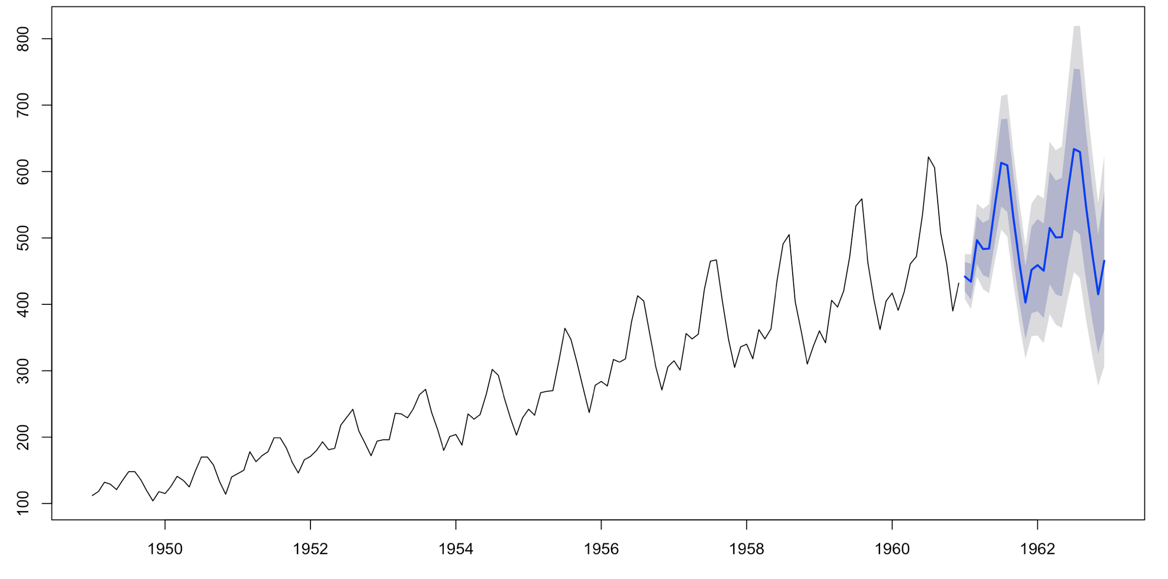
The gray area represents the 95% confidence interval. Notice that as we get further away from the historical data, the range of the confidence interval grows.
Causal Impact
This method is good for measuring changes that only a subset of our users encounter. Causal Impact considers the difference in historic patterns between the test and control groups and uses that difference to determine whether or not a measurable effect has been observed with the change. This implies that the control group needs to be somewhat similar or correlated to your test group. For example, if we’ve redesigned our Canadian website, but not our US or Mexican websites, then the web data from the Canadian site would be the test data, and the US and Mexican website data would be our control. (Notice how this is different from a controlled experiment!)
In a causal impact analysis, we define a predictive variable (our control group), a response variable (our test group), a pre-period (the historical data before the change occurred), and a post-period (starting at the time your change occurred). The CausalImpact R package can then produce a few graphs and a summary of the analysis. See this article on the CausalImpact R package. An analysis produced with example data is shown below, where the change occurred at 70 on the x-axis.
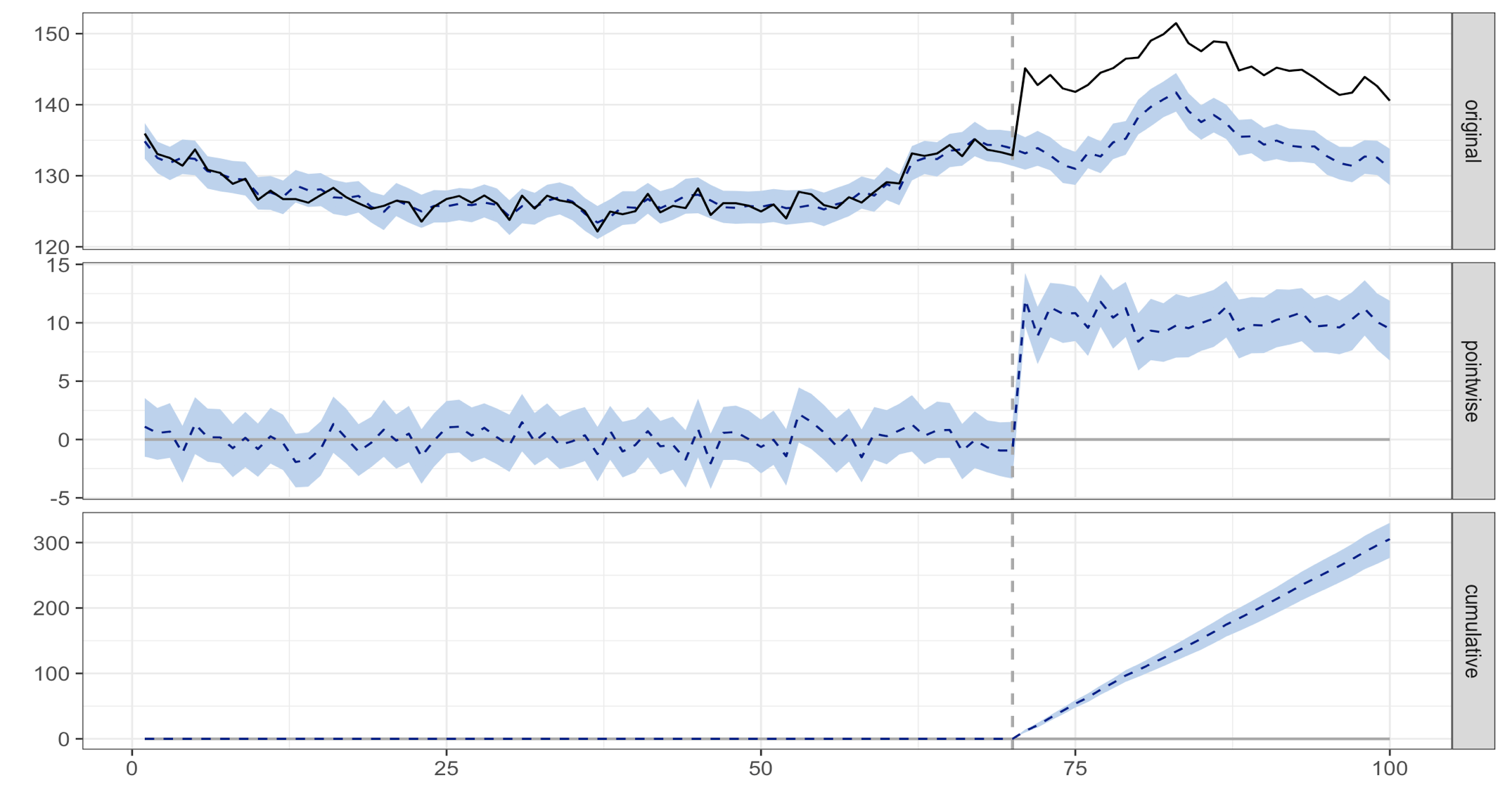
The first panel shows the data and a counterfactual prediction for the post-treatment period. The second panel shows the difference between observed data and counterfactual predictions. This is the pointwise causal effect, as estimated by the model.
The third panel adds up the pointwise contributions from the second panel, resulting in a plot of the cumulative effect of the intervention. There are many R and Python packages to do forecasting and causal impact models.
Using a large amount of historical data is important because it can catch seasonal and other long-term trends, and take those into account when doing the statistical analysis. However, it is more important that we are feeding our model reliable data, and that our goal has been tracked consistently throughout that time.
These methods should help us analyze any changes or experiments that have been made and also help us think about how we can test any future changes that we make to our websites.