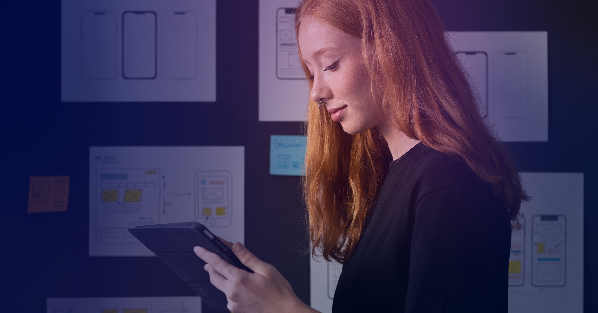
Designing “Hello”: Evoking Emotion‑Driven Moments that Lead to Positive Brand Experiences
Hi. Hello.
Introductions are ephemeral, emotion-driven moments. When you are introduced to a new person, do you have a feeling of attraction, confusion, surprise? Whatever the emotion, it sets the path for further connection; and if that interaction is negative, then work is needed to correct it.
Products and services have these “Hello,” moments as well. When you visit a website, put a battery into an electronic, or open a piece of packaging for the first time, you are experiencing an introduction. When created thoughtfully, these initial touchpoints can electrify and surprise a person, opening up the possibilities. When done haphazardly, these moments can also confuse, disorient, and frustrate a person. Unfortunately, it is very difficult to recover from a bad first impression. Like most of design, some extra time and love upfront can save a lot of complexity (and money) in the future.
Taking a page from the hospitality industry’s book
Before I worked in design, I worked in restaurants. Because of this, I’m going to use a café as a metaphor to illustrate some possible “hello,” moments. I’ll then draw comparisons to various states of the luxury e-tailer Farfetch’s* homepage in order to ground these concepts in a digital design.
*For the record, I’ve chosen Farfetch because they are a company actively investing in data and design, and doing some pretty cool things.
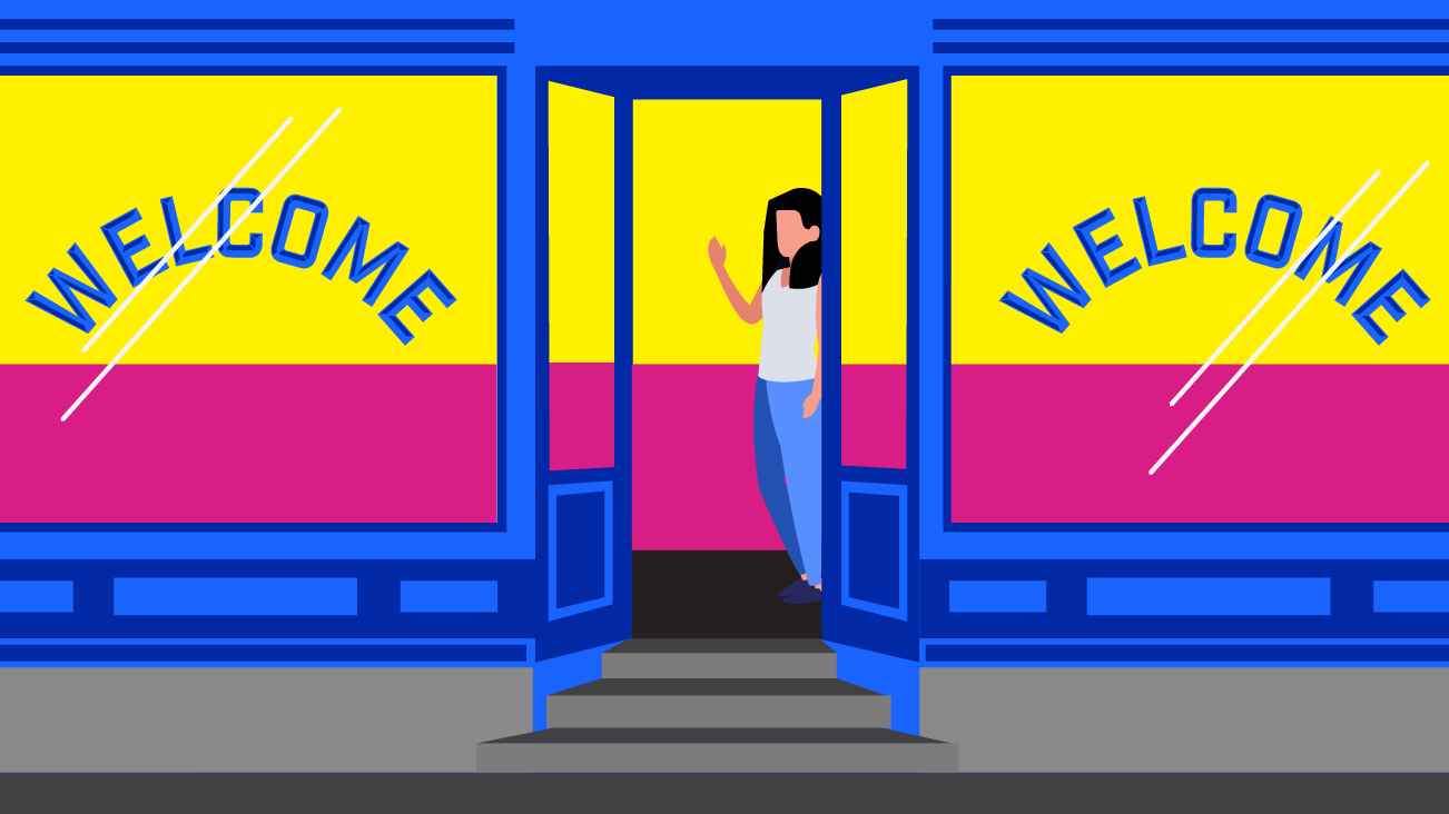
There are many ways to say hello. I’m a huge fan of contextual introductions. Let’s say there are three scenarios of you walking into this Café:
1) In the first scenario, this is your first time in this café.
Service response: Someone greets you right away and tells you to take a seat wherever you would like.

This is the null state of Farfetch. When you first arrive, you are given a simplified version of the global navigation prompting you to select Women’s, Men’s, or Kids’ clothing as you proceed. The page above mimics this by presenting two image modules (omitting the category “Kids,” presumably due to significantly lower amount of traffic). At the top of the page is the simple directional text, “Please select a gender to shop.” The simplified version of the site allows the user to focus on key tasks instead of looking at twenty or so different actions and having to discern where to start.
2) In the second scenario, you have been to this Café and the hostess recognizes you.
Service response: You are welcomed back and asked if you would like to sit at the bar again.

Upon returning to the site, based on your previous visit, you open to the section of which you were browsing. For me, it opened up the Men’s section of the site. Nothing revolutionary here. It is simply tracking a cookie and welcoming back where I left off.
3) In the third scenario, you are a regular at this café.
Service response: The host greets you by name, asks how you are doing today, then gestures to the bar where you normally sit.

If you have shopped on Farfetch, you have created a profile and, upon returning, you will be presented with your name, preferences, and wish list. There is even an area to update your preferences to include designers you are particularly interested in. I don’t see any personalization on my homepage experience in terms of what content they are serving to me, but I would bet that this is coming or is already in the works for specific designers.
Instead of showing the same screenshot as example two, I’ve decided to show a screenshot of the wishlist which is easily accessible from the home page as it demonstrates combining your personal profile with items you have yet to purchase. My assumption is that there is something psychologically powerful about putting wishlist items directly under a user's name. It designs a small moment of ownership which could absolutely be a factor in whether or not a user purchases an item.
What are your initial touchpoints?
There are numerous ways to say “hello” in a service experience. In the case of Farfetch, they are creating a contextual experience that has the possibility for all kinds of personalization in the future. Because I spent my formative years in hospitality, I always think in terms of how something I design digitally would translate to a real-world experience. When I think of initial touchpoints, I think of my training to smile, welcome a customer in, and reassure them that they will be taken care of while here.
And,
Now It’s Your Turn - Design for a Library
Because I love to work off of a prompt, I’ll leave a design exercise below for anybody who is so inclined. Examining initial touchpoints is important to go through for your own organization, but can be helpful to practice with other companies. For today, let’s practice with a local organization - or feel free to choose any business you wish.
- Choose your local library or another community organization
- Put yourself in the role of the three profiles we covered above:
- New user
- Return user
- Active user
- Using the examples from the article above, create three different iterations of initial touchpoints.
- Were there different experiences for different types of users?
- How could the experience be improved?
- What was the experience missing?
- Looking for a deep dive? Check out this great resource from Capital One on Service Blueprinting.