Audit Your Drupal Theme

Drupal themes can become a beast. Over time, features get added and new patterns get introduced. Tight deadlines may also cause you to make inefficient decisions with the desire to one day go back and refactor. There are also times you will inherit a project built by another team and need to understand how to add on and reduce duplication. How do you size up a theme to ensure you are efficient and not growing out of proportion?
In this article, we will explore tools and methodologies that provide insight to keep your Drupal theme manageable over time. We also introduce concepts to establish metrics within your theme to keep a pulse on how it grows over time.
Specifically, we will cover how to:
- Analyze your theme’s structure and size;
- Use CSS analysis tools Project Wallace and Parker;
- Place metrics within your theme.
Analyze Your Drupal Theme
When sizing up your theme, there are a few files in your theme directory I suggest you inspect to give you a good idea of the theme you are working with. In our examples, we will assume you are theming in Drupal 8.
First, locate the .info.yml file in your project’s theme folder. As you inspect this file, you can find out important information that will tell you the type of theme you are working with. Is it a custom sub-theme built from the base theme Classy? Or was the sub-theme built off the Stable theme? Perhaps you are working with a contributed theme that the developers have heavily modified instead of sub-theming. Yikes!
In the event that you have a community-contributed theme, you will want to visit the project page on Drupal.org and see if there are any updates, open issues, or fixes available. The project page will also help you determine if the theme is actively maintained, whether it’s covered by the Drupal Security Team, or has alpha/beta versions available.
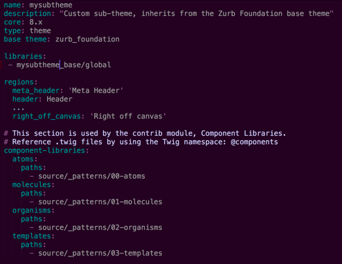
As an example, let’s take a look at the .info.yml file from one of my projects. As you can see in the image below, this is a sub-theme of the Zurb Foundation contributed theme.
Another thing we find in this image above is that we have a Component Library using Pattern Lab (Twig edition). Right away, this tells us that there is some complexity within the theme and I may need to search for the templates and styling outside of my theme directory. The Component Library could be in an external repository, or located elsewhere in my project.
Next, I suggest you review the .libraries.yml file. Within this file, you will see how your CSS and JS are being loaded. So, does your theme use React or Vue? Or are you including jQuery on every page? Remember, Drupal 8 no longer loads jQuery on all pages by default. By using Drupal 8, we have the advantage to only load CSS and JS if we tell Drupal it should load them. Drupal does not load all assets on every page because it slows down front-end performance.
The .libraries.yml file may also contain external dependencies like web fonts or a CDN (Content Delivery Network). Regardless, by reviewing this file, you will see the level of complexity you have ahead of you and opportunities to load assets only when necessary.
Reviewing your .theme file, you can inspect any hooks or see if the site is using template overrides. You will also want to peek into your “templates” directory to see how the Twig templates are organized. You want to understand the landscape of complexity for your site. Look for areas that may require extra attention or care while also looking for ways to optimize. Does your site have a .breakpoints.yml file? If not, then this is a great way to enhance your theme and improve your site. You will want to use this alongside Image Styles and the Responsive Image module for better mobile performance. Image styles are essential to any project and are an easy way to decrease your page load time. I recommend checking out the article Setting Up an Image Style that also has an excellent video if you need some guidance. I would also read over the Setup Responsive Images in Drupal 8 - A Step-by-Step Guide.
Lastly, you may find files in your theme folder related to your automation approach. If you don’t use automation, this is another opportunity to organize and optimize your theme. Does your theme use Gulp, Webpack, Grunt, or Yarn? Regardless of your approach, these tools are great ways to organize any theme.
Auditing Your Site
Before we move on, let’s take a big step back and think about overall site auditing. Does your site have analytics available to you? Reviewing analytics tells you what browsers you should support and how much mobile traffic your site is receiving. This helps you prioritize optimizations and meet your site visitor’s needs. It’s very important to review your analytics regularly so you can focus efforts on the browsers and viewport sizes your site visitors are actually using to view your site.
If you’re working on an established site, you may want to find out if the original developer is available for questions. If they are, I suggest that you set up time and have them navigate the site with specific tasks. As you move through the site together, they will give you context on “how things were built” in addition to the perspective on “why things were built in this particular way.” Remember to listen and not lead them. Finally, when they are through providing their valuable perspective, ask any remaining questions you may have from your initial investigation of the theme.
Finally, after all this analysis, don’t lose sight that your audit leads to action. By poring over your initial findings, you can begin to come up with a plan to improve and enhance your theme!
CSS Analysis Tools
Let’s take a look at some tools that will give you insight to write more efficient themes. The following stylesheet analysis tools can help you find ways to improve your site’s performance.
Parker
Parker is a stylesheet analysis tool that runs metrics on your stylesheets and reports on their complexity. These metrics provide valuable insights about your CSS and help you write more efficient themes. By running your stylesheets through this tool, you can understand how to write flatter, class-based themes that are efficient and utilize reusable patterns throughout. The project was created by Katie Fenn.
To get started, visit the Parker GitHub repo and install via npm locally. Once installed, you can analyze stylesheets located on your computer or at remote URLs. The valuable results Parker provides can be output as JSON format.
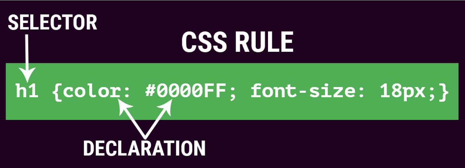
Before you run Parker and look at the output, I suggest a little refresher in CSS and specificity to get the most out of the results. The following articles by Chris Coyer at CSS Tricks will get you more familiar with the terminology used in the output:
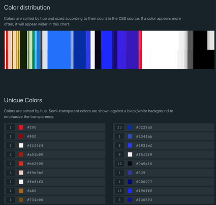
What I find immensely helpful when running Parker on a project for the first time is the ability to see the overall file size of your compiled CSS calculated. Also, you can easily review all the media queries, !important declarations, and see every unique color value. Listing all your media queries in one place allows you to see if there are ways to combine and reduce the number of tweaks at certain viewports. The same goes by seeing all your colors listed together. Do you have four different shades of the same brand color? This is a great opportunity to introduce SASS variables to have consistency throughout your styles and branding.
Lastly, it’s always crucial to understand if your theme is abusing !important declarations to “jam in” styles instead of fully understanding the cascade of the overall theme. If you find the need to constantly incorporate !important declarations, you need to take a step back and look at your overall theme cascade and ask some hard questions about how the page should be styled.
Other values in the output require digging deeper into your theme. I find the “Specificity Per Selector” and “Identifiers Per Selector” extremely helpful values to nudge my theme towards a more class-base and reusable styling approach. Let’s take a closer look at the “Selectors Per Rule” value and how these numbers can help us improve our CSS.
We want the “Selector Per Rule” value to be as close to one as possible. If we have lots of selectors per rule, that suggests that we’re applying the exact same declarations (styles) to a number of different selectors. If that is the case, then perhaps we could create a single catch-all selector to handle all cases. This would make our CSS smaller, and abstract the pattern into more reusable selectors. Let’s look at an example.
Let’s say you want to have consistent form inputs on your site. You may have written the following CSS in your theme.
input[type=text],
input[type=number],
input[type=email],
input[type=password],
textarea {
  width: 100%;
  border: 2px solid #949494;
  border-radius: 4px;
  color: #333333;
  font-size: 1rem;
  background-color: #FFFFFF;
  padding: .5rem;
  margin: .5rem 0;
}
This is a great opportunity to write a single CSS class to reduce the number of selectors. Let’s replace the CSS above with this:
.form-input {
  width: 100%;
  border: 2px solid #949494;
  border-radius: 4px;
  color: #333333;
  font-size: 1rem;
  background-color: #FFFFFF;
  padding: .5rem;
  margin: .5rem 0;
}
Now, all we need to do is add the CSS class form-input to the HTML markup of any form input. Our CSS is smaller and we are abstracting styles for re-use. Tracking over time, I can see how these types of CSS improvements are paying off by reviewing the values in Parker’s output.
Running Parker against multiple sites allows you to begin to get a feel for the values in its reports. While it might not be not fair to directly compare values for different projects, the goal is the same: to identify opportunities for improvements and get a deeper understanding of your theme.
Lastly, I suggest checking out the article Improving Your CSS with Parker by Harry Roberts. It’s a valuable guide to getting the most out of Parker. The documentation on the Github repo is good, especially the documentation regarding the metrics. However, one note of caution is that repo on Github has not been updated since 2016. Don’t let that fool you! It’s still a valuable tool as it stands today, however, I began to wonder if there was a more recent tool available. That’s when I found Project Wallace!
Project Wallace
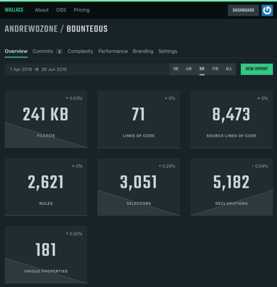
Project Wallace is another stylesheet analysis tool. It has an impressive online dashboard that allows you to track metrics over time. To get started, go to the Project Wallace site and create a free account. In addition to the online dashboard, there is also a CLI (Command Line Interface) which you can install via Node that outputs JSON. Project Wallace has an improved, robust output and interface compared to other CSS analysis tools. The project is inspired by Parker along with other analysis tools.
For me, Project Wallace is a “greatest hits” of any metric you could possibly want to track in your CSS. From the well thought out dashboard, to the beautiful unique color distribution interface, finally, to the ingenious ability to resize your browser to determine when media queries are applied in your browser. It’s truly impressive, well put together, actively, and passionately maintained by Bart Veneman from The Netherlands.
I can’t say enough great things about this project and tool. I encourage you to check it out for yourself and test drive your project’s stylesheet to get the idea of all the metrics it captures. While it’s free for one project, there is a paid version available, priced by the number of projects. Regardless, you can use the free CLI and output JSON locally.
Continuous integration into your build processes is very well thought-out. The settings and features make it fairly easy to incorporate via webhook into any project. You can read more details in the blog post Automatically Analyze CSS on Every Push.
However, one thing lacking with the project I have found is documentation. Hopefully, that will be remedied over time, either by the community of users or the project’s maintainers. In the meantime, it should be noted that you may need to reach out via Twitter @projectwallace if you have burning questions regarding your results.
What resonates strongest with me is the ability to measure and track your results over time. Time is very powerful and can give you remarkable insight. The road to improvement lies in your ability to baseline where your site has been in order to move forward sprint-by-sprint for a better, more efficient site.
Measure Over Time
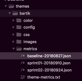
Using these tools, you are now able to establish metrics for your themes to measure over time. To do this, I suggest you create a directory within your theme titled “metrics.” You can then output the JSON from Project Wallace or Parker directly into this folder and commit it to your repository. Establish a baseline for your site, then run the output sprint-by-sprint to keep track of how your site grows.
You don’t have to limit the “metrics” directory to just your theme information. Why not include your Google Lighthouse accessibility and performance scores? This is a great way to understand how your scores will ebb and flow with features along with the content that comes and goes on your site.
Imagine, if you will, the following dreaded message from your project lead:
“Hey, do you have a minute? Our home page is slooooow.”
Your choice without capturing metrics is to ignore the message. From experience, I find that only works for about 2 hours :). Or, you can shake your fist in frustration that you can’t really compare the site to previous versions. Now, you can have confidence that, at your fingertips, you have actual data to lean on and investigate. Well, project lead, let’s take a look at the data and see how much “slower” the home page was compared to last month:
"Hey, what new features were added in the last sprint that may have caused the slowdown? Oh, a new marketing campaign launched and we added four new components?"
Let’s dig deeper and see if it’s image optimization or perhaps bloated CSS.
Lean and Efficient Drupal Theme
By using these tools and tracking over time, you can understand the health of your theme, and ultimately, your site. I look forward to continuing to implement this in our projects at Bounteous and working towards efficient and lean themes in Drupal.
