Dark Patterns in UX: Are You Compromising Customer Experience for Quick Wins?
To maximize profits, many commerce companies are striving to build more customer-centric platforms where they can deliver a personalized experience that both increase the bottom line and delights customers. As a means to fast-track the conversion process, some companies may opt for a darker approach to design. This approach leverages techniques to make users do things they might not want to do—resulting in actions that benefit profits at the expense of users. These techniques are known as “dark patterns.”
Why do brands use dark patterns? Simply put, they want to nudge users toward—or away from—certain actions to gather more data, enhance sales, or beef up distribution lists. This undoubtedly can offer immediate results for some metrics, yet what’s often overlooked is the tradeoff between a quick win and long-term damage to the brand.
If your organization prioritizes quick wins with dark patterns, over building genuinely valuable customer experiences, it won’t be long before your customers catch on. Brands that employ dark patterns can be considered unethical— and it’s almost certain users affected by them will be quick to take their trust and loyalty elsewhere.
Supposing you have input on design, are a product owner, marketer, or decision-maker in your organization, try to keep an eye out for how dark patterns come into play in your next branding project, site build, or other design-related projects. It’s important to know these exist and to understand how they can compromise your overall customer experience. Think about your big-picture relationship with the client and their audience—while dark patterns may help lead to quick conversions, an honest design approach will help you to create a relationship that promotes and builds trust and loyalty with your audience.
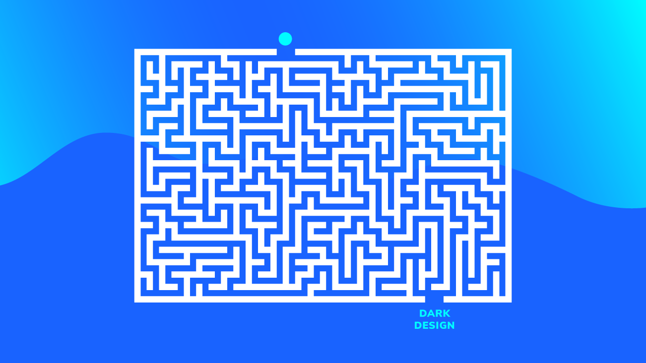
Dark Patterns In The Wild
With that in mind, you may be surprised to find out that dark design is more prevalent than you might think. All too often these simple patterns are hidden in plain sight.
Let’s take a quick look at a few common dark patterns to keep an eye out for, and a few takes on how we can make them better.
Sneak Into the Basket
During the checkout process, you may have come across an item in your cart that you didn’t put there. The sneak-into-basket pattern works in one of two ways—either by adding additional items or services by default, or getting the user to add an item to their cart that they didn’t want.

In this example from a web domain provider the subscription is defaulting to five years rather than one, and a Domain Name Privacy product is added by default for an extra $49.95.
As an alternative to sneaking an item into a user’s cart, consider surfacing a “recommended item” based on what’s already been added to the cart. This is a subtle way to upsell without being nearly as invasive as the “sneak into basket” pattern.
Hidden Costs
We’ve all been in a situation where we add an item to our cart, begin the checkout process only to be saddened, frustrated, or annoyed by a handful of fees that were added to your total at the very last minute. This is known as the “slow prices reveal” and are commonly used on many flower delivery sites, for example, where charges are added to the total after a user agrees on the initial cost for the floral arrangement.
This dark pattern is generally very successful because of the fact that even though users will not like that the price has changed, they complete the purchase anyway given all the time and effort that’s already been invested in the purchase process.

In this online florist example, the item price is listed as $79 in the cart before checkout.

During the last step of checkout added fees for vases, delivery, and tax are added.
A better approach is to always be transparent with your customer. Additional costs such as shipping, delivery fees, and surcharges often cannot be avoided. When they are required, these additional costs should be highlighted to users long before the final purchase stage. Doing so builds trust with the customer early on, ensures transparency, and ultimately leaves them feeling confident about their purchase.
Comparison Prevention
When it comes to making any sort of purchase, it’s always a good feeling to know the decision you made was informed based on the data available to you. With the comparison prevention pattern, online retailers and subscription-based services make it hard for the user to compare the price of one item with another. This pattern is common on subscription services plans that offer different bundling options. It’s also seen frequently on grocery sites where they change the way prices are displayed for the same type of item, for example by weight then by quantity. As a result, customers are not provided with all the information they need to make an informed decision.

In this example from a professional networking site, the different plans and features are displayed side-by-side, however, pricing is not visible until clicking into a "Select plan."
A better solution will always end with the customer feeling good about their purchase decision. While it’s certainly good practice to highlight items based on promotions, best sellers, etc. it’s critical that the customer is able to understand the options available to them. Leaving them with uncertainty can result in not making a purchase at all, or having buyers remorse when it’s too late.
What Matters Most
Although dark patterns are proven to produce short-term gains for the business, it’s what happens in the long run that matters most. Honest design is paramount as it ensures positive associations with the brand, builds trust, and makes it almost certain that the user will return. Designing for experiences that are transparent, unambiguous, and easy for the user to take their intended course of action is the recipe for success.