Predicting Customer Lifetime Value with Adobe Experience Platform Data Science Workspace

Every marketer faces different challenges when it comes to identifying, qualifying, and promoting to the correct audience. In this article, we use statistical models to predict Customer Lifetime Value (CLV), identify valuable customers, and ensure the marketing team is targeting the correct customer groups to ultimately drive sales and growth.
Let’s discuss how we can predict customer lifetime value (CLV) using Adobe Experience Platform (AEP) Data Science Workspace and use that for driving marketing decisions and strategies. To make the topic more digestible we have broken this down into three topics:
- Overview, Exploratory Data Analysis, and Model Fitting
- Recipe and Models in Adobe Experience Platform
- Deploy Model as a Service
Approach and Methodology
We will be using customer transaction history in the last seven days to predict their CLV for the next 30 days. We begin by processing, transforming, and aggregating the raw event dataset so that it is ready for analysis and model fitting. We took all the necessary steps to clean the data such as substituting missing categorical value with the most frequent value, substituting missing numeric values with mean figures, etc. We then spent a considerable amount of time analyzing and interpreting data to uncover patterns, trends, and relationships that will help us to improve the accuracy of our prediction model.
Getting Started
We will be using Jupyterlab, a web-based interactive computational environment that is integrated with AEP, to perform data analysis on our dataset. To access JupyterLab, select notebooks from the left navigation column in AEP.

Once inside the JupyterLab, we will use the kernels built-in functionality to read data from the platform into a Jupyter notebook for further analysis. We will select the dataset from the left navigation bar of JupyterLab and right-click, then select the Explore Data in Notebook option from the drop-down menu. This creates an executable cell with the python code in the active notebook.

We will select the cell and hit shift+enter, this will execute the cell and import the dataset into a pandas dataframe.
You can use the notebook server configuration tab on the top right corner to allocate RAM and toggle GPU on or off depending on your computational needs. For our analysis, we will keep the GPU off and allocate 20Gi of RAM.

Exploratory Data Analysis
The importance of exploratory data analysis cannot be emphasized enough. It can be used to reveal trends, patterns, and relationships that sometimes cannot be identified by formal modeling or hypothesis testing. In practice, this means there will be a lot of graphs and visualization in our EDA.
We will be importing some libraries and packages first.
import pandas as pd
import numpy as np
import seaborn as sns
import matplotlib.pyplot as plt
from scipy import stats
from sklearn.cluster import KMeans
from sklearn.model_selection import train_test_split
import statsmodels.api as sm
from sklearn import linear_model
from platform_sdk.dataset_reader import DatasetReader
plt.set_loglevel('WARNING')
# %matplotlib inline
To get a list of available packages in the current environment, you can run the following command in a new cell.
!conda list Now, let’s begin our analysis. We will be primarily looking at the following variables:
Customer_ID: A unique identifier that is assigned to each customer.
Recency_7: How recently a customer made their purchase.
Frequency_7: Number of purchases in the last seven days.
Purchase_Value_7: Total money spent on purchases in the last seven days.
Frequency_30: Number of purchases in the coming 30 days.
Purchase_Value_30: Total money spent on purchases in the coming 30 days.
We first plot the pairwise relationships and see if we can see something interesting. Let us have a look at scatterplots for joint relationships and univariate distributions for each of the variables:
def corrfunc(x, y, **kws):
    r, _ = stats.pearsonr(x, y)
    ax = plt.gca()
    ax.annotate("r = {:.2f}".format(r),
                xy=(.1, .9), xycoords=ax.transAxes)

g = sns.pairplot(df,vars=df.columns[:],diag_kind="kde")
g.map_lower(corrfunc)
Insights From Above Plots
Some features are immediately obvious:
- Some variables are highly associated, like
purchase_value_7andpurchase_value_30, andfrequency_30andfrequency_7(Pearson Correlation Coefficient > .7) recency_7seems to be the least associated with any variable (Pearson Correlation Coefficient < .47)recency_7only takes seven different values- It’s pretty evident some of the scatterplots have well-defined groups (For example: There is a straight line as well as a set of randomly distributed data points in
purchase_value_30vs.purchase_value_7scatterplot)
On the other hand, the relationship of the recency_7 variable with any other variable isn't quite obvious.
Since we suspect that our data contain groups, let us create a scatterplot with groups so that we can more easily see group-related patterns. With seven categories of the recency_7 variable we could try box plots:
ax = sns.boxplot(x="recency_7", y="purchase_value_30", data=df)
Box plots aren't telling us much. Let’s try some coploting and conditioning.
Coplots and Faceting the Data
To consider all four variables at once, we now have to facet two ways. That is, pick one predictor variable (here, frequency_7), then cut the other two predictors into categories and create a grid of faceted plots. In the grid below, left to right gives low to high purchase_value_7, while top to bottom gives low to high recency_7.
df['recency_7_cat']= pd.cut(df['recency_7'], 3)
df['frequency_7_cat']= pd.cut(df['frequency_7'], 3)
df['frequency_30_cat']= pd.cut(df['frequency_30'], 3)
df['purchase_value_7_cat']= pd.cut(df['purchase_value_7'], 3)
sns.lmplot(x="frequency_7", y="purchase_value_30",  col="purchase_value_7_cat",row="recency_7_cat",data=df);
The far-right plots seem to have very few data points. We make a mental note to not use the model for those combinations of predictor variables later on because of the sparsity of data or try log transformations to make the data normally distributed. Other than that, we see the relationship between purchase_value_30 and frequency_7 is generally positive, though the slopes vary a lot, which means that other variables are important and grouping might be necessary before prediction.
If this is getting too complicated to understand, it would be nice to give names to the categories to keep track of what’s going on. We do that in the code below.
recency_7_quantile_1 = df['recency_7'].quantile(1.0/3)
recency_7_quantile_2 = df['recency_7'].quantile(2.0/3)
recency_7_quantile_3 = df['recency_7'].quantile(.75)

frequency_7_quantile_1 = df['frequency_7'].quantile(1.0/3)
frequency_7_quantile_2 = df['frequency_7'].quantile(2.0/3)
frequency_7_quantile_3 = df['frequency_7'].quantile(.75)

frequency_30_quantile_1 = df['frequency_30'].quantile(1.0/3)
frequency_30_quantile_2 = df['frequency_30'].quantile(2.0/3)
frequency_30_quantile_3 = df['frequency_30'].quantile(.75)

purchase_value_7_quantile_1 = df['purchase_value_7'].quantile(1.0/3)
purchase_value_7_quantile_2 = df['purchase_value_7'].quantile(2.0/3)
purchase_value_7_quantile_3 = df['purchase_value_7'].quantile(.75)

df['recency_7_cat'] = df['recency_7'].apply(lambda x: "Low" if x <=recency_7_quantile_1
                                            else ("Medium" if (x > recency_7_quantile_1 and x <= recency_7_quantile_3)
                                                  else ("High" if x > recency_7_quantile_3
                                                        else "other"
                                                       )
                                                 )
                                           )

df['frequency_7_cat'] = df['frequency_7'].apply(lambda x: "Low" if x <= frequency_7_quantile_1
                                            else ("Medium" if (x > frequency_7_quantile_1 and x <= frequency_7_quantile_3)
                                                  else ("High" if x > frequency_7_quantile_3
                                                        else "other"
                                                       )
                                                 )
                                           )
df['frequency_30_cat'] = df['frequency_30'].apply(lambda x: "Low" if x <= frequency_30_quantile_1
                                            else ("Medium" if (x > frequency_30_quantile_1 and x <= frequency_30_quantile_3)
                                                  else ("High" if x > frequency_30_quantile_3
                                                        else "other"
                                                       )
                                                 )
                                           )

df['purchase_value_7_cat'] = df['purchase_value_7'].apply(lambda x: "Low" if x <= purchase_value_7_quantile_1
                                            else ("Medium" if (x > purchase_value_7_quantile_1 and x <= purchase_value_7_quantile_3)
                                                  else ("High" if x > purchase_value_7_quantile_3
                                                        else "other"
                                                    )
                                                 )
                                           )
sns.lmplot(x="frequency_7", y="purchase_value_30", col="purchase_value_7_cat",row="recency_7_cat",data=df);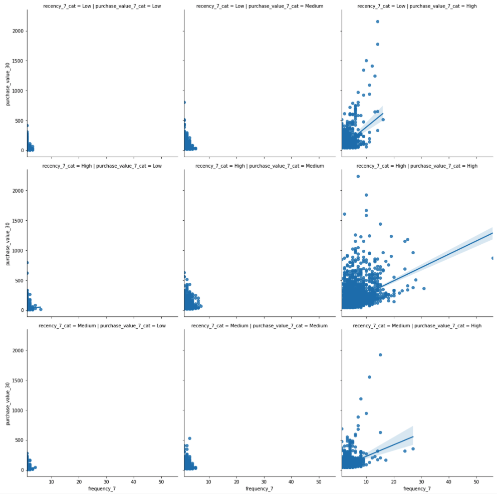
purchase_value_30 tends to increase with frequency_7. The levels of the fits, however, also change from top to bottom and from left to right, so the other variables will help us predict as well.
Now make purchase_value_7 the main x -variable and facet on frequency_7 and recency_7
sns.lmplot(x="purchase_value_7", y="purchase_value_30", col="frequency_7_cat",row="recency_7_cat",data=df);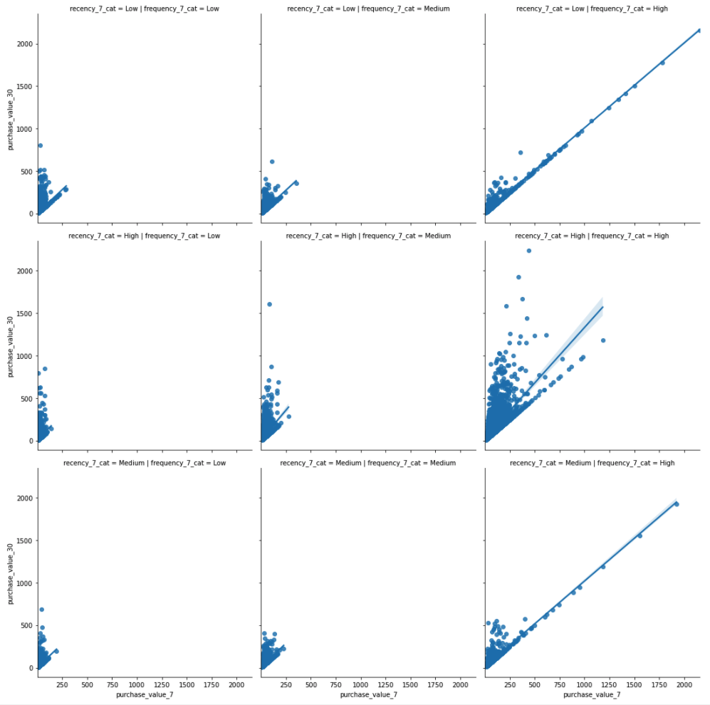
We see the relationship between purchase_value_30 and purchase_value_7 is generally positive, and the slopes are also pretty much consistent.
Finally, let us consider how purchase_value_30 and purchase_value_7 vary while conditioning on recency_7 with just two categories.
df['recency_7_cat']= pd.cut(df['recency_7'], 2)
sns.lmplot(x="purchase_value_7", y="purchase_value_30",  hue="recency_7_cat", data=df);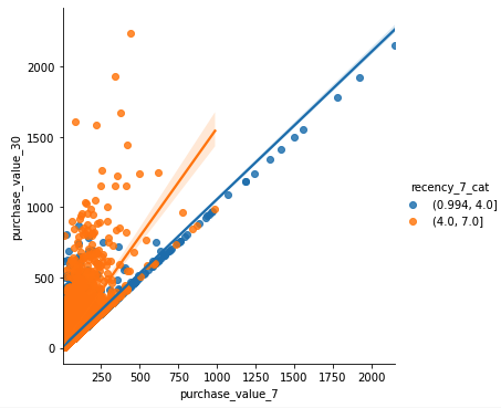
purchase_value_30 tends to increase with purchase_value_7. The levels as well as slope of the fits, however, also change with recency_7, so the recency_7 variable might help predict as well.
Model Building
Enough of data exploration, now let's dive straight into the machine learning world and focus on prediction and generalization.
We will fit a regression model with following the equation:
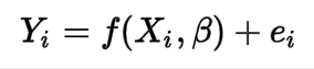
Where:
Yi = Dependent Variables (purchase_value_30)
Xi = Independent Variables (recency_7, frequency_7,monetary_value_7)
β= Unknown Parameters
ei = error terms
But, before we begin building the model, let’s split our data into two subsets, one for training and the other for testing the model. This is important because it ensures our model evaluation process is unbiased. We will use 80 percent Train and 20 percent Test split and we do that using the code below:
X_train, X_test, y_train, y_test = train_test_split(
    X, y, test_size=0.2, random_state=49)
Model Fitting
Let’s fit the model and look at its R-squared value:

Our model’s R-Squared value is .73 which means that 73 percent of the variation in the dependent variable is accounted for by the independent variables. Let’s see if we can improve it further by using some transformations.

Log-Transformation actually decreased the R-Squared value. We will stick to the original model without any transformations.
Model Evaluation
Let’s use our model to make predictions on the test subset that we had set aside. We will be using the following accuracy metrics to evaluate our final prediction model.
Mean absolute error (MAE): Measure of prediction accuracy as a ratio defined by the formula:
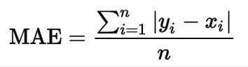

MAE of 21 means that, the average measure of error in our purchase value prediction is $21.
Custom Accuracy Metric: This is a custom metric we will use to evaluate our model. Prediction is correct if it is within +-20 percent range of actual value. For example, if our model predicts a customer will spend $100 in the next 30 days but they actually end up spending $80, it will be considered as a correct prediction.
You can also use metrics such as precision, recall, and F1 score if you suspect the data to be imbalanced.
Let’s write the code for our custom accuracy metric:
def custom_accuracy(prediction,target):
    correct = 0
    for i in range(len(target)):
        if ((abs((target[i]-prediction[i]))/target[i])*100)<20:
            correct +=1
    return correct/len(target)*100
This will give the percentage of predictions which are within 20 percent range of the actual values.
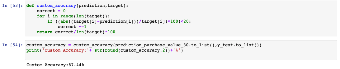
Custom Accuracy of our model is about 88 percent. This is expected to improve after the model re-trains on more data in prod. For now, let’s be content with our model efficiency and move over to the model deployment phase in AEP.
Recipe and Models in AEP
Model creation in AEP is a two-step process. First, you have to create a recipe, which is Adobe’s term for model specification and blueprint. Once the recipe is created, an instance of that recipe needs to be created and trained on a specific dataset. This instance of the recipe is our model that can be used as a service in Production. We will go over the entire process of creating, training, and scoring the recipe within the JupyterLab notebook in AEP.
Creating Recipe
From the Launcher tab, click on the Recipe Builder notebook.
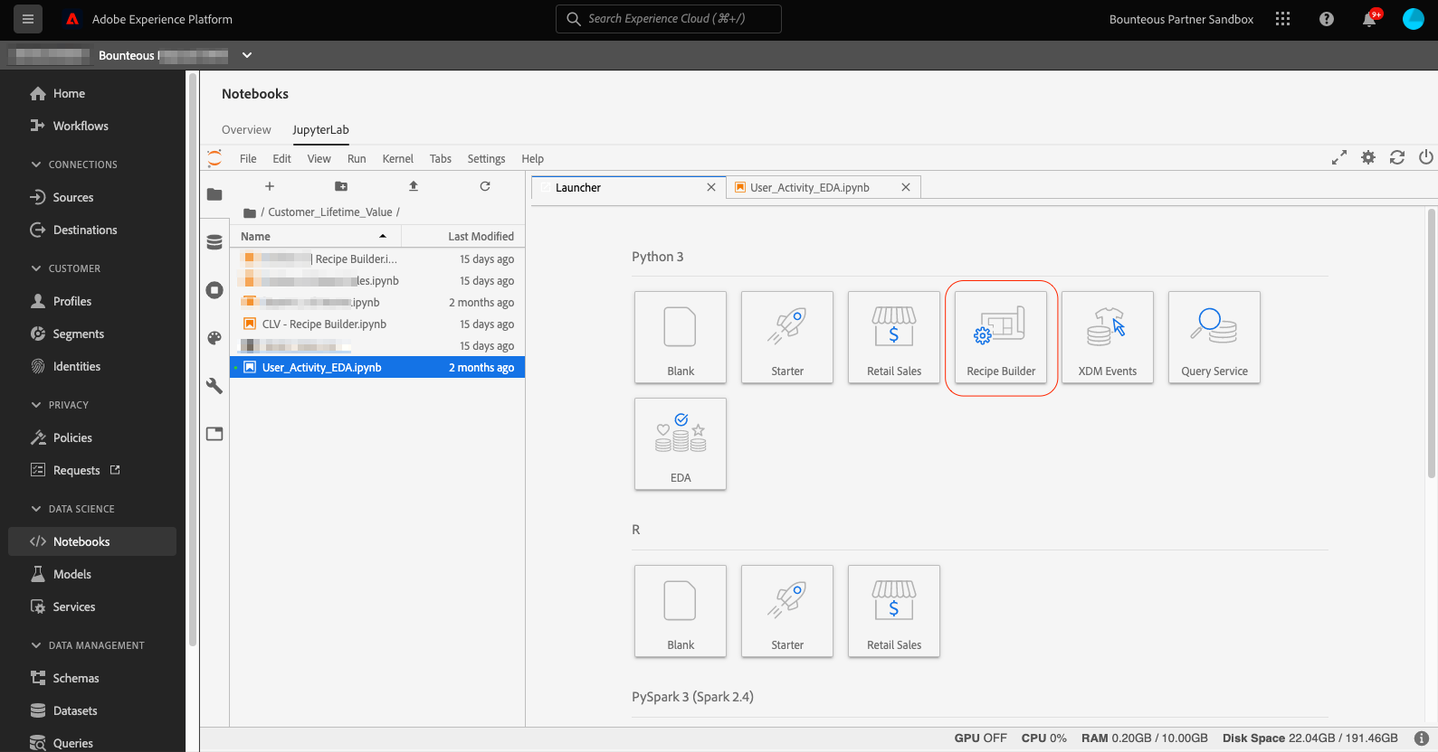
This will open up the recipe builder notebook in a new tab. You will notice that this is very similar to a standard jupyterLab notebook except the Train, Test, and Create Recipe buttons in the toolbar as shown below.
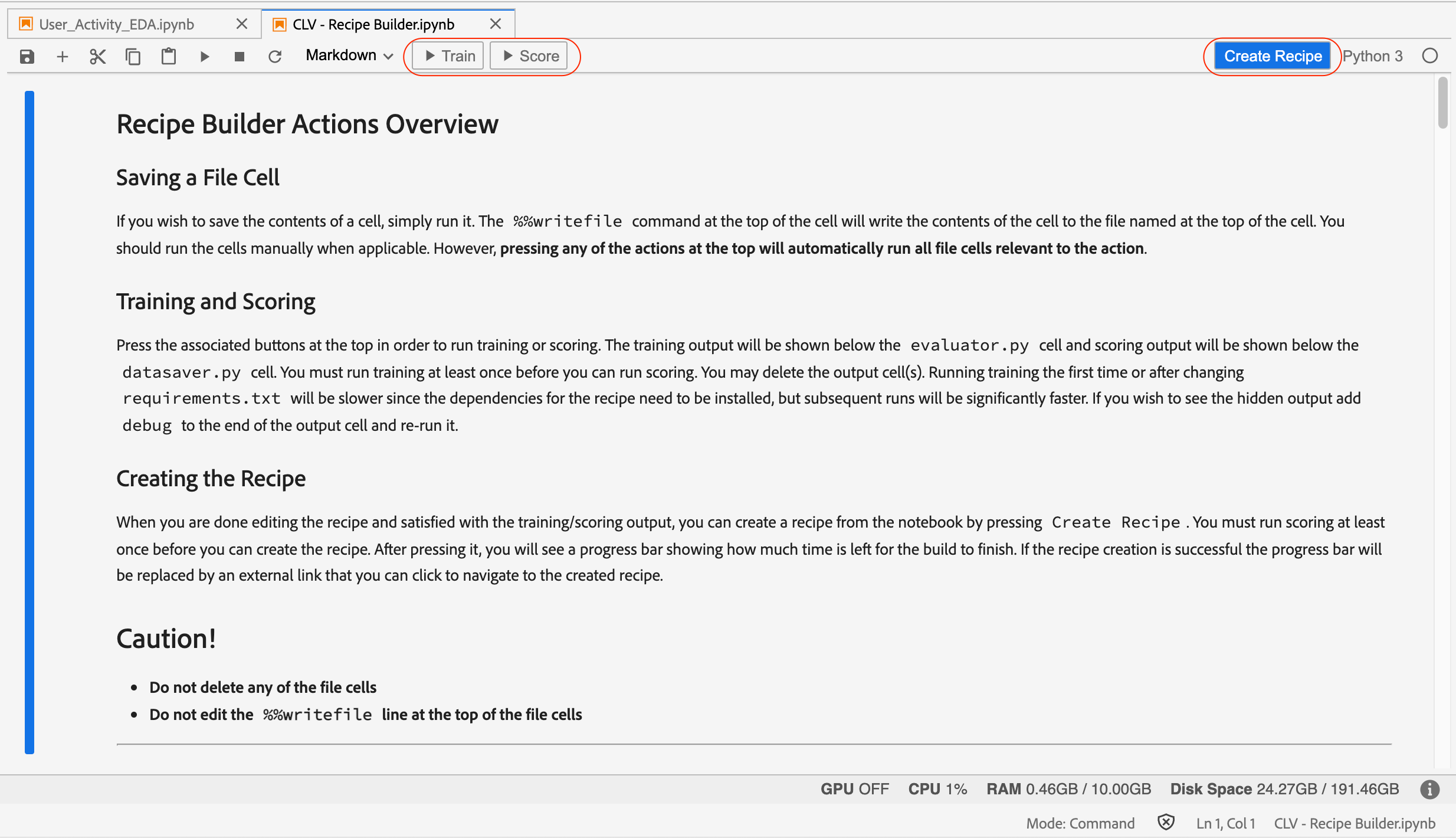
As mentioned earlier, recipe is a high-level container for model specification. We will go over each cell in the recipe builder and make necessary changes as per our model specification.
Let’s go over individual components of the recipe builder one by one and make necessary changes for our model.
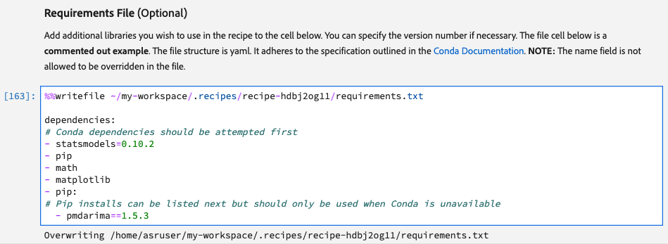
Requirement File
This is where all the additional libraries to be used in the recipe need to be declared. By default, the following libraries are already included.
python=3.6.7
scikit-learn
pandas
numpy
data_access_sdk_python
Any additional libraries along with their version go into the Requirement File cell.
Configuration Files
This is the section where we will specify configurations for model input and output datasets, as well as hyperparameters for the model. There are two separate cells, one for training and the other for scoring. We have put in the correct datasetIDs, SchemaID, and tenantID in both the cells.
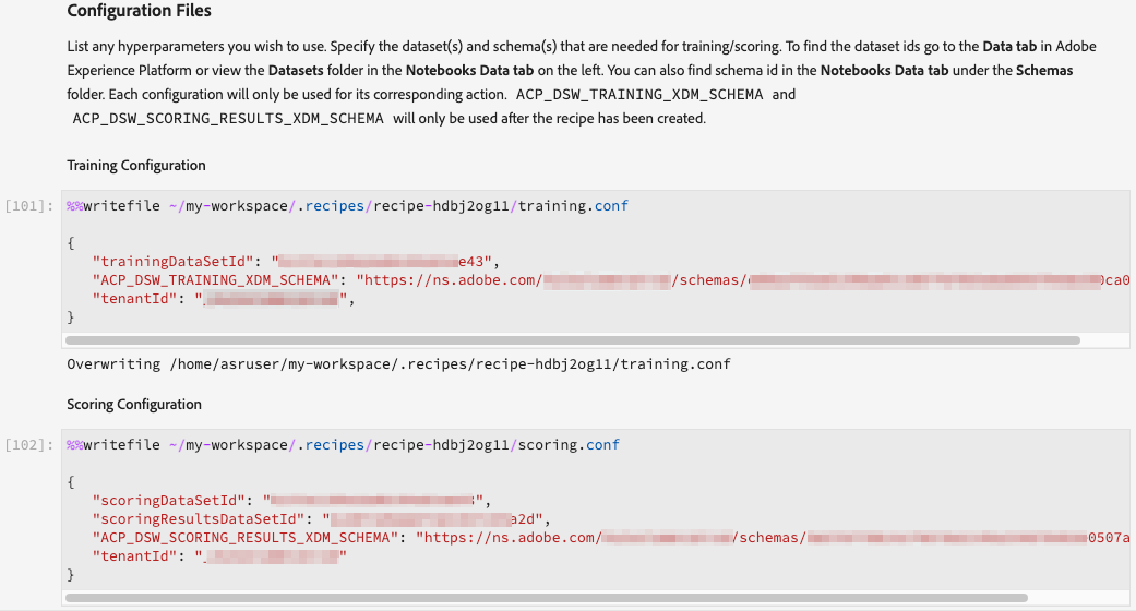
To know your datasetID and schemaID, go to the dataset or Schema tab and search for the respective object.
Training and Scoring Data Loader
In these two sections, we will define the functions to load and prepare the data for our model for both training and scoring. There are two different cells for these but each has its own load() function. All the data preparation and feature engineering needs to be defined within the load() function.
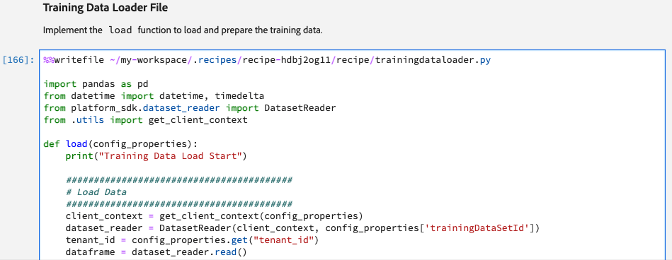
As part of data preparation, we also get rid of _tenantID and other platform-specific features such as _id, eventType, and timestamp from the data.
We will repeat the same process in the Scoring Data Loader File cell as well.
Pipeline File
This is where we define the algorithm of our model for both training scoring. If we have defined any hyperparameters in the configuration files, they can be referred here using the config_properties. There are two pre-built functions in this cell:
train() function: Model fitting logic goes into the train() function.
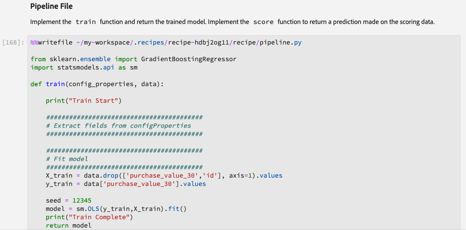
score() function: Model prediction logic goes into the score() function.
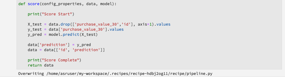
Evaluator File
The logic for evaluating the performance as well as the train-test split is defined in this section. As mentioned earlier we will use a train-test split of 80:20 and MAE (Mean absolute error) and Custom Accuracy Metric as our evaluation metrics.
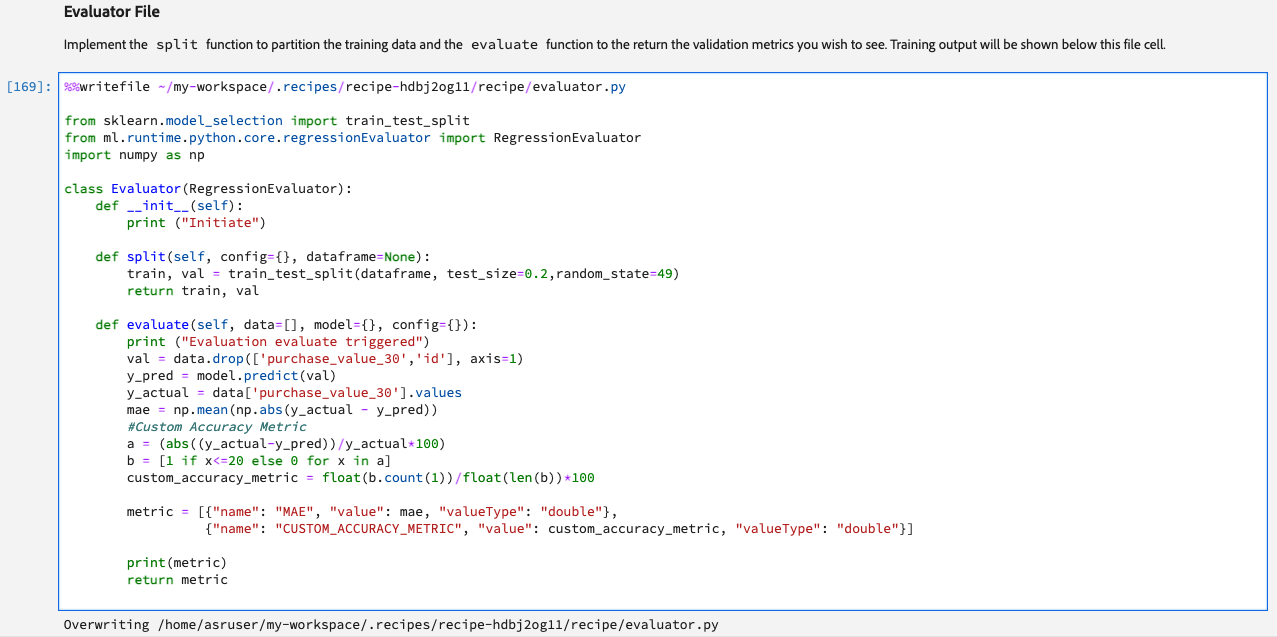
DataSaver File
We will use the DatasetWriter library from the platform Python SDK to save the predictions to a dataset defined in the configuration file section. The logic for saving the predictions to a dataset within the platform goes into the save() function in the Data Saver File cell.
We also prefixed the output column labels with <tenant_id> to match them with the field names of the output dataset schema. Also, since the save() function will append new predictions to the existing dataset instead of overwriting, we recommend including the prediction run date in the final output as it can come in handy during debugging.
Training and Scoring
Once we have modified each of the above sections in the Recipe Builder notebook, we can click on the Train button at the top to initiate a training run. The first training run will take some time as it needs to install the dependencies and prepare the environment before running but the subsequent runs will be much faster. The output from the training script will appear under the evaluator file cell.
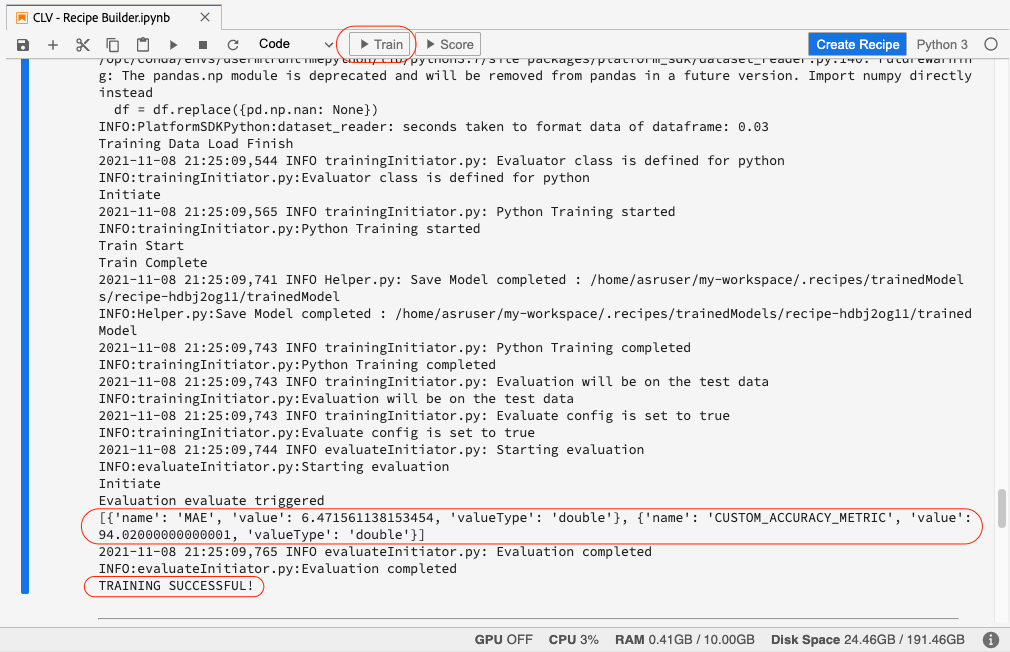
Once training is complete, we can score the trained model by clicking on the Score button.
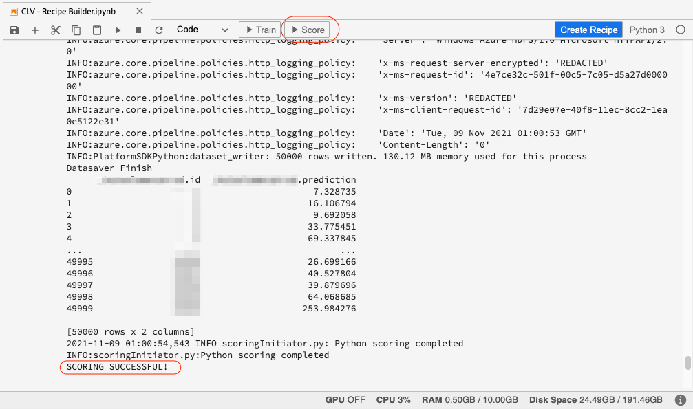
If the model scoring ran successfully, you will see SCORING SUCCESSFUL! message in the output under the Data Saver File cell.
Create Recipe
Once we have successfully trained and scored our model and are satisfied with the results, we can create a recipe by clicking on the Create Recipe button in the top right. We will call our recipe CLV Prediction - Recipe.

Once we hit enter, the recipe creation process will start and it will take several minutes to create. Once created, the recipe will be available on the recipe page.
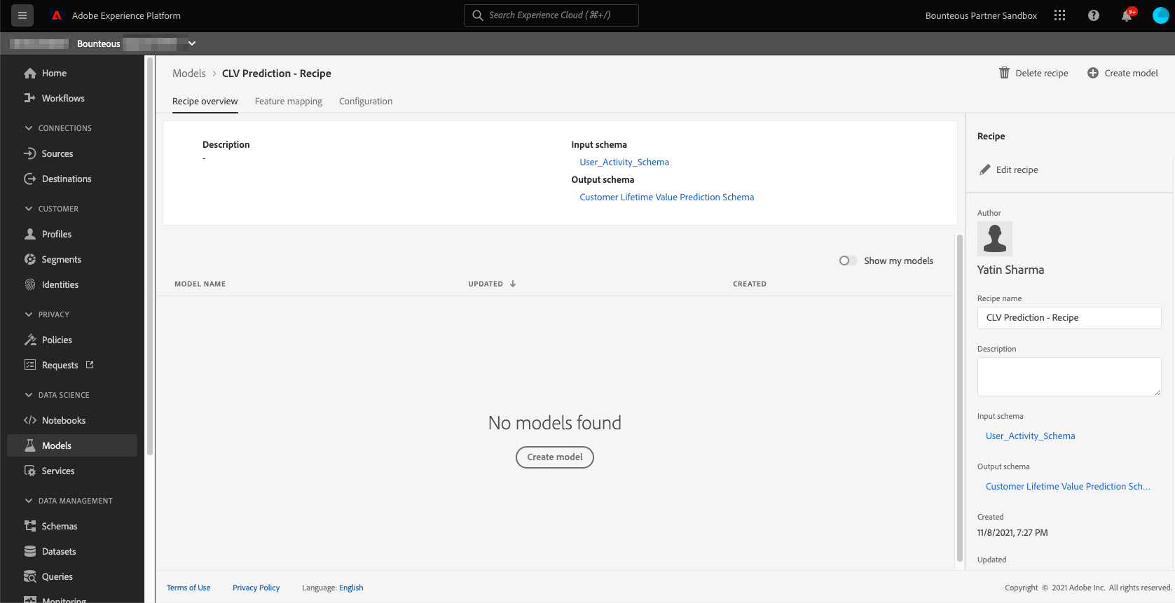
Creating a Model
Once the recipe has been created, a model needs to be created based on the recipe. As explained earlier, recipe is Adobe’s term for model specification and blueprint, whereas model is an instance of a recipe that can train and score on data at scale. To create a model, click the Create Model button on the recipe overview page and it will take you to the model creation workflow.
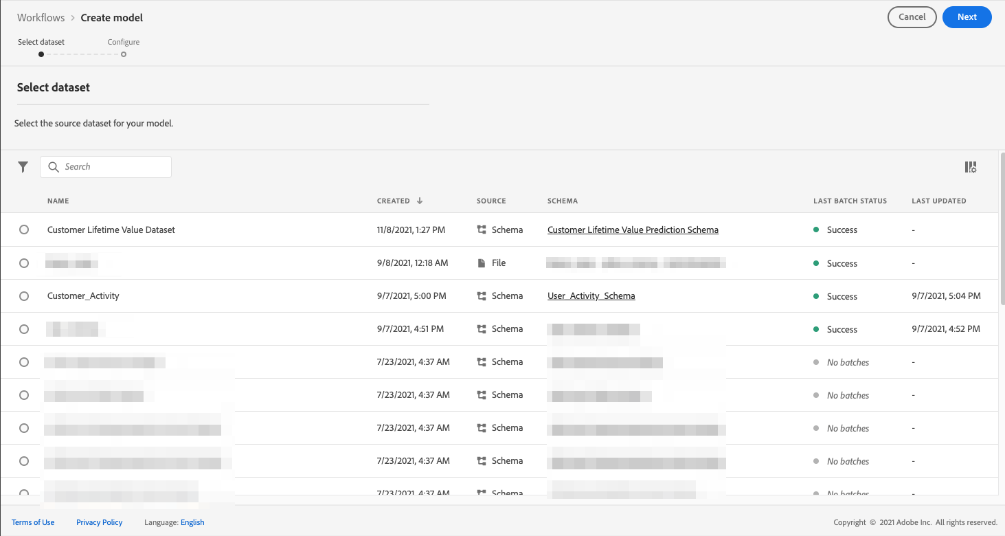
We name our model CLV Prediction Model and select the same training and scoring parameter configurations we used when creating the recipe for this model.
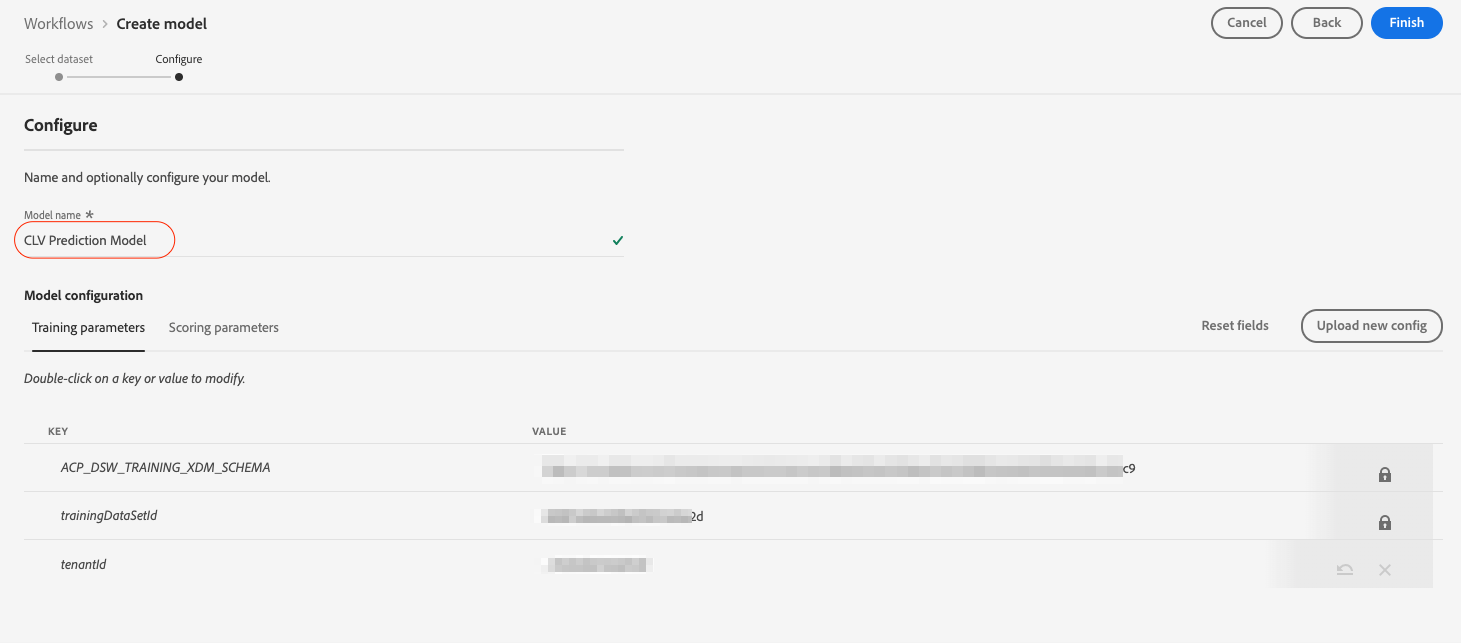
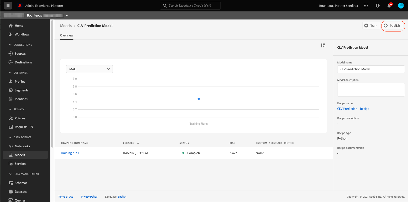
After reviewing the configuration, we click on Finish and this will create the model and redirect us to the model overview page. A new training run is generated by default.
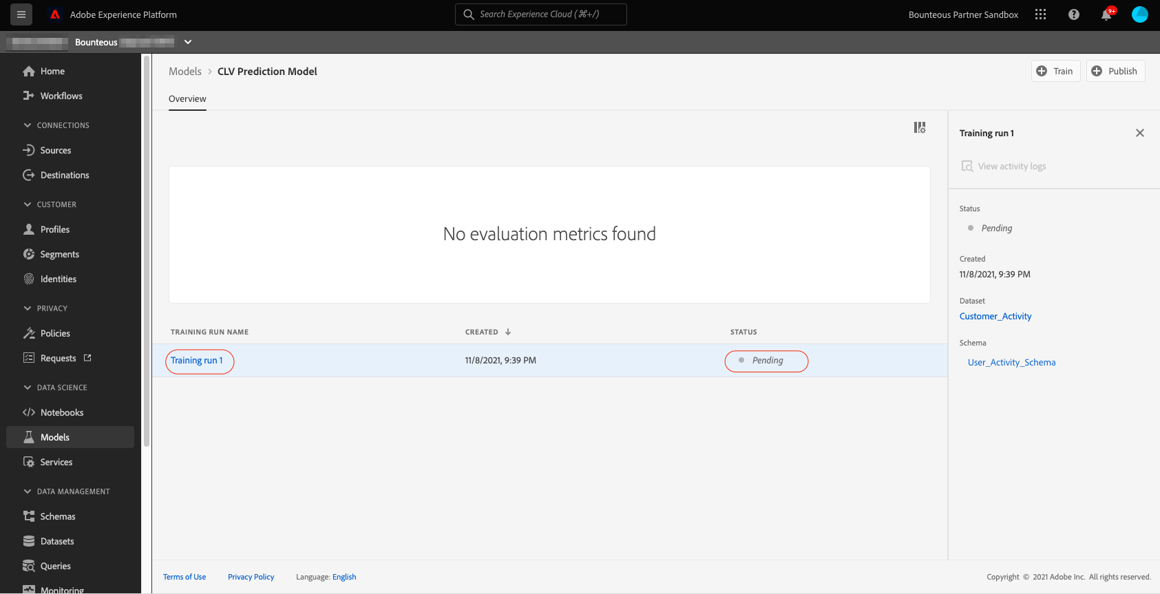
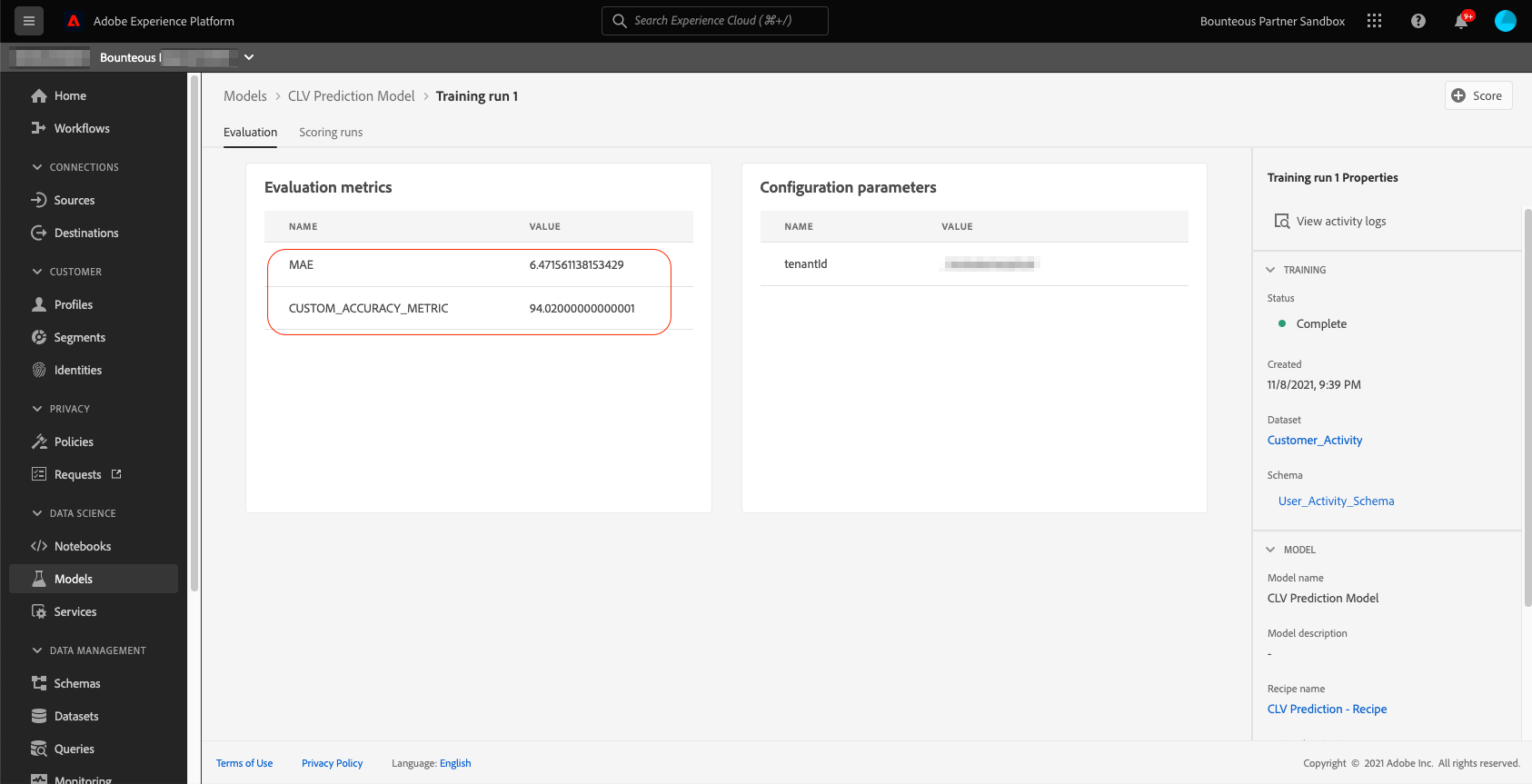
After the model training run is complete, we can view our pre-defined evaluation metrics for that run in the evaluation section of the model. The model training run returns MAE of 6.47 and Custom_Accuracy_Metric of 94 percent. If we wish, we can use the Train button in the top right of the model overview page to create a new training run until we are satisfied with the evaluation metrics. The final step in model creation is to score the model. For that, we will click the Score button on the top right of the model evaluation page.
This will take us to the model scoring workflow where we select the right input and output datasets for the scoring run. Next, we review the configurations and click Finish.
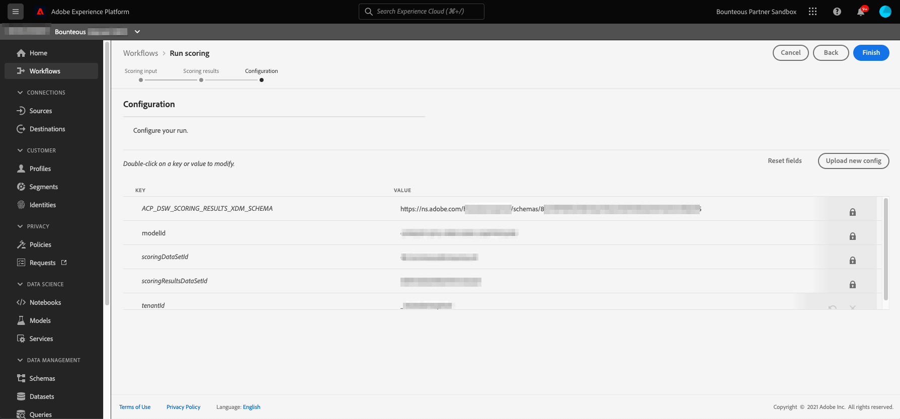
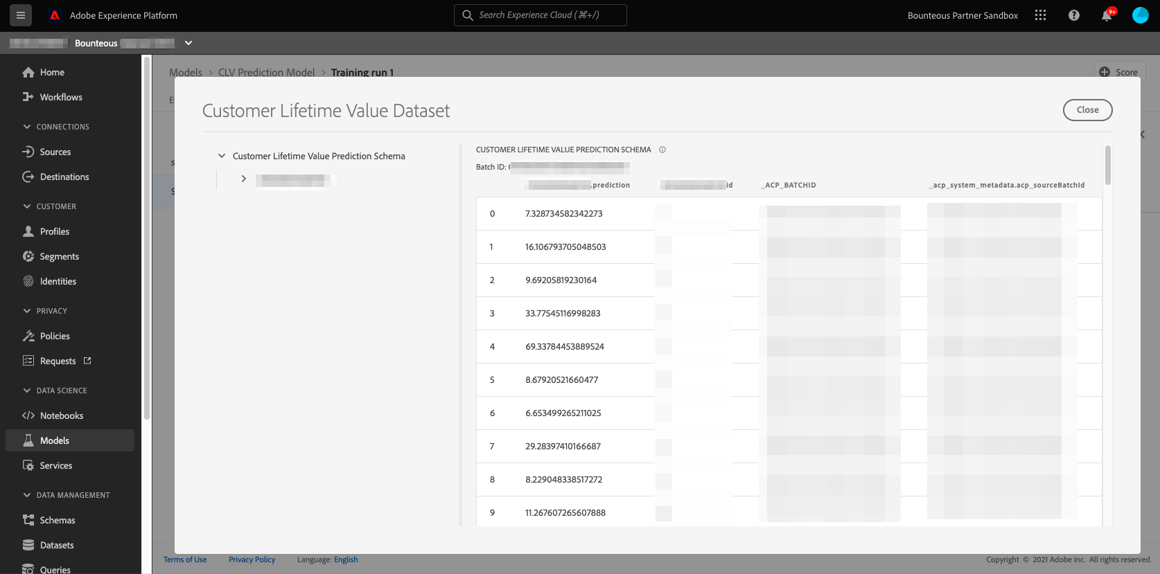
This will start the scoring run. Once the scoring is complete, we will be able to view the scoring run results on the scoring run page. We can click on Preview scoring results dataset in the top right to view the latest successful batch outputted by this model.
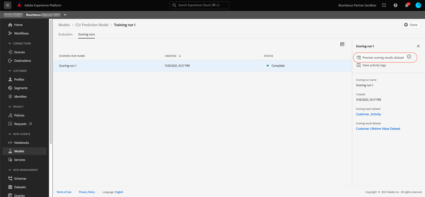
In the preview dataset, each row represents a customer with their userID and their future purchase value prediction.
Deploy Model as a Service
The final step in the process is to deploy the model as a service in the platform either at one time or scheduled.
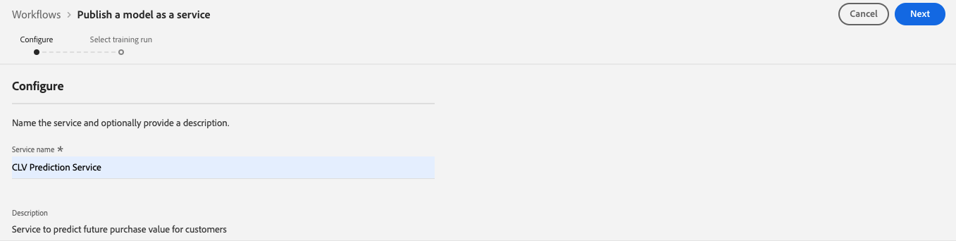
Click on Publish on the top right of the model overview page to start to publish process:
This will take us to the configuration page, where we put in the service name and description and then click Next.
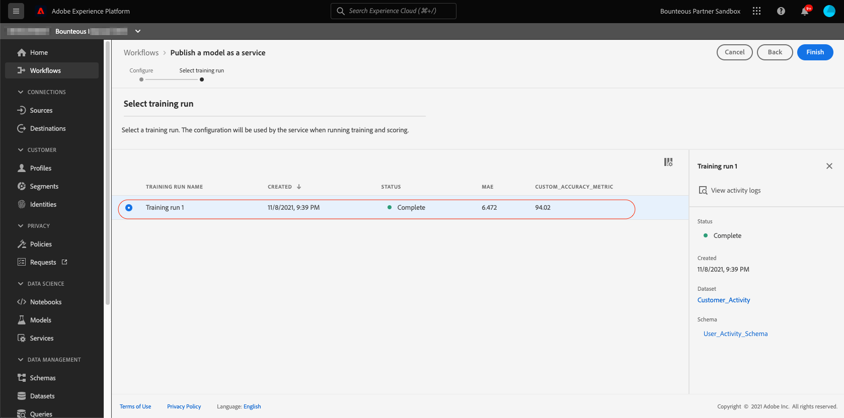
Next, we select the training run whose configuration we want this service to use. Since we have only one training and run and we were happy with its evaluation metrics, we will select it and click Finish.
This will take us to the Services overview page. From here we or any other user in the same IMS organization can use this service to train and score on data by providing correct input and output datasets.
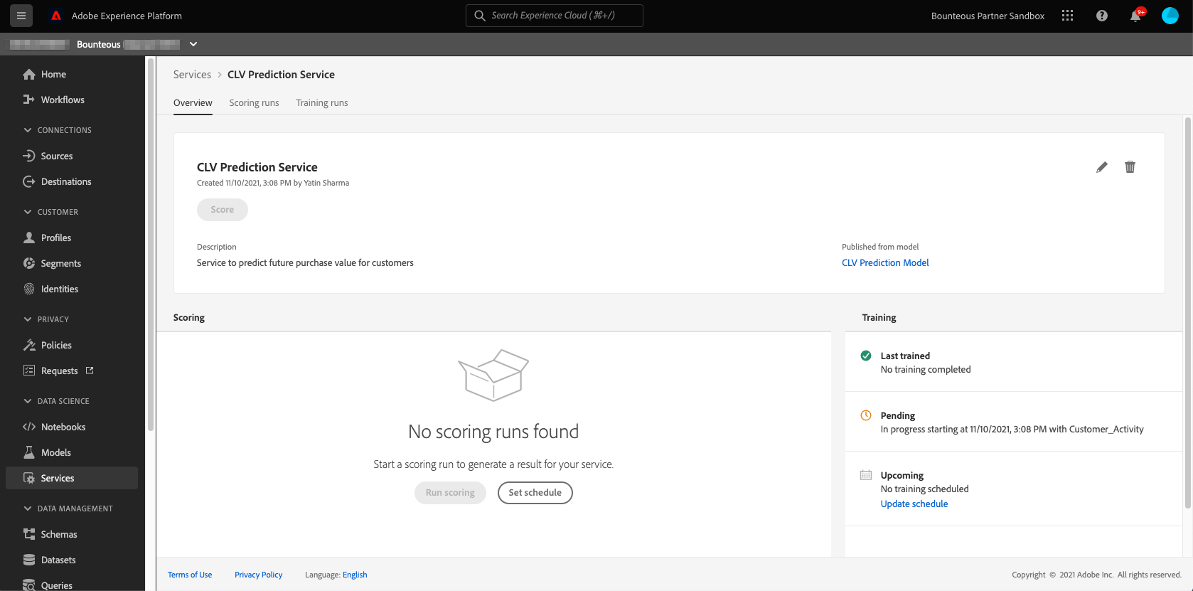
Scheduling Training and Scoring Runs
Since we want the service to retrain and rescore new data every week, we will use the service scheduler feature to set up a weekly schedule for training and scoring. For that, we will click on Update Schedule under the training section. In the configuration page, we specify the start date, end date, frequency, time, and input dataset and then click Create. [Note, there’s no output dataset here since this is a training run schedule.]
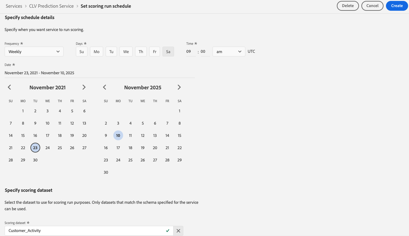
We will repeat the same process for scheduling the scoring runs. We’ll make sure that we specify the output dataset and keep a gap of one hour between the scheduled training and scoring runs.
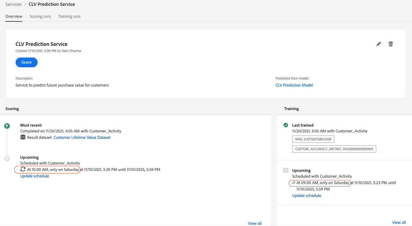
We have now deployed our prediction model as a service and also scheduled its automated training and scoring runs to run every Saturday morning. This service will output future purchase value predictions for every customer into the Customer Lifetime Value Dataset that has been enabled for Real-time customer profiles, which means this dataset will enrich customer profiles with its ingested prediction data.
Activation
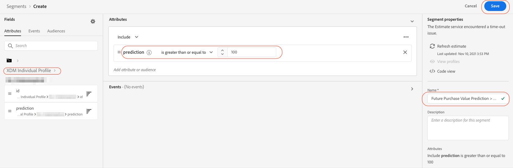
Finally, we should be able to use these predictions in our marketing campaigns. For that, we will go to Segments and create a segment using the prediction attribute from the XDM Individual Profile class. We will create a segment of customers whose future purchase value prediction is greater than or equal to $100. We will call this segment Future Purchase Value Prediction >=100 and hit Save.
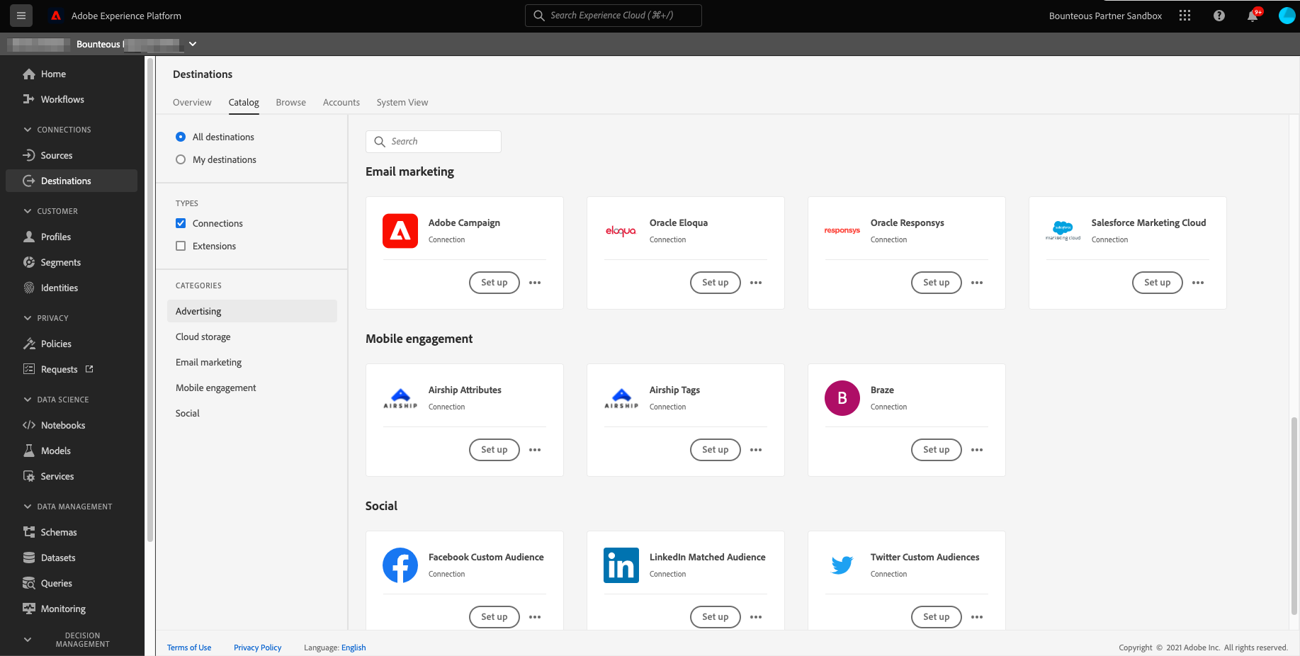
Next, we will go to Destinations and configure the destination platform of our choice such as Facebook, LinkedIn, Google, Salesforce, etc., and export the segment we created above to that platform. [Note you need Adobe's Real-time Customer Data Platform (Real-time CDP) to activate data to destination platforms supported by Adobe.]
Predict Customer Lifetime Value
With AEP’s Data Science Workspace, you can predict Customer Lifetime Value, and use these predictions to make accurate marketing decisions and increase the value of your current customers. As you can see, AEP is a powerful tool, and data science is just one of its capabilities. I encourage you to browse our other resources to learn more about the dynamic capabilities of AEP.