What’s New in Acquia Site Studio 6.9?
Acquia has been very busy developing new features for Site Studio over the past year, making it an even more compelling answer to Drupal core's Layout Builder functionality. With Site Studio, you get everything you need for site building, whether it’s an atomic design based component library, or more traditional, locked down page structures; Site Studio offers it all. While Layout Builder was a massive addition to Drupal earlier in the version 8.x lifecycle, it hasn’t kept up with the way users look to construct pages. Its setup and user interface is clunky at best and requires a lot of extra additions through other Drupal elements, such as custom block types, paragraph fields, etc. in order to truly be useful to content editors and marketing managers.
The drag-and-drop, low-code solution has been receiving regular updates every few months. The biggest of these changes is the ability to create custom components in code. We’ll discuss that major change as well as some other highlights from Site Studio 6.9. Additionally, we’ll also catch you up on some other new updates from other previous releases that you may have missed. Let's take a look at a few of these enhancements!
Custom Components for Acquia Site Studio 6.9
This feature, released recently in version 6.9 of Site Studio, provides developers the ability to define custom components entirely in code. Prior to this, a developer would need to use the Site Studio backend to drag and drop elements into a layout canvas, and from there configure all the various elements (by adding CSS styles, HTML attributes, etc.) using the Site Studio UI. While this process often works well when building simple components, it can quickly become cumbersome and limiting for more complex components.
With this new update, developers can build custom components entirely in code and the process is simple. You first create a directory in your theme or module where you will store your component. In that directory you create a .yml file which defines what assets need to be included with your component (ie, your CSS and JS), and then you specify what kind of template will be used to render your component. You can choose from rendering via a standard HTML template, a TWIG template, or a JavaScript template. Optionally, but probably recommended, you can add a form.json file to define what the edit form for the component should look like (more on that in just a bit). So your custom component file structure may look something like the following:
/path/to/my-theme/


  /custom-components


    /card


      card.custom_component.yml


      form.json


      card.html


      card.js


      card.css
This new functionality is a game changer for developers who feel bogged down by having to work within the Site Studio UI, or who feel they are not able to take advantage of Site Studio to build richer, more complex components. With this new approach, it is now trivial. Check out this example of how to build a React-powered component! In a custom component, the necessary React code can simply be attached as a dependency in the component's definition, just as you would with a React-powered custom block.
Beyond the process of building a component, another advantage to this approach is that component definition is taken out of Drupal config. Exporting Site Studio components to config (as an enormous JSON file) has always been troublesome, if only because code review of the config is nearly impossible (but for other reasons as well). Now, pull requests will include links to markup, JS and CSS that can be reviewed easily and coherently. Furthermore, collaboration between developers on a single component is now possible without exporting and importing config. This really does elevate the experience considerably for developers.
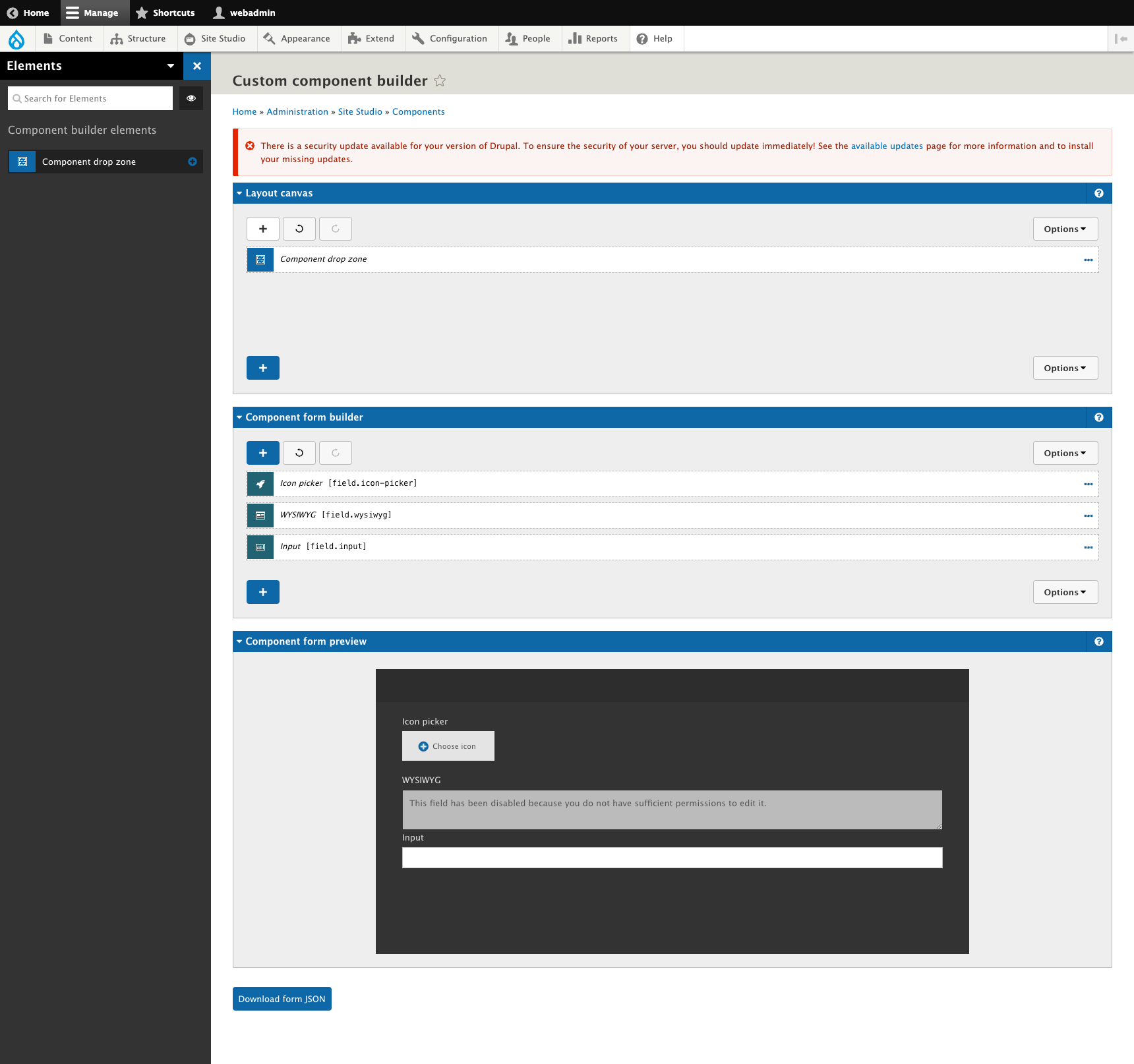
Finally, this opens up the development process to those who are not familiar with Drupal (or maybe even those who do not have access to Drupal). All development can happen outside of the CMS, with the exception of building the form that will be used by content authors. For that process, Acquia has provided a Custom Component Builder where a developer can use the layout canvas to design an authoring form for their component. Once built, the JSON for the form can be exported and added to the component directory. This may be the most cumbersome part of what is otherwise a very slick and exciting new way to build components in Site Studio.
Custom Elements Can Be Containers
Site Studio allows users to create custom layout canvas elements, which is nothing new. Now, we can make custom elements behave as layout containers, meaning users can place nested elements side of a custom element, further making it a powerful feature for builds that require some custom code additions.
Accessibility Improvements
Site Studio comes with a handful of interactive components that can be used out of the box to create things such as sliders, accordions, and even drop down menus. These components include all the JavaScript necessary to power the component. However, in the past we have found that some of these components lack certain accessibility features, and as a result we end up rolling our own custom components and including our own JavaScript plugin (or writing our own JavaScript, if necessary).
Release 6.6.0 included a number of substantial updates to the built-in slider component, addressing a number of accessibility issues. The updates are based on the excellent work by Accessible360 on their Slick slider replacement.
A couple of the more notable improvements include:
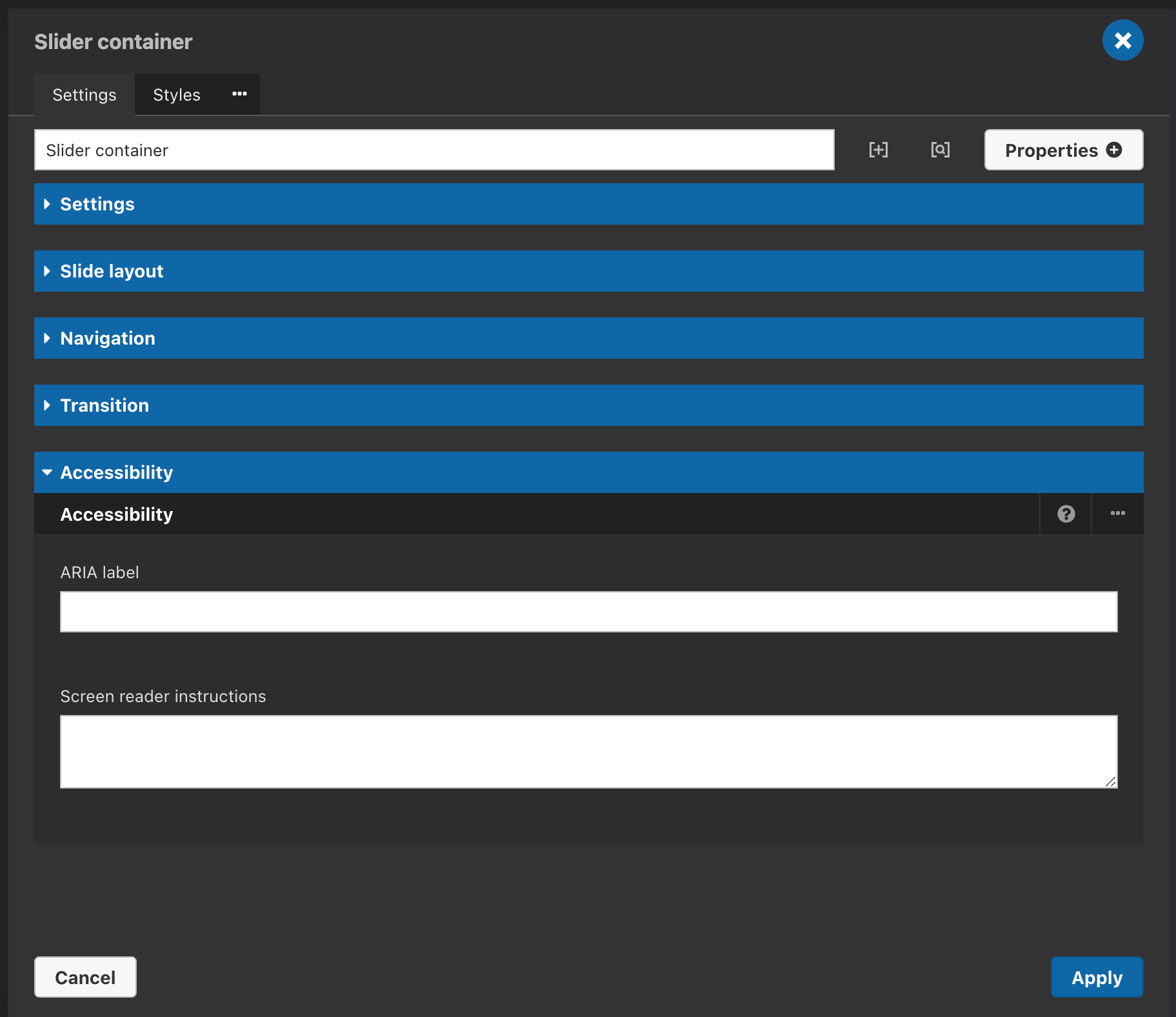
- Users can define an `aria-label` for the Slider container, providing a place to include descriptive text for screen reader users.
- Instructions can be provided for screen reader users on the Slider container. This can be very helpful as it provides a way for screen reader users to learn how to navigate the slider.
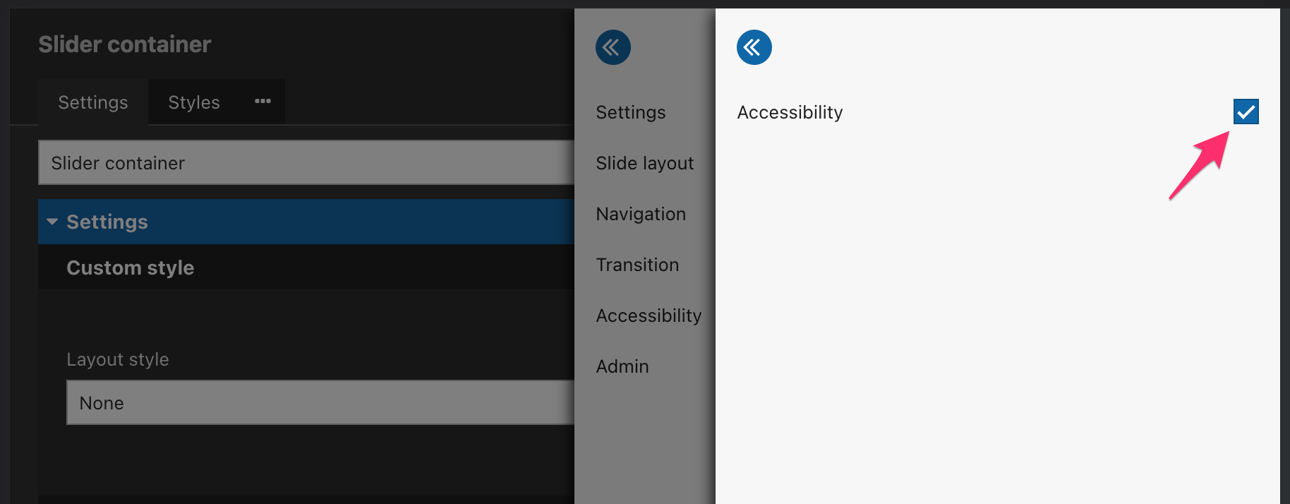
These two properties are not visible by default, so when adding a new slider, you will need to edit the slider container and then click Properties -> Accessibility, and then check the Accessibility checkbox:
You will then see an accordion item in the slider container's edit form with fields for "ARIA Label" and "Screen reader instructions:"
With these changes, site builders can feel confident that adding an out-of-the-box slider will be both functional and accessible, without having to get their hands dirty writing any JavaScript.
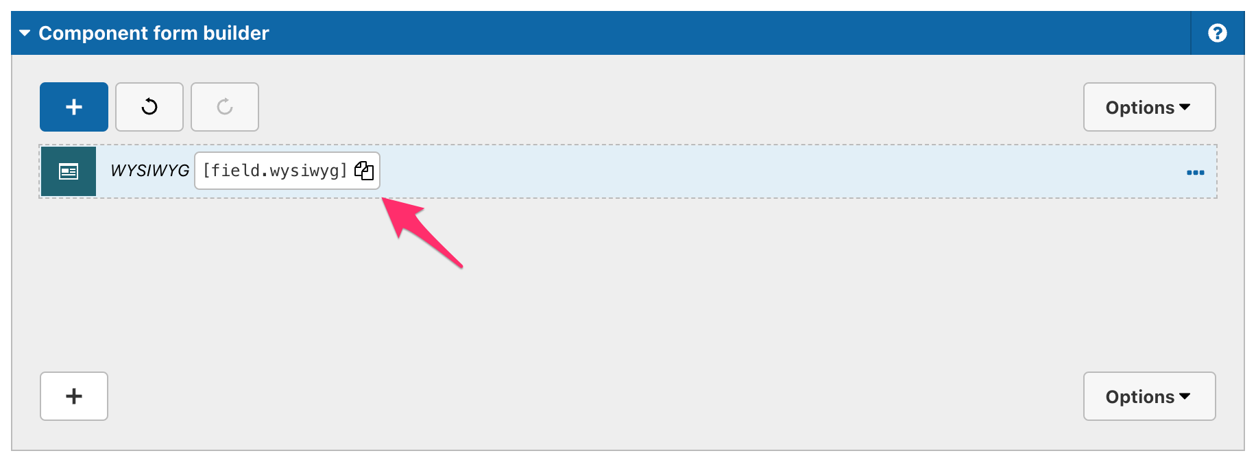
Copy Token Button
The layout canvas now includes a button to allow users to copy token values. This sounds like a tiny update, but this is a huge improvement in the user experience for site builders. Previously, you would have to manually type in the name of a token, an operation obviously prone to error.
Undo / Redo Layout Canvas Buttons
Another new feature added to recently is the ability to undo / redo changes in the layout canvas. This feature adds two buttons to the top of a layout canvas allowing you to go back and go forward with your changes. This is another minor change that goes a long way to improving the component building experience. Like with any undo/redo feature, there is a risk of manually deleting data by using the buttons inadvertently.
New UI Kits
Though not strictly a new feature in Site Studio, Acquia is now offering two new UIKits for Site Studio users. Think of these UIKits as Bootstrap for Site Studio. They offer site builders a way to quickly populate a site with pre-built and styled components for things like modals, sliders, tabs, etc. These new UIKits also come in two flavors called the Primitives UIKit and the Sections UIKit. Let's take a closer look at these two and see what the difference is!
Primitives UI Kit
The Primitives UIKit is intended to provide maximum flexibility for site builders and designers. This kit comes with a comprehensive set of content components and layout components that can be mixed and matched and combined to create an endless variety of designs. The components are granular and discreet - think cards, videos, testimonials, stats and sliders. When combined with the Visual Page Builder, content authors have a drag-and-drop interface which allows them to build very complex pages, and they are able to do so quickly and efficiently. This kit is best for sites with varied content that would benefit from the flexibility that it provides. Content editors using this kit would likely benefit from some training in how to combine the various components in the most effective way and would be trusted to do so consistently.
Sections UI Kit
If you want to get a site up and running as quickly as possible, and you do not have highly-customized designs, the Sections UIKit will likely be what you are looking for. Rather than providing a collection of discrete components as in the Primitives UIKit, the Sections UIKit instead provides a collection of pre-built "page sections" that can be mixed and matched as needed. Where the Primitives UIKit includes a "map" component and a "text" component, the Sections UIKit includes a "Text and map section" where the discrete components are already combined into one page section. By stacking page sections on top of each other, content authors can very easily build landing pages full of rich content with very little training.
Acquia has made some significant improvements to Site Studio in the last year. Most importantly, the support for Custom Components is going to be a game changer for a lot of developers, and will significantly expand what kind of sites can be developed using this platform. We look forward to using this new functionality and pushing its boundaries.
Growth and Maturity
Site Studio was already a powerful tool in Acquia’s impressive line of products, but it continues to grow and improve. The addition of the custom components feature alone opens up Site Studio to a much larger potential user base. At Bounteous, we will look to dive in further into these new features and look forward to where Acquia takes Site Studio in future.
As with any Drupal updates, it's recommended to fully test these new features and fixes (as applicable) on your site's development environment before deploying to production. You should also have a backup of any code or databases before upgrading. Version 6.9 of Site Studio is not backwards compatible.
For additional information on Site Studio, check out some of our other posts: