How to Use Custom Components in Acquia Site Studio

Acquia recently announced a new feature for Site Studio that could have major implications on how it’s used and expand its potential use cases. It’s called Custom Components and developers and designers alike will benefit greatly from these new features as it harnesses processes and design patterns in a way that empower end users and scales more efficiently. In this post, we’ll discuss what Custom Components are, how to use them, and what it means for future builds as well as the improvements we’d like to see in the future.
But before we talk about custom components, let’s refresh our memory of what Acquia Site Studio is and what it brings to the table. Site Studio is a powerful visual user interface for creating page layouts, template layouts, views templates and other aspects of your website theme faster than ever before. It plugs into Drupal 9 to provide a rich set of features to allow for low-code website development with a drag and drop interface and many other exciting features.
What is a Custom Component in Site Studio?
Traditionally in Site Studio, developers would build a library of components through the user interface (UI). This allowed for fast component development and maintained a low-code environment. While this is still a valid way to do things, component development done primarily within the user interface does have drawbacks and limitations. That doesn’t mean you couldn’t use CSS styles from a traditional Drupal theme or add on some extra JavaScript. The issue is that it’s not the pattern that Site Studio was built on, and generally means there would be a separation of elements that would typically be organized together in a traditional theme setting.
At its core, a custom component is really no different from the components that were previously constructed in Site Studio. Content editors and marketing managers won’t see any difference to the editing experience. The end users, however, will now see a richer, more engaging experience. Designers, user experience specialists, and site architects have a lot more room to dream up unique site experiences. Site Studio was already a very powerful, game-changing tool, but now, it’s functioning outside the box.
Instead of being entirely contained within the module’s UI, the custom components feature allows developers to define components in code. At its core, you can still arrange Site Studio elements via a Layout Canvas and define form fields through the form editor. Now, users will export the custom component data in a JSON format and add to a custom Drupal theme or module. Developers have the option to still add drop zones to a component via the Layout Canvas, but will mostly define templates via twig or HTML. All in all, there is far more development flexibility in Site Studio with the addition of custom components.
This allows you to write custom CSS via the theming layer instead of the UI. It provides the ability to include complex JavaScript or use this feature in a React application. Let’s not forget about Twig templates either! In Site Studio, Twig templates were locked down due to being automatically generated by the module’s build processes. This prevented users from being able to do much, if any, custom twig work in Site Studio. Now, users can forgo the layout canvas entirely and rely on traditional Drupal Twig templates to develop components.
Another powerful upgrade that comes with Custom components is code reviews. This might not be as obvious, but is a huge improvement for developers and architects. Previously with Site Studio, local development of Site Studio components was difficult to peer review. Unless you are using Site Studio’s package manager, code review of Site Studio components is nearly impossible due to the JSON data being minimized. Review of Site Studio components was actually closer to QA work than code review. With the ability to create custom components in code, we’ve restored balance to the peer review process.
Now that we’ve discussed what this new feature looks like, let’s walk through how to use it.
Defining Custom Components
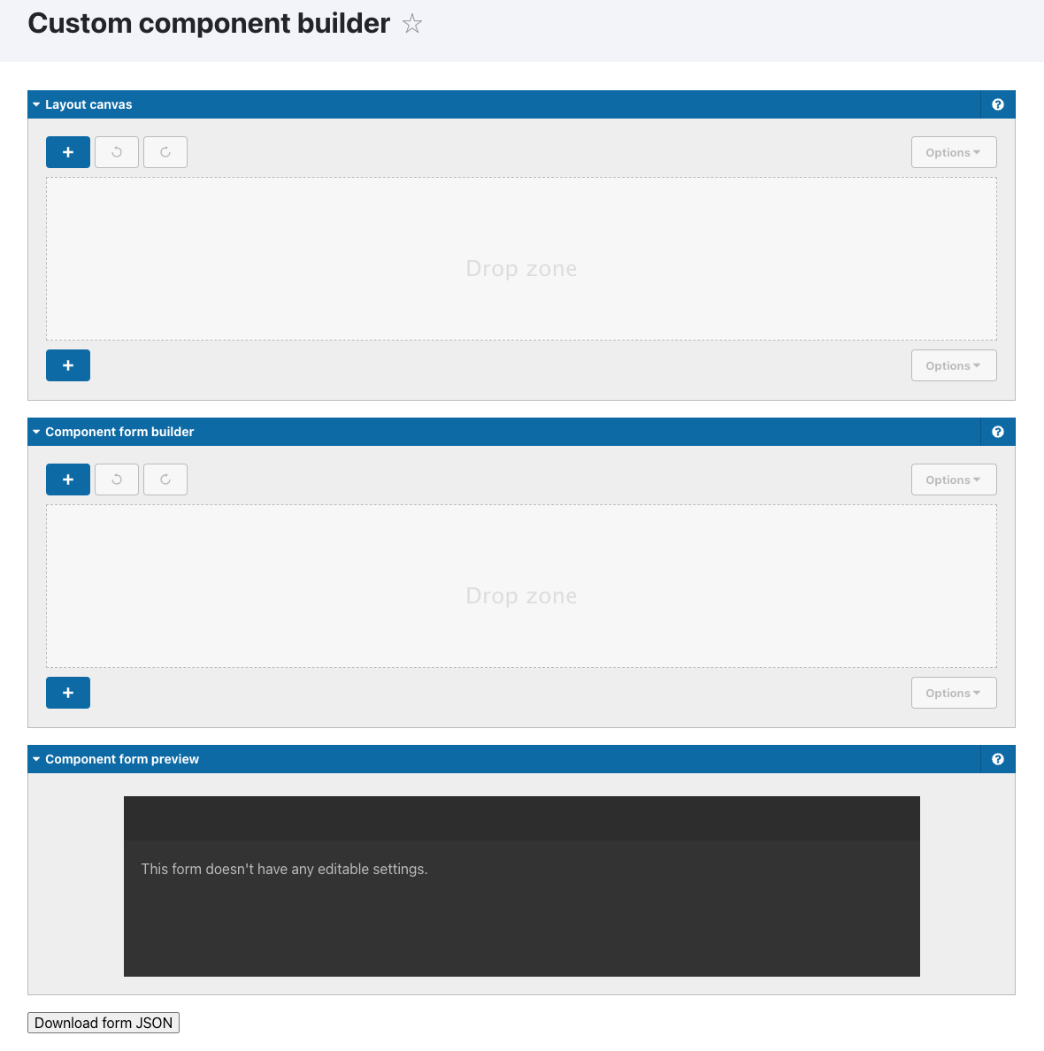
When looking to build a custom component, developers will start with the traditional layout canvas and form builder just like with any Site Studio Component. The Primary difference is that the layout canvas currently only allows users to place Dropzones. Otherwise, the form builder still remains largely unchanged. Once the layout canvas and form building is complete, users will export the form.json file and start the process of adding it to a custom module or theme. In the examples below, we are borrowing from Acquia Site Studio User documentation to show how custom components could be incorporated into a module. Steps to include via a theme would be similar, although, as a module gives developers the most flexibility, particularly in a multisite/Site Factory environment.
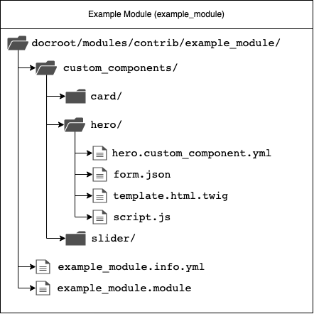
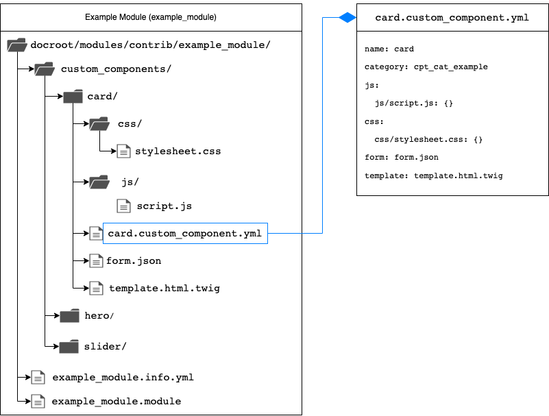
Like with Drupal themes and modules, custom components expect to see a specific format in order to be readable by Drupal. Below is an example of custom components contained within a module. Regardless of being in a module or theme, all custom components must be included in a directory named, custom_components. Within that directory, individual components can be added.
Each custom component must have a definition file formatted as a YAML file and a naming convention using the following structure:
<unique_component_machine_name>.custom_component.yml.
The component machine name itself should be in all lowercase and use underscores instead of spaces. Numbers are allowed but only in conjunction with letters and underscores such as layout_3col or grid_3x9. Special characters are not permitted. Additionally, it is important to only use unique machine names when naming components. If repeated, even from a separate module or theme, Drupal and Site Studio will only pick up one of the components.
Any file names referenced in the definition file, such as templates, html, js, or css files should be placed inside of the same directory as the definition file or into relevant subdirectories. Filenames and paths to file names should be made relative to the location of the definition file as shown in the example below.
Once the definition file is created, and the module or theme containing the custom component is enabled, a Drupal cache clear should result in the component appearing in the sidebar.
Setting Up a Custom Component Definition File
The component definition file is the most important element to Site Studio components. It is a cross between a module’s info YAML and an entity configuration YAML. Name and Category properties are required by a custom component but developers can add optional properties such as: preview image, availability, template, html, form, js, css, and dependencies. Here are two example structures provided by Acquia via the Custom Components Example module:
Example A:
name: Custom component JS with template
category: cpt_cat_hero_components
js:
  js-template.js: {}
  https://cdn.jsdelivr.net/npm/slick-carousel@1.8.1/slick/slick.min.js: { type: external, minified: true, attributes: { defer: true, async: true } }
css:
  js-template.css: {}
form: form.json
html: html-template.html
preview_image: preview.png
Example B:
name: Twig custom component
category: cpt_cat_example
template: template.html.twig
availability:
  -
    type: node
    bundles:
      - article
      - layout_page
form: form.json
css:
  twig-component.css: {}
preview_image: preview.png
Definition References:
Name (required)
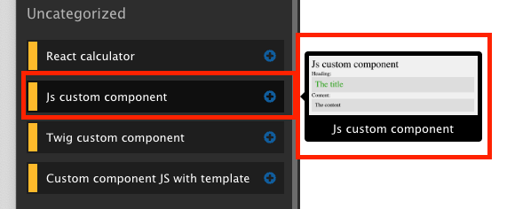
While the name of this file handles the machine name property, within the definition file, we must set a human readable name that content editors and marketing managers will see. It will appear in the sidebar browser, layout canvas, and other areas of Site Studio.
Category (required)
Custom component categories operate in the same way that traditional Site Studio categories do. This helps to organize components in a more user friendly way, such as following an Atomic Design model. Developers can find the list of existing categories and/or create new ones from the Site Studio categories administration page found at:
/admin/cohesion/components/categories
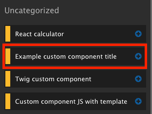
If the specified category doesn’t exist, the component will be placed into the default “Uncategorized” category, or cpt_cat_uncategorized as a safe default.
Preview Image (optional)
A preview image can be assigned to custom components, much in the same way that traditional components can. Preview images help content editors and market managers get a better sense of what the component looks like prior to using.
Availability (optional)
Custom components can utilize availability controls in order to limit how or when a component can be accessed. This includes availability to various Drupal entities and Site Studio templates. When not set, the component will be available to all Site Studio elements.
availability:
  -
    type: node
    bundles:
      - article
      - layout_page
Templates & HTML (optional)
The template property specifies the path to the Twig file that will be used to render the custom component. The HTML property specifies the path to the HTML file that will be used to render the custom component. Only one of these properties can be used on a custom component. The Twig template property is more widely used in cases of traditional Drupal theming. Whereas, a developer would opt to use the html template property in the cases of a JavaScript or React based component.
Twig Example
<div class="twig-component">
    <h2>Twig custom component</h2>
    <label>Input field:</label>
    <h3 class="twig-title inline-style">{{ field.input }}</h3>
    <label>Paragraph field:</label>
    <p class="twig-paragraph">{{ field.plain_text_area }}</p>
    <label>Entity reference:</label>
    <div class="twig-entity-reference">
        {{  renderContent(field.entity_reference['#entity_type'], field.entity_reference['#view_mode'], field.entity_reference['#entity']) }}
    </div>
    <label>Dropzone content:</label>
    <div class="twig-dropzone">
        {{ dropzones['dropzone_c6d16282_1402_41cc_bcfd_c8204b3aae0b'] }}
    </div>
    {% set styles %}
    <style>
        .twig-component .inline-style {
            color: {{ field.color_picker }};
        }
    </style>
    {% endset %}
    {{ renderInlineStyle(styles) }}
</div>
HTML Example
<div class="custom-component">
    <div class="js-with-template">
        <h2>Js with template</h2>
        <label>Title:</label>
        <h3 class="js-title"></h3>
        <label>Dropzone content:</label>
        <div class="js-dropzone"></div>
    </div>
</div>
Form (optional, but strongly recommended)
This optional property specifies the path to the JSON file that contains the structure required for rendering the custom component form in the Sidebar Editor. A custom form is used to define the layout of fields in the Sidebar Editor. Values entered into this form are made available to the component’s template.
It is recommended to use the Custom Component Builder for building the form structure. Once built, you can download the JSON file required for the form.
/admin/cohesion/components/custom-component-builder
Examples of the form.json can be found here.
JS, CSS, and Dependencies (optional)
The file definition structure for both CSS and JavaScript follows the same syntax and organization found in a libraries yaml file. Likewise, the dependencies referenced in the definition file follows the same pattern of assigning Drupal library dependencies in a libraries yaml file.
JS Example
js:
  js-template.js: {}
  https://cdn.jsdelivr.net/npm/slick-carousel@1.8.1/slick/slick.min.js: { type: external, minified: true, attributes: { defer: true, async: true } }
CSS Example
css:
  example_stylesheet.css: {}
  https://cdn.jsdelivr.net/npm/bootstrap@5.1.3/dist/css/bootstrap.min.css: { type: external, minified: true }
Dependency Example
dependencies:
  - core/jquery
  - example_module/example_library
Step-By-Step Process For Building a Custom Component
1. Create a Custom Component
From either a module (recommended) or theme, add a custom_components directory to that element's root directory. From within that directory:
- Create a yaml file:
[your_custom_component_id].custom_component.yml - Add the required Name and Category properties.
- Add any necessary optional properties such as preview image, availability, template, html, form, js, css, and/or dependencies.
Depending on which of the optional properties are used, add the appropriate file type.
2. Define and Manage the Form
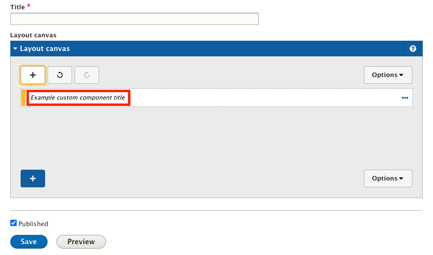
Like any other component, you can add a form to your custom component. To build a custom component form, Site Studio provides an interface similar to components. In this UI you will be able to add fields and layout to your form. You are also able to add dropzones to your custom component.
To add a form to a custom component:
- Go to
admin/cohesion/components/custom-component-builderand build your form - Export the
.jsonfile from the bottom of the page - Place that exported
.jsonfile alongside the YAML of your custom component - Add a form property to the YAML file with the path to the form json as a value
To edit a form of a custom component:
- Go to the list of components and click edit on the custom component
- Change the form and export the
.jsonfile - Replace the form
.jsonfile of the custom component by the one you exported
Once these steps are completed, and the Drupal caches have been cleared, you should now see your new custom component available for use in Site Studio. Be sure that your module has been enabled, or if using a theme, that your theme is enabled and set as the default.
What We Want to See in the Future
As great as the new custom components feature is for Site Studio, we believe that it can be even better with a few improvements.
Include Site Studio Helpers
Currently in Site Studio 6.9, we don’t have access to Helpers on the form builder. In the case of wanting to either migrate a traditional Site Studio component to a custom component or just wanting to be able to reuse form elements, we would have to build forms from scratch each time we want to develop with Custom Components. Helpers are one of the features of Site Studio that helps promote faster site building.
Expand Layout Canvas for Custom Components
Currently, with Custom Component, we can only place a Dropzone in the Layout Canvas. We’d love to still be able to build a full component via the Layout Canvas but store it as a Custom Component instead of as config. We could still lean on the Layout Canvas to assemble our components, but also include CSS and/or JavaScript via code.
A Proper Style Guide
Site Studio currently includes a style guide, but it’s not actually a style guide in the traditional sense of the word. The style guide available in Site Studio is a holdover from before Acquia acquired what was previously known as Cohesion. The Site Studio Style Guide offers the ability to define theme-specific overrides. It does not show examples of styles or component usages. Content managers and/or developers could manually create pages for style guides, but we’d love to see a more automated version of this.
Fully and Partially Decoupled Options
And finally, while we love that we can now build a custom component using a little ReactJS, we’d really love to see more possibilities with a partially or fully decoupled (headless) build. As we’ve stated previously, we believe that Site Studio is an excellent site building tool for developers and a great content editor experience, but if we could use it on a headless application, there’s very little limit to what we could build while still providing a rich, ease to use editing experience.
Endless Possibilities with Custom Components
Like with any solution, it’s rare that you have a tool that is one size fits all. Site Studio is no exception and while it’s not the right solution for everyone, the addition of custom components opens the doors to a lot more use cases for Site Studio. This product is now about as close as it gets to being the perfect site building tool.
No longer will we have to tell designers, user experience, content editors or market managers that something may not work or be too difficult to build, or isn’t possible in Site Studio. Gone are the days where you have to potentially sacrifice or compromise on site building. With custom components, the restrictions have been lifted and all bets are off. I’m really excited at the possibility of what we can build with this new tool.