What the Font are Vertical Rhythm and Modular Scale?
Anyone that’s been in earshot of me has likely heard my ramblings about style guides, and a big part of that lately has been establishing a vertical rhythm and using a modular scale. But what the font am I talking about? In this article I’m going to walk you through why you should care about vertical rhythm and modular scale, define them, and finish up with a demonstration on how to integrate them into your next project.
Why Should I Care?
I wanted to start with this first because I feel it’s beneficial to understand the problem we’re trying to solve and the importance of both vertical rhythm and modular scale as parts of an overall solution. The whole reason this article is on both vertical rhythm and modular scale is because they both contribute to the visual harmony of a page. Vertical rhythm engages and guides the reader down the page, good vertical rhythm makes a layout more balanced and beautiful, and its content more readable. Modular scale provides resonant numbers using culturally relevant, historically pleasing ratios and encourages thoughtful repetition. Repetition breeds familiarity and reinforces a pattern that helps the user make sense of the content and layout. The Before example below is using the browser default font sizes and line heights, while the After example shows how this same content changed when applying the concepts I'm introducing below.

Vertical Rhythm
Vertical rhythm is the spacing and arrangement of text as the user descends the page. Vertical [ ↕ ] Rhythm [ a repeated pattern ]. It's contributed by three factors; font size, line height, and vertical margins or padding. The basic unit of vertical space is line height - typically the line height of the body copy, as that will be the dominant content on any given page. To illustrate, I'm going to take examples from a recent site I've been working on. At the beginning of the project, we were provided designs that use Open Sans 15px font with a line height of 25px. So in this example below the vertical rhythm base unit would be 25px.

Vertical Rhythm Line Height example
With our base unit figured out, we need to now ensure that it’s maintained throughout the body copy. A common place to lose the rhythm is in the margin gaps set between block level elements. The default browser treatment of paragraphs is to insert a top and bottom margin of 1em and call it a day. This is not ideal if the rhythm is to be maintained, in our example below that’d mean the margins would be 15px instead of the 25px we need. It's also worth noting that different fonts have different line heights built into them further causing visually inconsistent spacing. So margins and line heights need to be reset.

An example showing the gaps from margins between block level elements
This is common practice nowadays but I wanted to note that it’s always best to start things out on a level playing field, we need to make sure all vertical measurements including line height, padding, and margins are reset in a cross-browser compatible way. With this level playing field we’ll be able to then set these values as needed while maintaining the rhythm. I’ve used the Normalize.css, good ol’ Reset CSS from Eric Meyer, and even the following block with success. Whichever you choose will depend on your projects needs.
body,
pre,div,
dl,dt,dd,
ul,ol,li,
h1,h2,h3,h4,h5,h6,
form,fieldset,
p, blockquote,
th,td {
    margin:0; padding:0;
}
With any site there are bound to be quite a few variations in text sizes for elements such as headlines and block quotes, all these differing text sizes should also take up multiples of the base unit. Continuing our example, that’d mean that every diversion from the paragraph text size should still take multiples of 25px. This is where the real fun begins, adjusting the line height and margin of these elements accordingly. We’ll dive into more details on this in the last section on how to integrate these concepts into your projects.

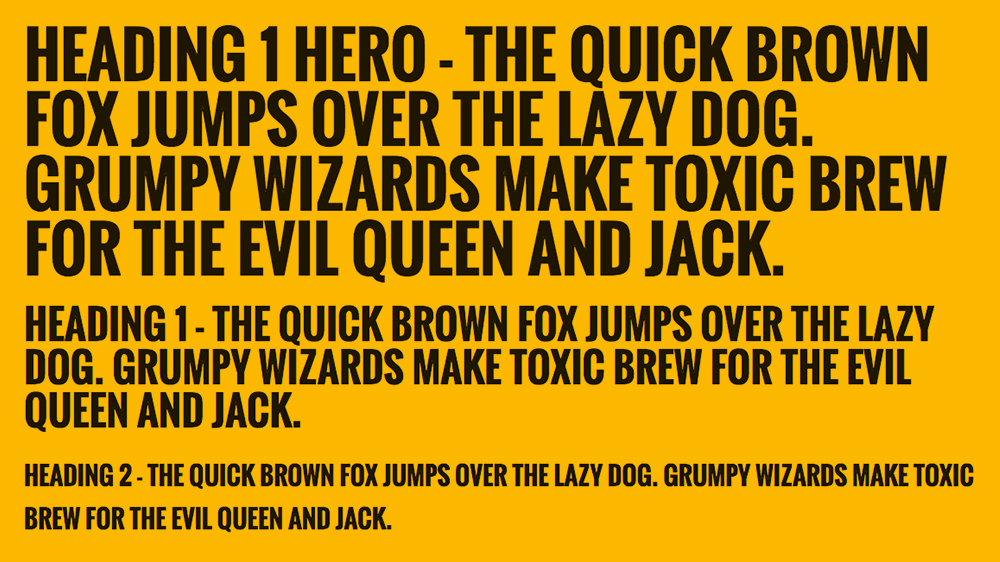
Illustration of multiple variations in text size
Modular Scale
Modular scale is a sequence of numbers that relate to one another in a meaningful way.
You start with a ratio and a number. Like Vertical Rhythm, the best way to ensure the effectiveness of your starting number is to use the body copy. Since this is setting the scale, we want to use its font size rather than its line height. Continuing with the same example from before, we’d use 15px as our base number. The ratio is more difficult to find, most common are the Golden Ratio (1.618) and Perfect Fourth (1.333). Both are culturally relevant; the former being a favorite in classical Greek and Renaissance math, architecture and art, and also found in nature; the latter was popular in early 20th-century music. One good rule of thumb is to consider how much typographical and layout variety you need. If you require steps for all six headers you’ll likely want to choose a ratio that allows for more subtlety between steps.
On the web, using a modular scale means choosing numbers from the scale for type sizes, line heights, line length (the width of a line of copy), margins, column width, and more.
With a ratio and number chosen, you can then multiply and divide them to get many resonant numbers. Below is a list of resonant numbers we'd get from using the 15px base and the “golden ratio” of 1:1.618 for the multiplication/division, I’m using the super helpful modularscale.com site to do these calculations for me and show me visually what the resulting sequence looks like.

An example of modular scale applied with the Golden Ratio from modularscale.com
What this did was take the starting number of 15 and
- Multiply it by the golden ratio of 1.618 to get 24.27
- Then it multiplied that by 1.618 to get 39.269, and so on
- It also divided 15 by 1.618 to get 9.271
- Then divided that by 1.618 to get 5.73 and so on
For comparison, below is the same 15px base and the “Perfect Fourth” ratio of 1 to 1.333 mentioned previously. As you can see, this ratio has more subtlety between steps in the new set of calculations. Because the ratio is smaller, the steps between scale are closer together and more subtle.

An example of modular scale applied with the Perfect Fourth Ratio from modularscale.com
You also have the option of defining a second base number and ratio to generate what’s called a double-stranded modular scale. This combines two sets of resonant numbers to give you more measurement options that fill in the gaps of the first scale. For the second base number, I’ve seen people use smaller caption text and larger numbers like the width of a column in the 12-column grid they’re implementing. So long as it’s an “important” number to the layout, there is no wrong answer. Here’s what adding a second base of 95px (the size of one column in a 1140px wide layout) would look like.

An example of modular scale applied with the Golden Ratio and two base numbers from modularscale.com
Great! Now we have a lot more options to work with!
History Lesson


The origin of establishing a typographic scale came as much from practical need as aesthetic judgement. Back when printing was done via letterpress, movable type was composed by hand for each page using cast metal sorts (upper right). It was impractical to manufacture and store whole character sets of each typeface in all possible sizes. Over time, typesetters settled on a usable range of sizes that worked harmoniously together.
Bonus - letters were organized and stored in small compartments of drawers (lower right) in a type case. Capital letters were traditionally stored in a separate drawer, or case placed above the case holding the other letters. This is the origin of the terms "upper case" and "lower case."
Similarities and Differences
Now let’s quickly go over some similarities and differences between Vertical Rhythm and Modular Scale
As mentioned at the beginning, this article includes both vertical rhythm and modular scale because both are interrelated and contribute to the visual harmony of a page. Both vertical rhythm and modular scale most often use the primary body copy for their starting base numbers.
Where they differ most is in their application - vertical rhythm is only concerned with typography where modular scale provides a set of resonant numbers to use for typography, columns, line lengths, etc. Another key difference is how strict they’re intended to be followed. With vertical rhythm the more consistently you follow the pattern the better the rhythm will be. On the other hand, modular scale is more of a tool that can be improvised as necessary. The quote below is in reference to the math involved with Modular Scale.
Integration
Hopefully, by now I’ve convinced you that these methodologies are beneficial and worth your time to implement because I’ve got two bits of bad news.
First, a pervasive assumption is, “I can plug a couple of numbers into a generator and it all just works!” While there are online tools that help with a lot of the math and guesswork, there’s still going to be some trial and error. Every project is different, so a perfectly viable solution for one isn’t necessarily going to fit for another.
Second, all materials I’ve found online related to these topics have come from the design or design-dev mindset where the person determining the modular scale and vertical rhythm is the one ultimately in charge of making those typographic decisions. In our case more often than not we’re handed designs that need to be converted from Sketch/PSD to web.
But there’s hope! On my most recent projects, I’ve successfully taken what was provided by a design team and was able to work them into a rhythm and scale that fit the guidelines mentioned thus far while also maintaining the integrity of the design. The trick is in getting the calculations as close as possible and setting up an example page that clearly illustrates the benefits before reaching out to the design team for the OK to move forward with the changes. In my experience, they’ve been even bigger type nerds than me and appreciated the extra effort involved.
Did this article speak to you? Are you giddy with the prospect of math-inspired uniformity and consistency in design work? In addition to complete end-to-end solutions like website and mobile overhauls, we have the best-in-class designers on every project, ensuring consistency and making clients’ dreams a reality. Check out our recent contribution to builtinchicago.com on hiring designers and our open design positions.