Energize Your Data Studio Report With Bullet Charts, Scatterplots, and Treemaps
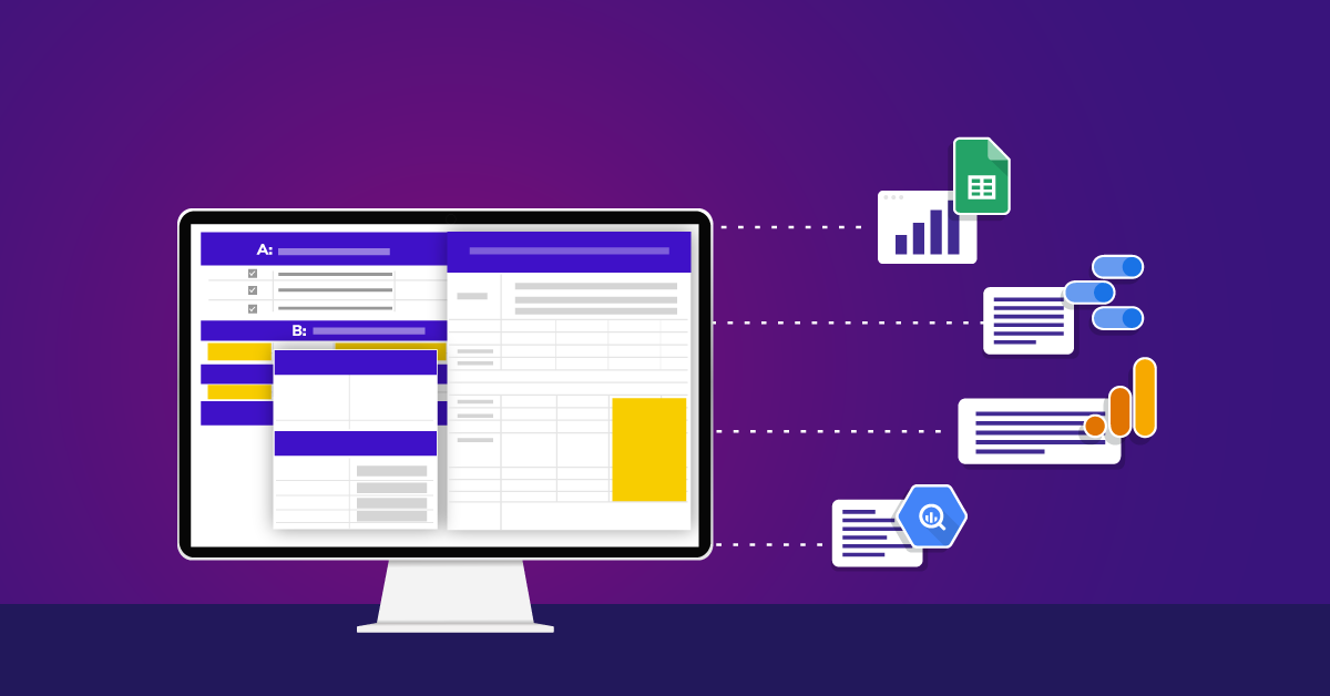
Data Studio offers a variety of visualizations, including charts, graphs, and table options along with features that help customize and interpret your data based on your business goals and objectives. If you are just getting familiar with Data Studio, check out this guide to get started.
Choosing the most effective visualizations to tell your story is the key to creating a strong Data Studio dashboard, but sometimes it can be tricky. You probably find yourself reaching for some chart types more often than others, like line charts, tables, or bar charts. Bullet charts, scatterplots, and treemaps seem to get less love and are maybe underused. If you tend to skip over these chart types, let's think about some use cases you might consider for your next dashboarding adventure.
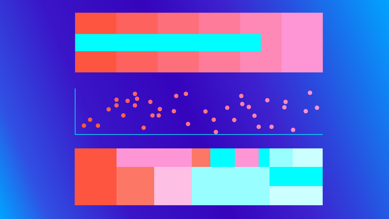
Bullet Charts
Bullet charts were developed and designed by Stephen Few1. The idea spiraled from gauges and meters in which the main focus is to show the relationship between performance and target. Bullet charts provide qualitative ranges of performance on a quantitative scale.
What are some ways we can use bullet charts in Data Studio?
Bullet charts can be used to show a dynamic goal, for example, the number of monthly registrations. This target number may change monthly based on your marketing efforts and SEO optimizations. You may also have a static goal with a long term goal, such as the number of visitors from an organic search.

What does it mean to have qualitative ranges of performance on a quantitative scale? When looking at the bullet chart, the vertical line represents a target value or benchmark. The blue bar in this example shows the actual value of our performance measurement. The colored bands represent qualitative ranges, such as "poor," "average," and "good." In Data Studio, these bands are specified by assigning values to Range 1, Range 2, and Range 3 in your chart configurations.

In the Registration bullet chart, the actual bar lands on the safe zone which is closer to the target of 180 registrants a month and indicates that business is on the right path. If the blue bar were in the 0-50 range, it would indicate poor performance and require immediate action. If the blue bar were in the 50-150 range, it would represent an average performance and would not necessarily require action but maybe give time to observe the performance.
These ranges can take on a different meaning if you're using negative goals. The ranges could represent "fun," "safe," and "danger zone" if you have 50 seconds to free-fall, five to six minutes to float, and 10 seconds to open your parachute after jumping from an airplane. If your negative goal is approaching the "danger zone," we know we need to change our business plan, open up our parachute, and land safely on the ground!
Let’s say you decided to provide product maintenance guidelines as a PDF download on your site to offer fast solutions for “how to prevent damage” questions and eventually reduce the number of “contact us form” submissions and increase your customer service team’s efficiency.
Here, we'll want to look at the number of form submissions with maintenance tracking.


Even though humans tend to think incrementally from left to right, you can still apply to the bullet charts for your negative goals by playing with colors. Bullet charts give you a great picture of where you stand with your goals against your target and can inspire you with smarter ideas. We can see we're approaching the "danger zone" with maintenance requests and this could mean there needs to be some changes such as improvement in guideline content or the products themselves.
Bullet charts are very helpful when you have a target number and a goal to increase user satisfaction and company efficiency.
Scatterplots
When you have this perfect correlation in mind and can’t put into words, put it in scatterplots, because that’s what they are for! One way you can benefit from this chart type is with eCommerce product performance analysis. Finding the correlation between product view and checkouts on your site can give you a lot of insights such as whether users are visiting your site for some window shopping, or completing a checkout.
In this example, the scatterplot shows the correlation between product list views and checkouts. The linear trendline in this chart slopes upward, indicating that there is a positive relationship between these two metrics. This tells us that the more times a product list is viewed the more likely that user is to purchase products from the site. Hypothetically, if the linear trendline slopes downward, it would indicate a negative relationship between these two metrics which would tell us that there are more users visiting the site to view products without a purchase. This perspective gives us an opportunity to analyze the relationship between user behavior and product performance, i.e products with higher checkout volume vs. products with lower checkout might be helpful in decision-making for sales, promotional coupons, etc.

Another use case to consider is the correlation between scroll tracking and engagement time. Looking at these two metrics and their relationship can provide useful insights, especially on sites that are content-heavy such as news articles, blog sites, or even food recipe sites.
This example shows the correlation between average engagement time and an event for 100 percent scroll depth. The downward linear trend line shows that there is a negative correlation between users’ engaged time and the number of times 100 percent scroll was reached. In the 0 to 50 range, the page was scrolled all the way down the most with averaging 1:30 engagement time. Bubbles on the Y-axis with zero full scroll events could mean that users got what they needed in the three-quarters of the page without needing to scroll 100 percent, or the user lost interest before reaching the end of the page. Hovering over the bubbles allows you to see the dimension and metric values.

If you think of the engagement time as the speed, what does 100 percent scroll reach in such a short time tell us? This chart shows a closer snapshot of an outlier bubble. This specific page was scrolled 100 percent 169 times with users spending 2 min 20 seconds average on the page. This can be a good or bad sign depending on the length of the content.

The conclusion from scatterplots will be specific to your site. If most of the content on your site is more than a “three to five minute read” and your scatterplot shows around two min average engagement time, this could be a sign for some improvement or changes on the content-heavy pages.
Treemaps
Treemaps are visual representations of a data tree that displays nested categories. The reason it contains the word tree is because of the similarity to the hierarchical order of a tree, branches, and leaves. Each rectangle represents nodes, a central or connecting point at which pathways branch. Each branch can have sub-branches, and one parent branch. These rectangles are sized and colored according to their values. By default, the darker to lighter represents high to low value.
In this treemap example, each Default Channel Grouping is a branch. Drill down dimensions and levels are placed on the top right of your chart configuration. The drill-down option will add another level of dimension which in this example is Medium.

Each dimension is considered a level. “Levels to show” literally means how many dimensions to display on the treemap. You can choose to display one dimension level and can then drill down up to five dimensions with the drill-down enabled option.
The treemap example below shows two dimensions: User Type and Device Category. The drill-down option can be used to go from User Type to Device Category, and drill-up goes from Device Category to User Type. From this treemap, we can see that there are many more new users than returning users. Here are some of the questions you can ask yourself; Is this an expected picture? Is the business dependent on loyalty or focused on acquiring new users? On the other hand, the mobile portion is smaller for returning users which can lead to some questions. Is the site mobile friendly? Could we be facing an ITP issue?
Treemaps work best with a large amount of data and when you want to visualize a part-to-whole ratio. Looking at a bigger picture can help you see where you stand with your business goals and make decisions on what to improve.

Chart Types That Speak for The Data
It's best to apply chart types that speak for your data the most. These charts can be customized based on your business goals and also can power your dashboard by using a variety of visualizations. Repetitiveness can bore eyes easily, so consider changing it up with these chart types.
Also, check out the new Community Visualizations in Data Studio. Our recent post can help guide you in the right direction with these visualizations. Data Studio is constantly adding new features. Be sure to stay in the know here!
1"Bullet Graph Design Specification - Perceptual Edge." 10 Oct. 2013, https://www.perceptualedge.com/articles/misc/Bullet_Graph_Design_Spec.pdf. Accessed 24 Mar. 2020.