Forecasting with a Time Series Model using Python: Part One

What is a time series analysis and what are the benefits? A time series analysis focuses on a series of data points ordered in time. This is one of the most widely used data science analyses and is applied in a variety of industries.
This approach can play a huge role in helping companies understand and forecast data patterns and other phenomena, and the results can drive better business decisions. For example:
If you’re a retailer, a time series analysis can help you forecast daily sales volumes to guide decisions around inventory and better timing for marketing efforts.
If you’re in the financial industry, a time series analysis can allow you to forecast stock prices for more effective investment decisions
If you’re an agricultural company, a time series analysis can be used for weather forecasting to guide planning decisions around planting and harvesting.
In this two-part series, I’ll describe what the time series analysis is all about, and introduce the basic steps of how to conduct one. I’ll also share some common approaches that data scientists like to use for prediction when using this type of analysis.
In Part One, the discussion focuses on:
- Reasons for Using Python for Analysis
- How to Get to Know Your Dataset
- How to Prepare and Analyze Your Dataset to Help Determine the Appropriate Model to Use
In Part Two, the discussion will focus on commonly used prediction models and show how to evaluate both the models and the resulting predictions.
If you'd like to get all the code and data and follow along with this article, you can find it in this Python notebook on GitHub.
Why Use Time Series Modeling?
There are many ways to analyze data points that are ordered in time. One way is to simply put the data into a spreadsheet and use the built-in features to create a linear trendline and examine the slope to get the forecasted change. This is not a bad place to start since this approach results in a graph with a smooth line which gives you a general, visual sense of where things are headed.
But, the simple linear trend line tends to group the data in a way that blends together or leaves out a lot of interesting and important details that exist in the actual data.
Creating a time series model in Python allows you to capture more of the complexity of the data and includes all of the data elements that might be important. It also makes it possible to make adjustments to different measurements, tuning the model to make it potentially more accurate.
Of course, the predictive power of a model is not really known until we get the actual data to compare it to. Given that the Python modeling captures more of the data’s complexity, we would expect its predictions to be more accurate than a linear trendline.
Get to Know Your Dataset
It’s important to carefully examine your dataset because the characteristics of the data can strongly affect the model results.
For this blog post, I’ll provide concrete examples using a dummy dataset that is based on the real thing. This dummy dataset contains two years of historical daily sales data for a global retail widget company. The dataset contains data for the date range from 2017 to 2019.
If you’re starting with a dataset with many columns, you may want to remove some that will not be relevant to forecasting. You should also be sure to check for and deal with any missing values. There are many other data preparation steps to consider depending on your analytical approach and business objectives. You can read more about dealing with missing data in time series analyses here, and dealing with missing data in general here.
Using the ‘pandas’ package, I took some preparation steps with our dummy dataset so that it’s slightly cleaner than most real-life datasets. I checked for missing data and included only two columns: ‘Date’ and ‘Order Count’.
Another important step is to look at the time period. Like many retail businesses, this dataset has a clear, weekly pattern of order volumes. To make sure this regular, expected pattern doesn’t skew our predictive modeling, I aggregated the daily data into weeks before starting my analysis.
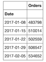
Finally, remember to index your data with time so that your rows will be indicated by a date rather than just a standard integer. Since our data is weekly, the values in the first column will be in YYYY-MM-DD date format and show the Monday of each week.
import pandas as pd
# Import the data
df = pd.read_csv("Blog_Orders.csv")
df['Date'] = pd.to_datetime(df['Date'])
# Set the date as index
df = df.set_index('Date')
# Select the proper time period for weekly aggreagation
df = df['2017-01-02':'2019-12-29'].resample('W').sum()
df.head()
Examine and Prepare Your Dataset for Modeling
Check the Data for Common Time Series Patterns
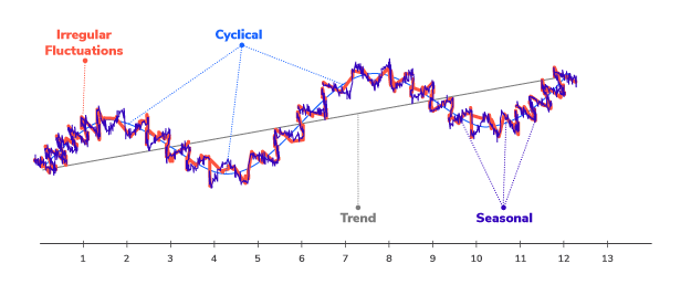
It’s important to check any time series data for patterns that can affect the results, and can inform which forecasting model to use. Some common time series data patterns are:
| Level | The average value in the series |
| Trend | Increases, decreases, or stays the same over time |
| Seasonal or Periodic | Pattern repeats periodically over time |
| Cyclical | Pattern that increases and decreases but usually related to non-seasonal activity, like business cycles |
| Random or Irregular Variations | Increases and decreases that don’t have any apparent pattern |
Most time-series data will contain one or more, but probably not all of these patterns. It’s still a good idea to check for them since they can affect the performance of the model and may even require different modeling approaches.
Two great methods for finding these data patterns are visualization and decomposition.
Visualize the Data
The first step is simply to plot the dataset. In the example, I use the matplotlib package. Since it’s easier to see a general trend using the mean, I use both the original data (blue line) as well as the monthly average resample data (orange line).
By changing the 'M’ (or ‘Month’) within y.resample('M'), you can plot the mean for different aggregate dates. For example, if you have a very long history of data, you might plot the yearly average by changing ‘M’ to ‘Y’.
import warnings
import matplotlib.pyplot as plt
y = df['Orders']
fig, ax = plt.subplots(figsize=(20, 6))
ax.plot(y,marker='.', linestyle='-', linewidth=0.5, label='Weekly')
ax.plot(y.resample('M').mean(),marker='o', markersize=8, linestyle='-', label='Monthly Mean Resample')
ax.set_ylabel('Orders')
ax.legend();
Then we can look at the basic up/down patterns, overall trend, anomalies, and generally get a sense of what kind of data we’re dealing with. This is just a gut check of the data without going too deep. If there are any very strange anomalies, we might reach out to a subject matter expert to understand possible causes. We are also looking here for any red flags like missing data or other obvious quality issues.
Decompose the Data
By looking at the graph of sales data above, we can see a general increasing trend with no clear pattern of seasonal or cyclical changes. The next step is to decompose the data to view more of the complexity behind the linear visualization. A useful Python function called seasonal_decompose within the 'statsmodels' package can help us to decompose the data into four different components:
- Observed
- Trended
- Seasonal
- Residual
import statsmodels.api as sm

# graphs to show seasonal_decompose
def seasonal_decompose (y):
    decomposition = sm.tsa.seasonal_decompose(y, model='additive',extrapolate_trend='freq')
    fig = decomposition.plot()
    fig.set_size_inches(14,7)
    plt.show()
seasonal_decompose(y)
After looking at the four pieces of decomposed graphs, we can tell that our sales dataset has an overall increasing trend as well as a yearly seasonality. Depending on the components of your dataset like trend, seasonality, or cycles, your choice of model will be different. We discuss evaluating and choosing models in Part Two.
Check for Stationarity
Next, we need to check whether the dataset is stationary or not. A dataset is stationary if its statistical properties like mean, variance, and autocorrelation do not change over time.
Most time series datasets related to business activity are not stationary since there are usually all sorts of non-stationary elements like trends and economic cycles. But, since most time series forecasting models use stationarity—and mathematical transformations related to it—to make predictions, we need to ‘stationarize’ the time series as part of the process of fitting a model.
Two common methods to check for stationarity are Visualization and the Augmented Dickey-Fuller (ADF) Test. Python makes both approaches easy:
Visualization
This method graphs the rolling statistics (mean and variance) to show at a glance whether the standard deviation changes substantially over time:
### plot for Rolling Statistic for testing Stationarity
def test_stationarity(timeseries, title):

    #Determing rolling statistics
    rolmean = pd.Series(timeseries).rolling(window=12).mean()
    rolstd = pd.Series(timeseries).rolling(window=12).std()

    fig, ax = plt.subplots(figsize=(16, 4))
    ax.plot(timeseries, label= title)
    ax.plot(rolmean, label='rolling mean');
    ax.plot(rolstd, label='rolling std (x10)');
    ax.legend()
pd.options.display.float_format = '{:.8f}'.format
test_stationarity(y,'raw data')
Both the mean and standard deviation for stationary data does not change much over time. But in this case, since the y-axis has such a large scale, we can not confidently conclude that our data is stationary by simply viewing the above graph. Therefore, we should do another test of stationarity.
Augmented Dickey-Fuller Test
The ADF approach is essentially a statistical significance test that compares the p-value with the critical values and does hypothesis testing. Using this test, we can determine whether the processed data is stationary or not with different levels of confidence.
# Augmented Dickey-Fuller Test
from statsmodels.tsa.stattools import adfuller

def ADF_test(timeseries, dataDesc):
    print(' > Is the {} stationary ?'.format(dataDesc))
    dftest = adfuller(timeseries.dropna(), autolag='AIC')
    print('Test statistic = {:.3f}'.format(dftest[0]))
    print('P-value = {:.3f}'.format(dftest[1]))
    print('Critical values :')
    for k, v in dftest[4].items():
        print('\t{}: {} - The data is {} stationary with {}% confidence'.format(k, v, 'not' if v<dftest[0] else '', 100-int(k[:-1])))
ADF_test(y,'raw data')
Looking at both the visualization and ADF test, we can tell that our sample sales data is non-stationary.
Make the Data Stationary
To proceed with our time series analysis, we need to stationarize the dataset. There are many approaches to stationarize data, but we’ll use de-trending, differencing, and then a combination of the two.
Detrending
This method removes the underlying trend in the time series:
# Detrending
y_detrend =  (y - y.rolling(window=12).mean())/y.rolling(window=12).std()

test_stationarity(y_detrend,'de-trended data')
ADF_test(y_detrend,'de-trended data')
The results show that the data is now stationary, indicated by the relative smoothness of the rolling mean and rolling standard deviation after running the ADF test again.
Differencing
This method removes the underlying seasonal or cyclical patterns in the time series. Since the sample dataset has a 12-month seasonality, I used a 12-lag difference:
# Differencing
y_12lag =  y - y.shift(12)

test_stationarity(y_12lag,'12 lag differenced data')
ADF_test(y_12lag,'12 lag differenced data')
This method did not perform as well as the de-trending did, as indicated by the ADF test which is not stationary within 99 percent of the confidence interval.
Combining Detrending and Differencing
This approach uses both methods to stationarize the data.
# Detrending + Differencing

y_12lag_detrend =  y_detrend - y_detrend.shift(12)

test_stationarity(y_12lag_detrend,'12 lag differenced de-trended data')
ADF_test(y_12lag_detrend,'12 lag differenced de-trended data')
Using the combination of the two methods, we see from both the visualization and the ADF test that the data is now stationary. This is the transformation we will use moving forward with our analysis.
Create Training & Testing Datasets
To get ready to evaluate the performance of the models you’re considering for your time series analysis, it’s important to split the dataset into at least two parts.
One part will be the ‘Training’ dataset, and the other part will be the ‘Testing’ dataset. Sometimes you will create a third dataset or a ‘Validation’ dataset which reserves some data for additional testing.
For the purposes of this sample time series analysis, I created just a Training dataset and a Testing dataset.
Set the y_to_train, y_to_test, and the length of predict units
y_to_train = y[:'2019-05-26'] # dataset to train
y_to_val = y['2019-06-02':] # last X months for test
predict_date = len(y) - len(y[:'2019-06-02']) # the number of data points for the test set
Conclusion
By now you may be getting impatient for the actual model building. This is normal since most people find the model building and evaluation more interesting.
Though it may seem like a lot of prep work, it’s absolutely necessary. Like a good house painter, it saves time, trouble, and mistakes if you take the time to make sure you understand and prepare your data well before proceeding. Good data preparation also makes it easier to make adjustments and find ways to improve your model’s fit, as well as research potential questions about the results.
I hope this post has provided a good overview of some of the important data preparation steps in building a time series model. In Part Two, we’ll jump right into the exciting part: Modeling!
Remember that all the code referenced in this post is available here on Github. Please feel free to use it and share your feedback or questions.


